Valley of the Sun YMCA
A $683K program service revenue boost derived from mission-driven design
FOR
Valley of the Sun YMCA
TYPE
Community & Wellness Nonprofit
PERSONALITY
Family-first, Vibrant, Approachable
SERVICES
Art Direction
Campaign Design
Event Branding
Print Design
Email Graphics Advertising
Social Design Apparel Graphics
Print Design
Email Graphics Advertising
Social Design Apparel Graphics
ROLE
Graphic Designer
The Valley of the Sun YMCA is a nonprofit with 16 community centers and camps across Arizona. The Y develops healthy minds, bodies, and spirits with educational programs, fitness, sports, childcare, and local services.
The Y needed a design partner to market their growing program catalogue, support staff with on-brand materials, develop monthly membership campaigns, and elevate the overall brand.
The Y needed a design partner to market their growing program catalogue, support staff with on-brand materials, develop monthly membership campaigns, and elevate the overall brand.
%20(1).webp)
.webp)
Strategy
Monthly membership campaigns
Every new membership scales the Y’s ability to fund essential nonprofit programs like swim lessons, career services, and senior wellness. Monthly membership campaigns help ensure a steady stream of revenue to keep those missions alive and fuel community growth.
We recognized that our target audience wanted a community where they belong, but they may be intimidated to join a gym or get started. Campaign designs needed to be inviting—using retail offers to lower the financial stakes, while visuals show that the Y is more than just a gym. I served as the creative lead, incorporating each month’s offer and message into a visual narrative for the campaign funnel.
We recognized that our target audience wanted a community where they belong, but they may be intimidated to join a gym or get started. Campaign designs needed to be inviting—using retail offers to lower the financial stakes, while visuals show that the Y is more than just a gym. I served as the creative lead, incorporating each month’s offer and message into a visual narrative for the campaign funnel.


Core brand
With 16 locations, hundreds of employees, and thousands of members and volunteers, the Valley of the Sun YMCA needed to bridge the gap between high-volume output and brand excellence with only myself and one other designer on the team. The Y’s visual style is both approachable and future-facing, so I stepped in to apply these values into a more cohesive visual story across the organization.
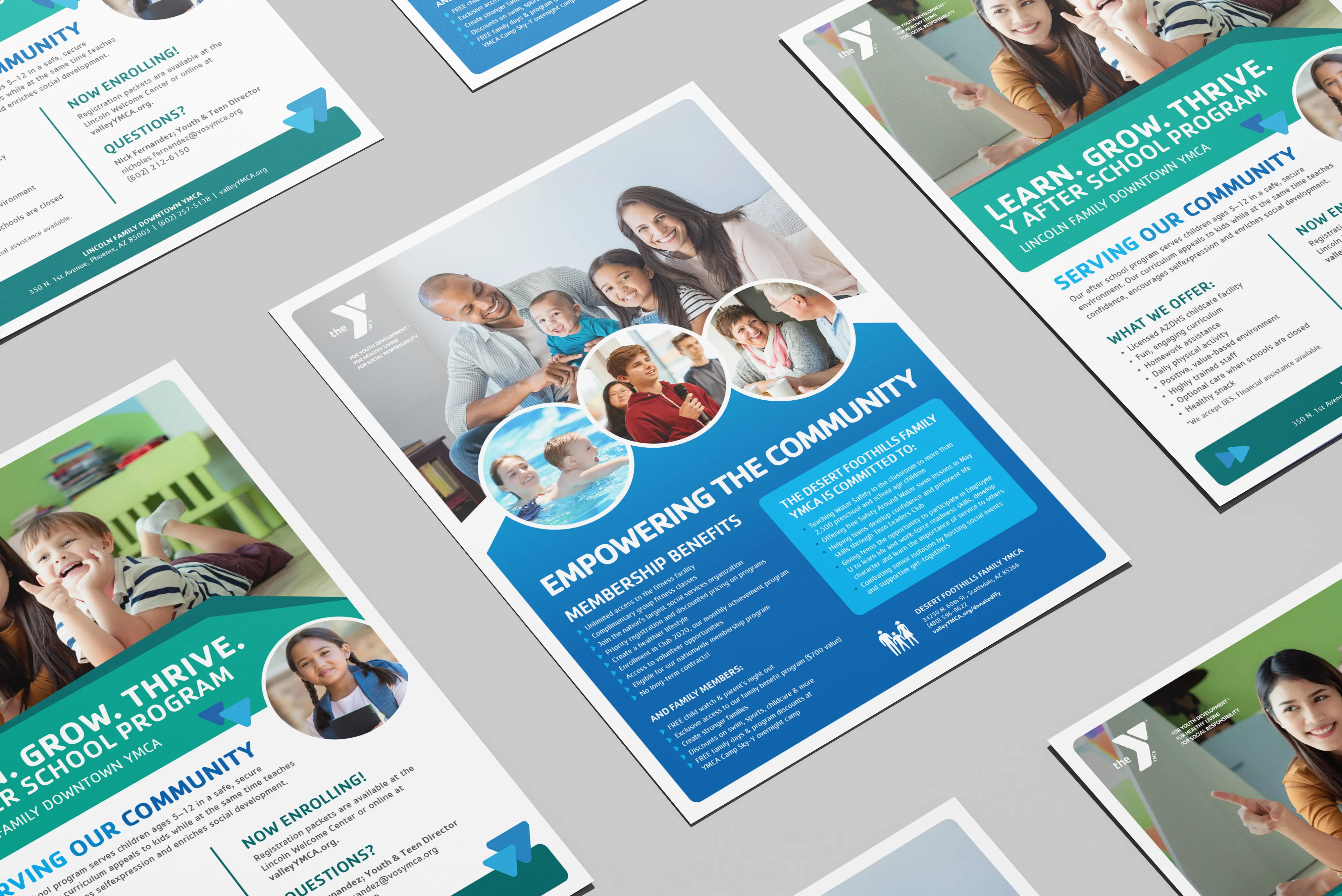
I focused on marketing assets that showcased community and optimism while implementing repeatable, scalable design standards. Due to budget constraints and the need for a rapid turnaround, I acted as an art director and photo editor—sourcing and customizing stock photography for an inclusive and on-brand visual narrative, and ensuring subjects felt relatable and not staged.
I focused on marketing assets that showcased community and optimism while implementing repeatable, scalable design standards. Due to budget constraints and the need for a rapid turnaround, I acted as an art director and photo editor—sourcing and customizing stock photography for an inclusive and on-brand visual narrative, and ensuring subjects felt relatable and not staged.
Tempe’s Spooky Sprint 5K
Hosted by the Tempe branch, the first annual Spooky Sprint 5K was set to be the start of a new community tradition. The event needed a visual identity that was scalable, eye-catching, and welcomed a costume-friendly atmosphere for all ages and ability levels.
To achieve this, my goal was to blend clean graphics and seasonal flair to attract both dedicated Y members and the general public. Since all event proceeds funded the annual support campaign, the event branding needed to drive registrations to allow the Tempe Y to expand their programs and meet the community’s evolving needs.
To achieve this, my goal was to blend clean graphics and seasonal flair to attract both dedicated Y members and the general public. Since all event proceeds funded the annual support campaign, the event branding needed to drive registrations to allow the Tempe Y to expand their programs and meet the community’s evolving needs.


Child abuse prevention
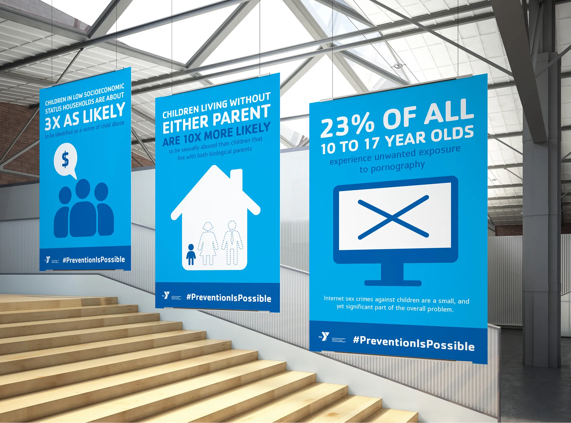
The Y is committed to creating communities we all want to live in. The Five Days of Action is a national campaign designed to raise awareness and inspire adults to take action to protect children from sexual abuse.
As part of this national campaign, the Valley of the Sun YMCA organized a press conference announcing their commitment to training 10,000 Arizonans in child abuse prevention. This high-stakes project required visual aids that translated sensitive information into accessible visual communication. My role was to create designs that sparked conversations on how to work together to prevent sexual abuse.
As part of this national campaign, the Valley of the Sun YMCA organized a press conference announcing their commitment to training 10,000 Arizonans in child abuse prevention. This high-stakes project required visual aids that translated sensitive information into accessible visual communication. My role was to create designs that sparked conversations on how to work together to prevent sexual abuse.
Creative
.webp)
.webp)
“You matter” membership campaign
This campaign centered around inclusivity—tapping into our audience’s desire for community and justifying the Y’s value as a mission-driven nonprofit. Photography features diverse ages and backgrounds, and focuses on optimism and belonging to attract adults and families. I chose bright, sunny colors to draw attention in competitive advertising spaces, helping to attract and convert new members and support the financial stability of the Y.
.webp)
%20(1).webp)
.webp)
.webp)
“Give thanks”
membership campaign
membership campaign
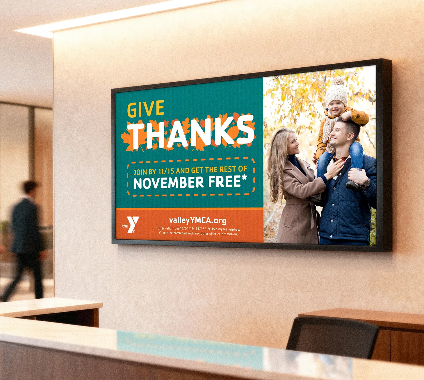
By evolving the visuals each month, I ensured campaigns felt timely and relevant to meet the community where they were. The warm gratitude of November shines through with intimate family-centric photography, leaf textures and visuals, stitch-like elements, and rich fall colors. The custom design frames the retail offer as a seasonal invitation instead of a sales promotion.
.webp)
.webp)
.webp)
.webp)
.webp)
.webp)
.webp)
“Jump start” membership campaign
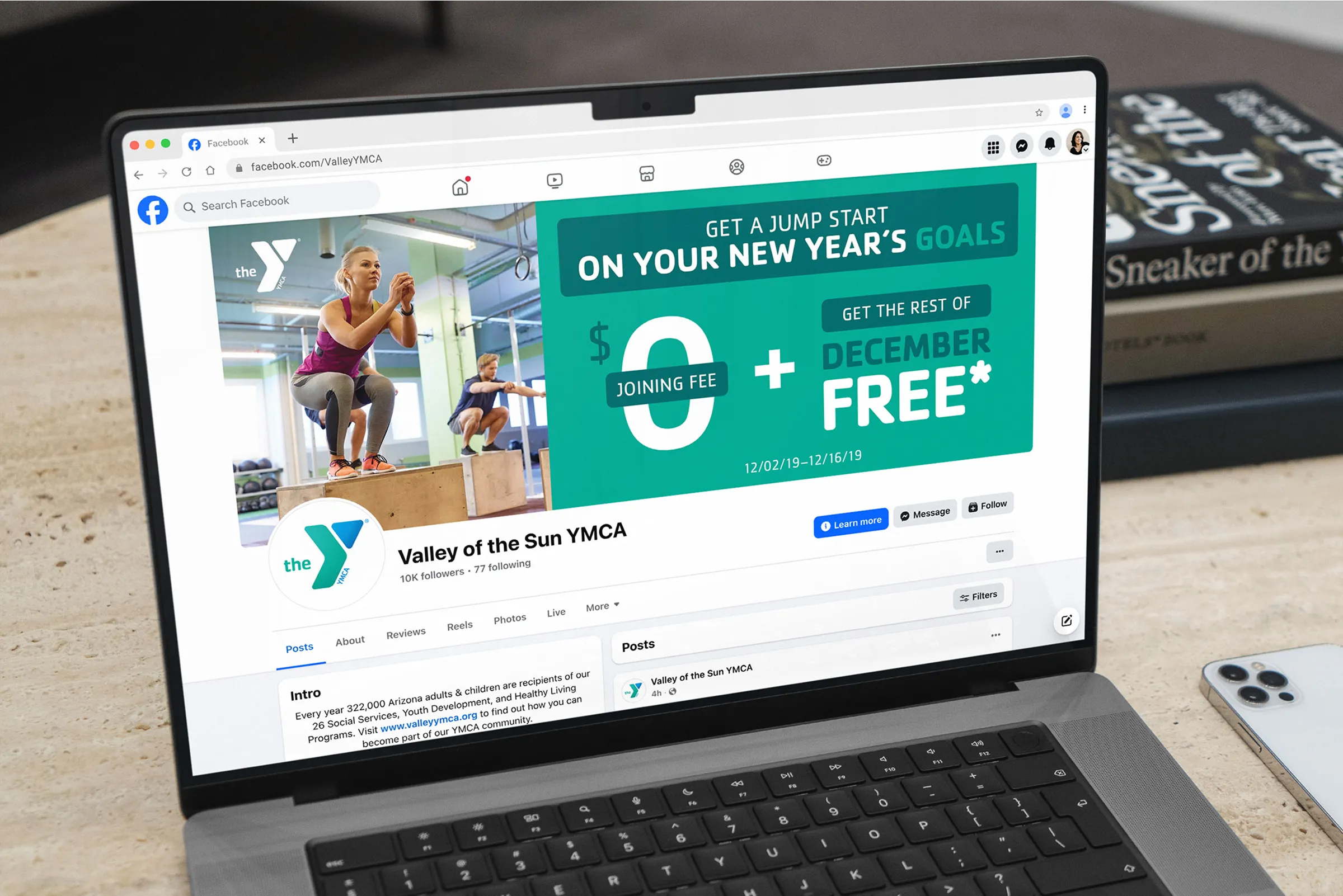
The creative for this December campaign shifts to a high-energy, athletic tone. The concept channels an end-of-year drive to start fitness resolutions early, and positions the Y as the premier place to fulfill them. I curated active gym imagery, high-contrast design elements, and green tones to lean into a fresh start.
This campaign paired with a month-long fitness challenge that included individual and public goal trackers. This fostered collective motivation and shared goals, making it easier for new members to start a routine in a new community.
.webp)
.webp)
.webp)
.webp)
.webp)
.webp)
.webp)
.webp)
“Be bold. Be strong. Belong.” membership campaign
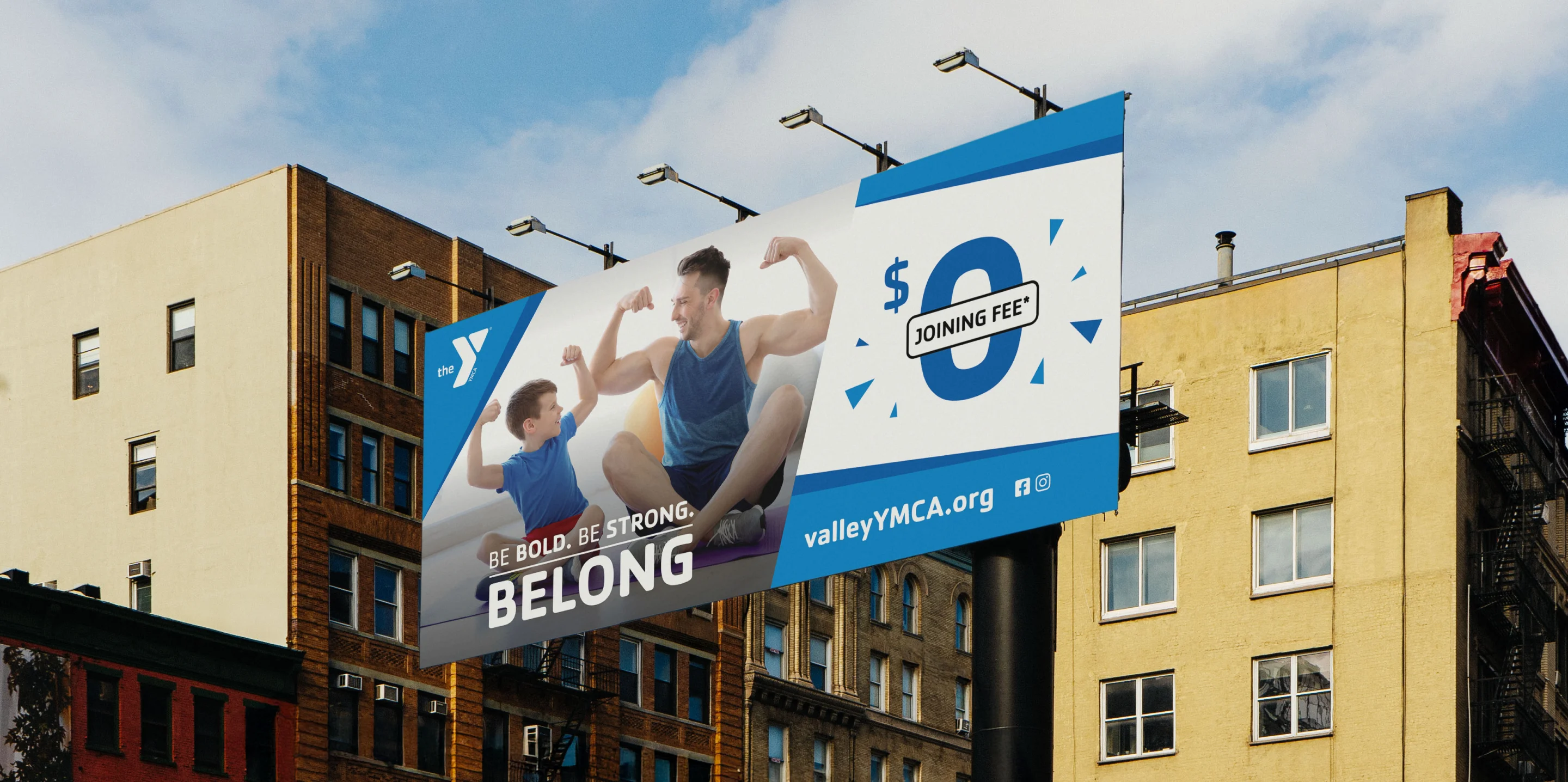
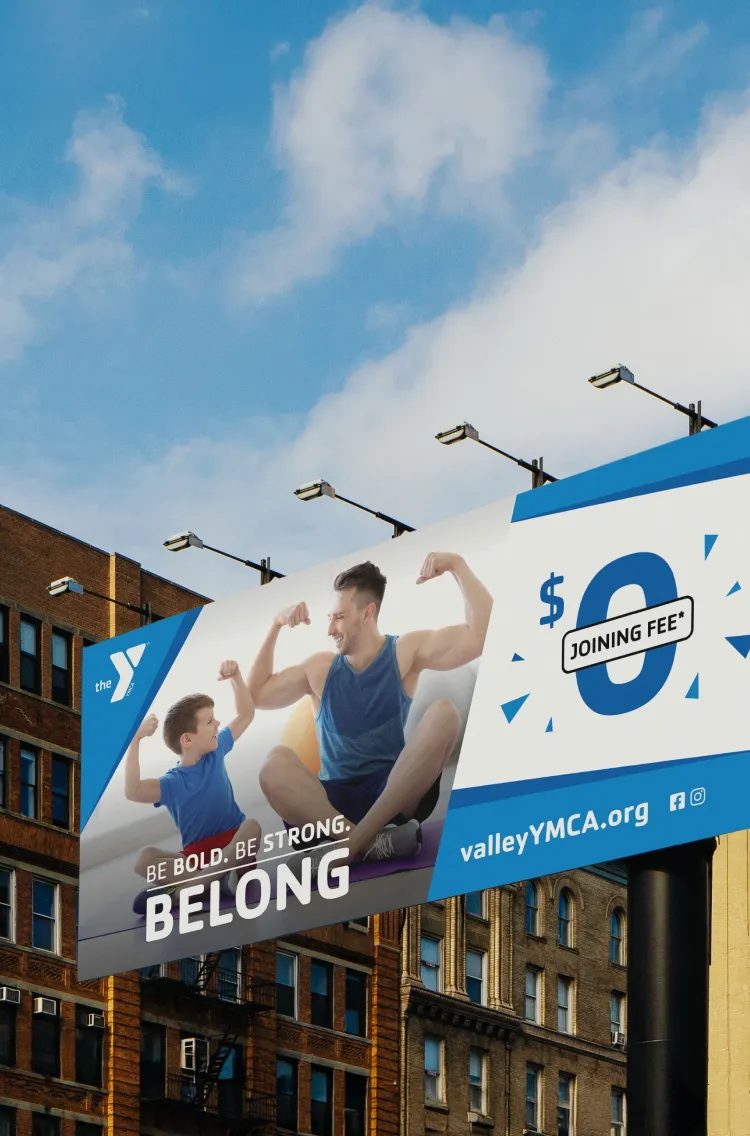
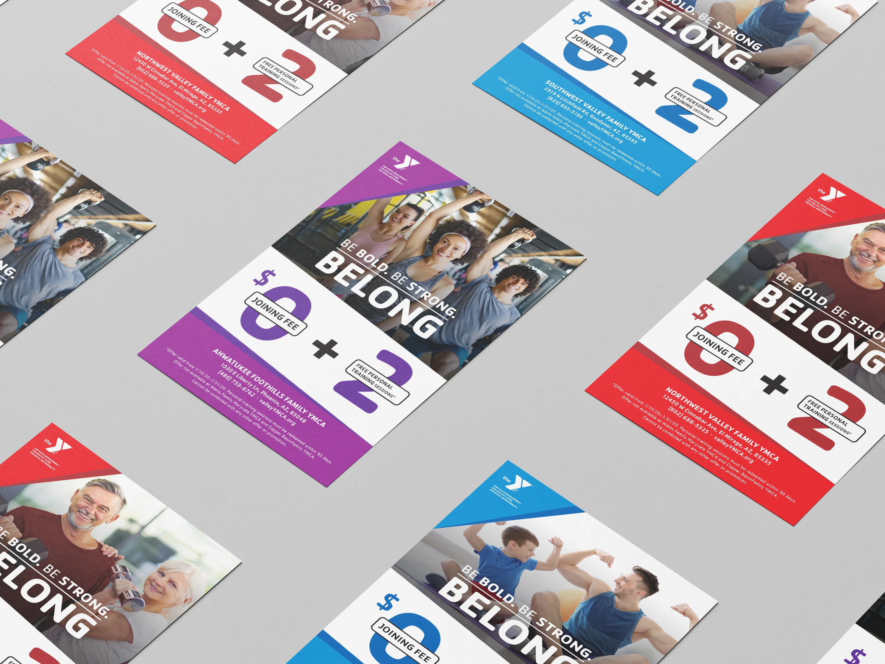
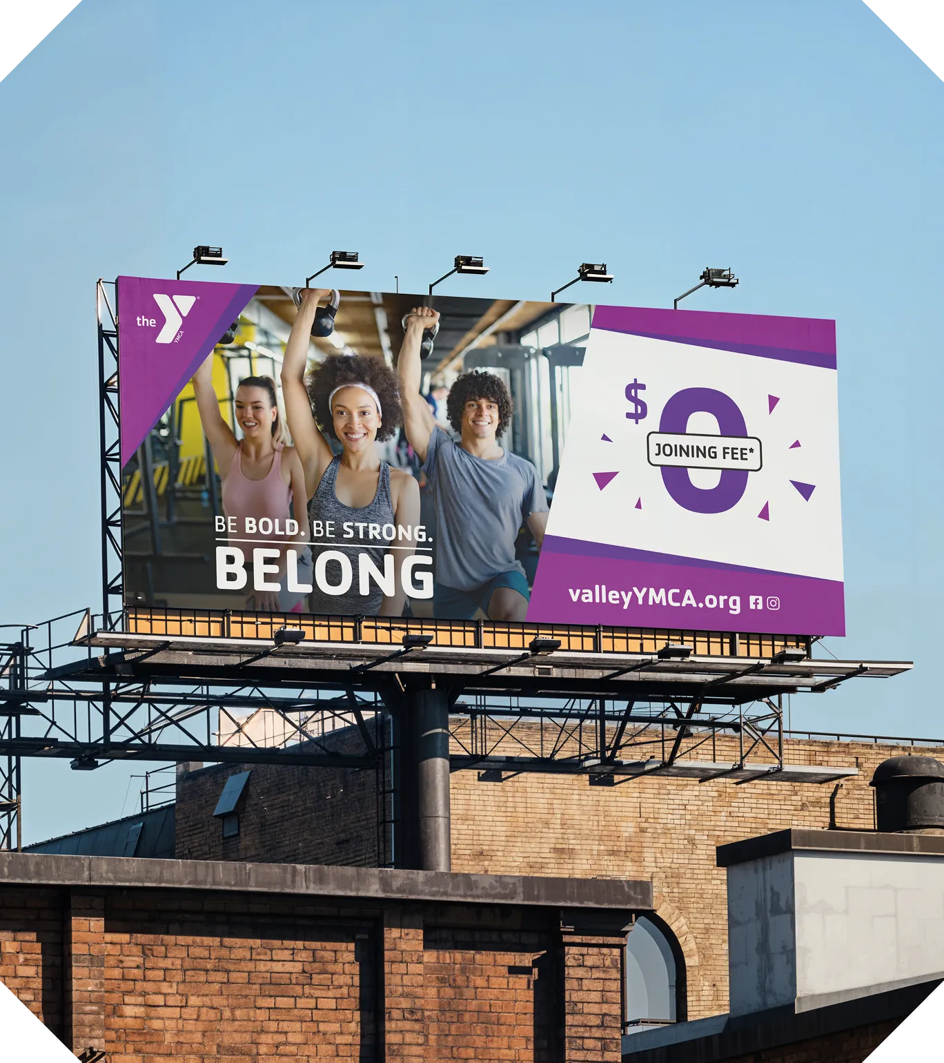
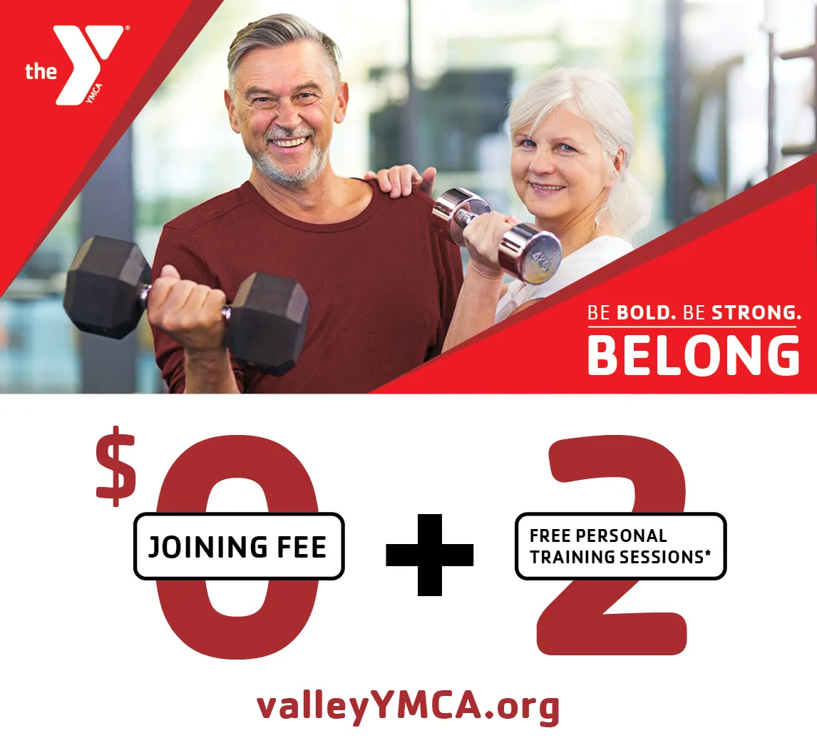
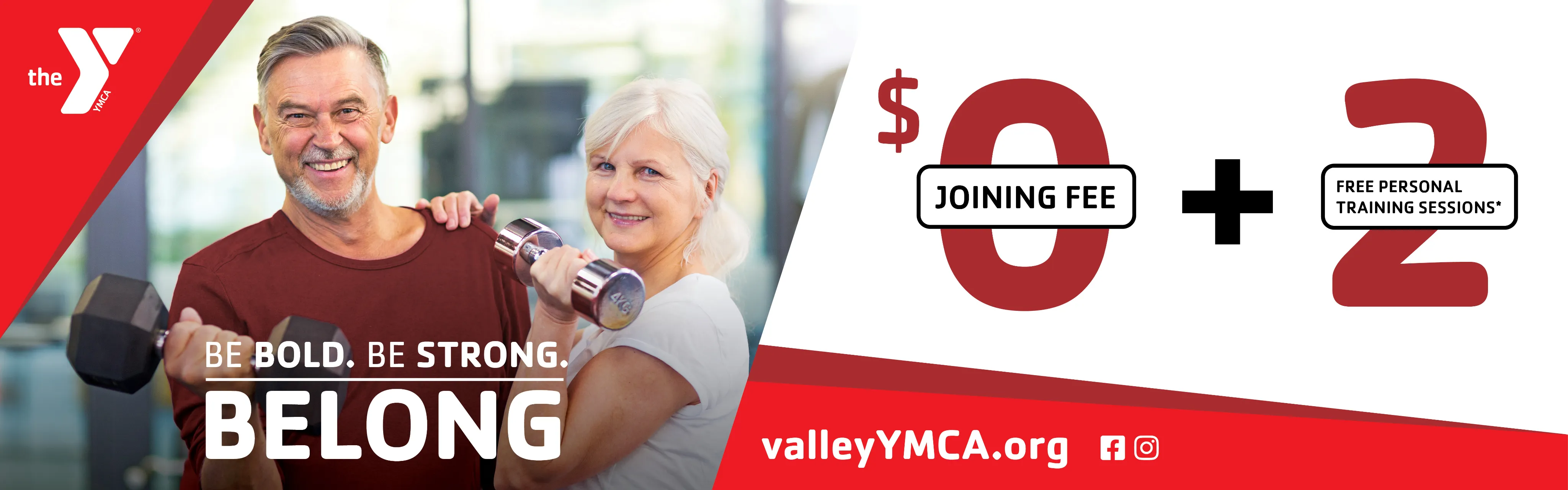
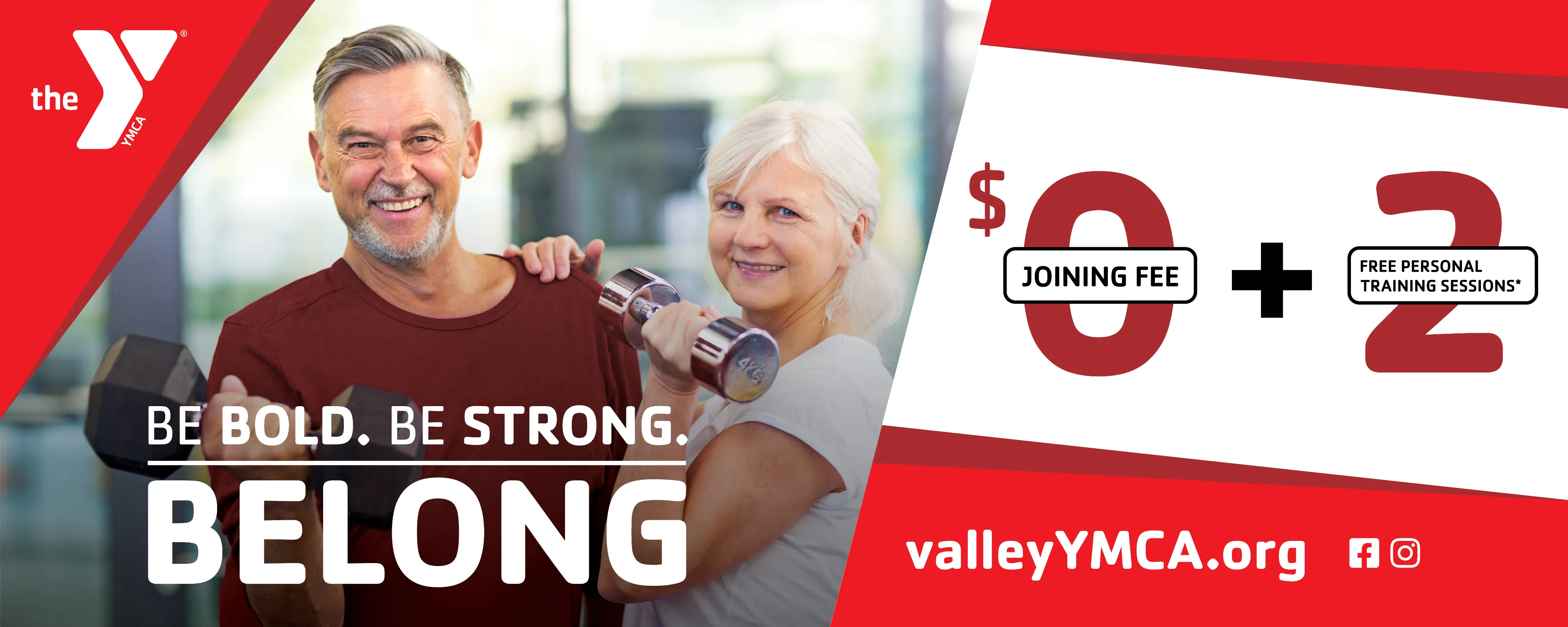
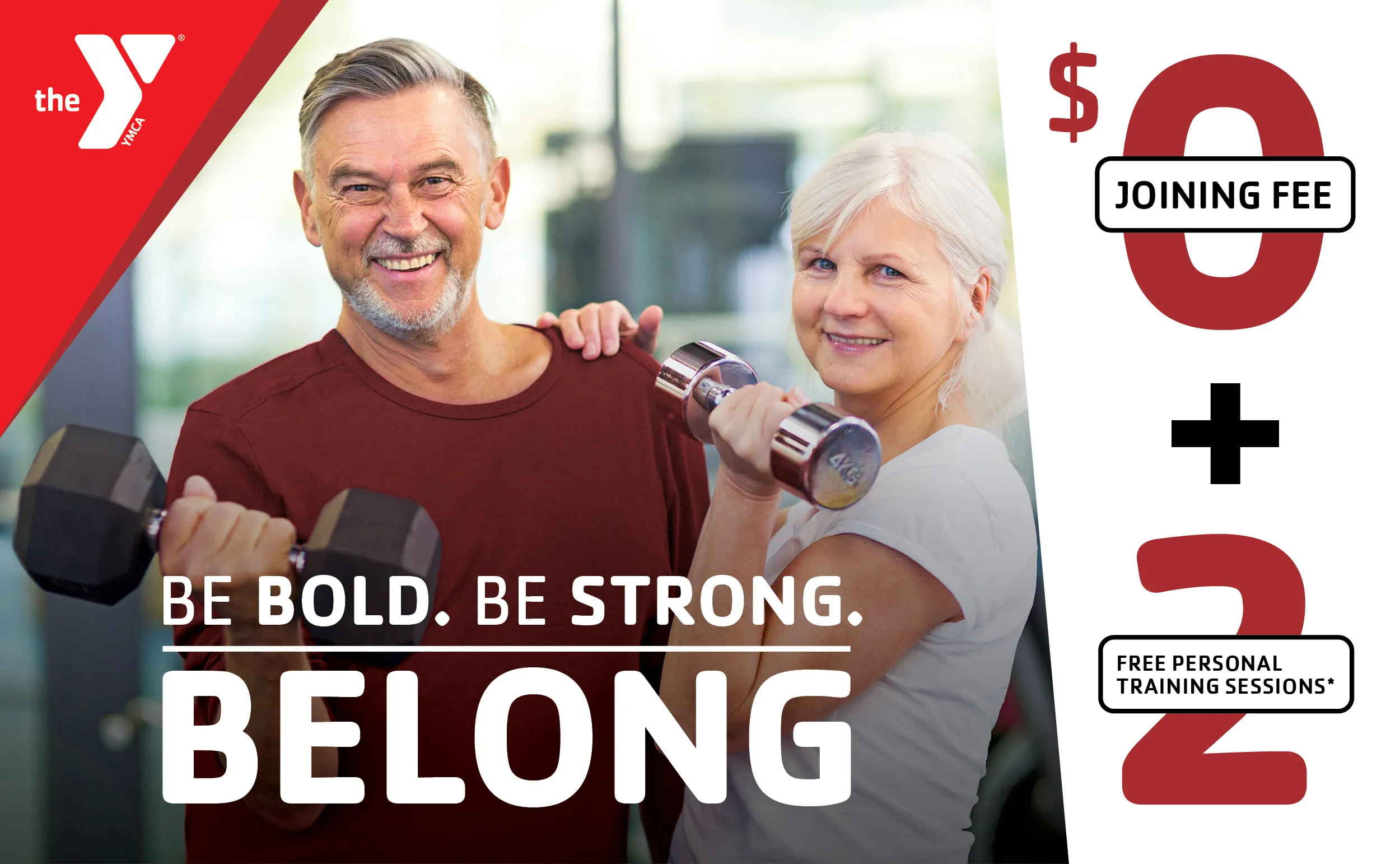
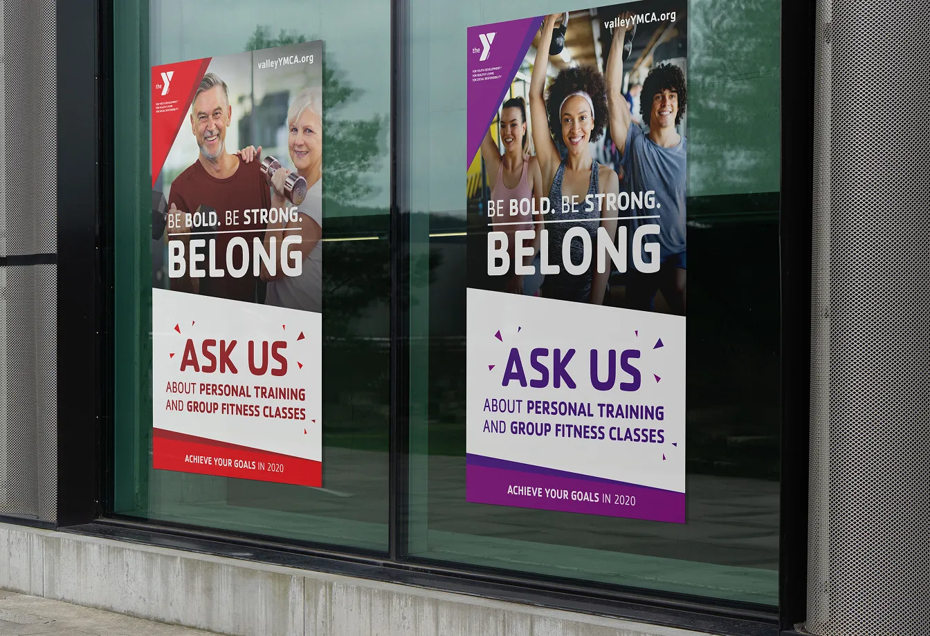
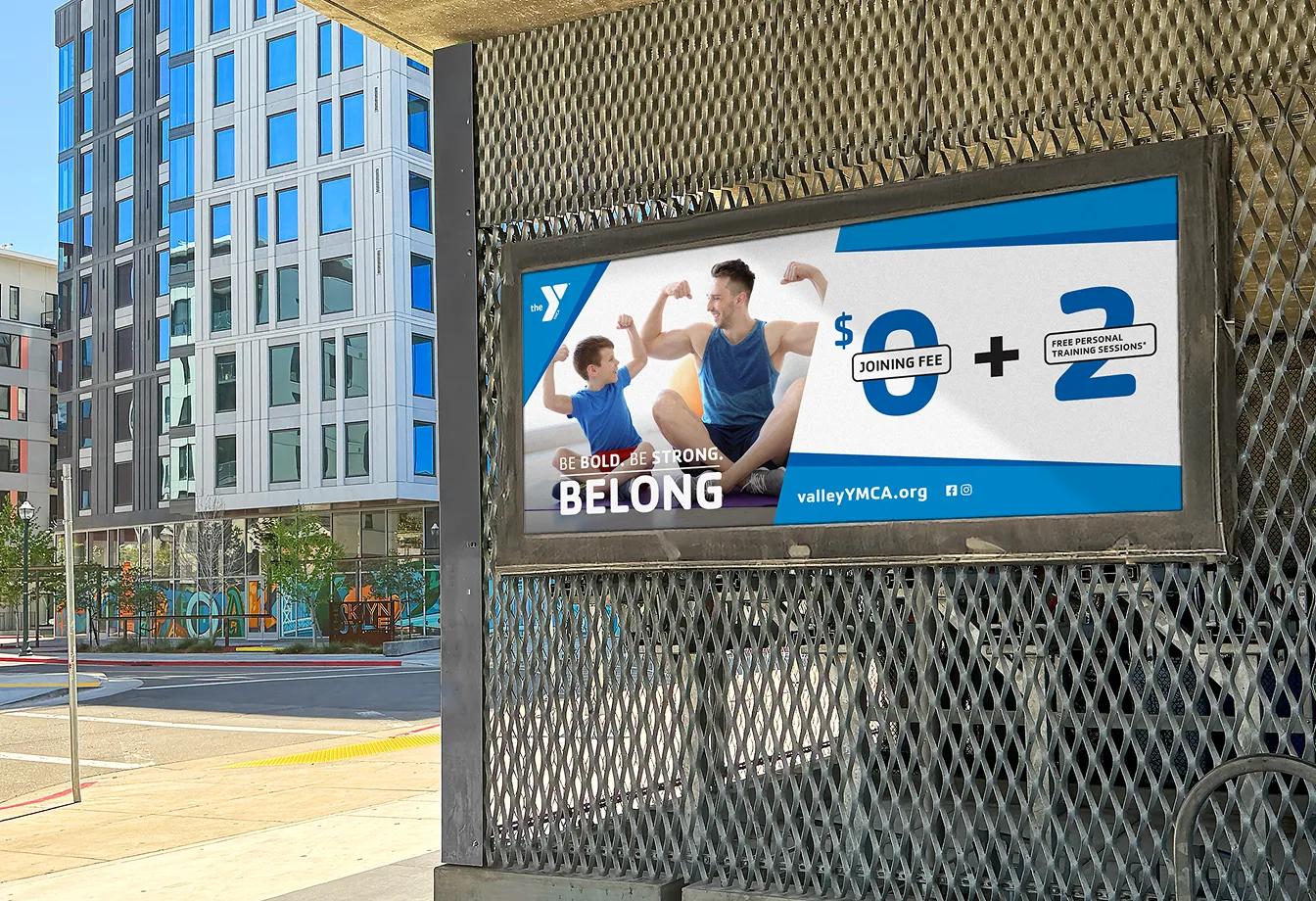
During January’s competitive registration period, the marketing team segmented this campaign with photography and color to ensure that every potential member could see themselves at the Y. The active adult segment leverages sophisticated purples for strength and action; the senior segment uses energetic reds for vitality and longevity; and the family segment utilizes trusted blues to signal a safe, supportive environment.
Diagonal design elements across the campaign design symbolize progress and momentum, while benefit-driven headlines focus on the positive outcome of joining the Y. Aspirational messaging and photography scales across a full funnel of deliverables to convey the emotional reward of belonging at the Y.
Diagonal design elements across the campaign design symbolize progress and momentum, while benefit-driven headlines focus on the positive outcome of joining the Y. Aspirational messaging and photography scales across a full funnel of deliverables to convey the emotional reward of belonging at the Y.
.webp)
.webp)
.webp)
.webp)
.webp)
.webp)
.webp)

.webp)
.webp)
.webp)
.webp)
.webp)
.webp)
.webp)
“Leap year” membership campaign
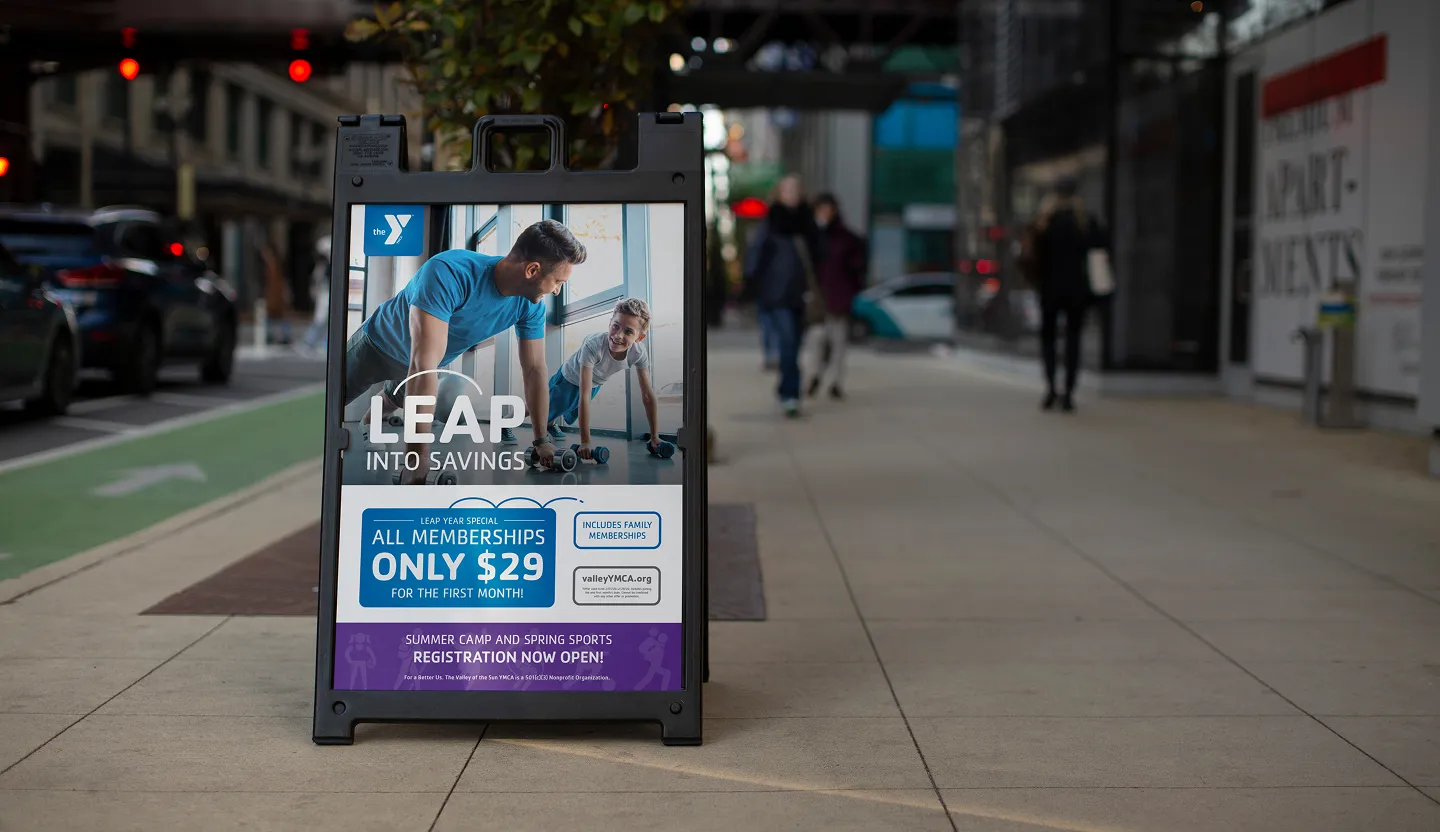
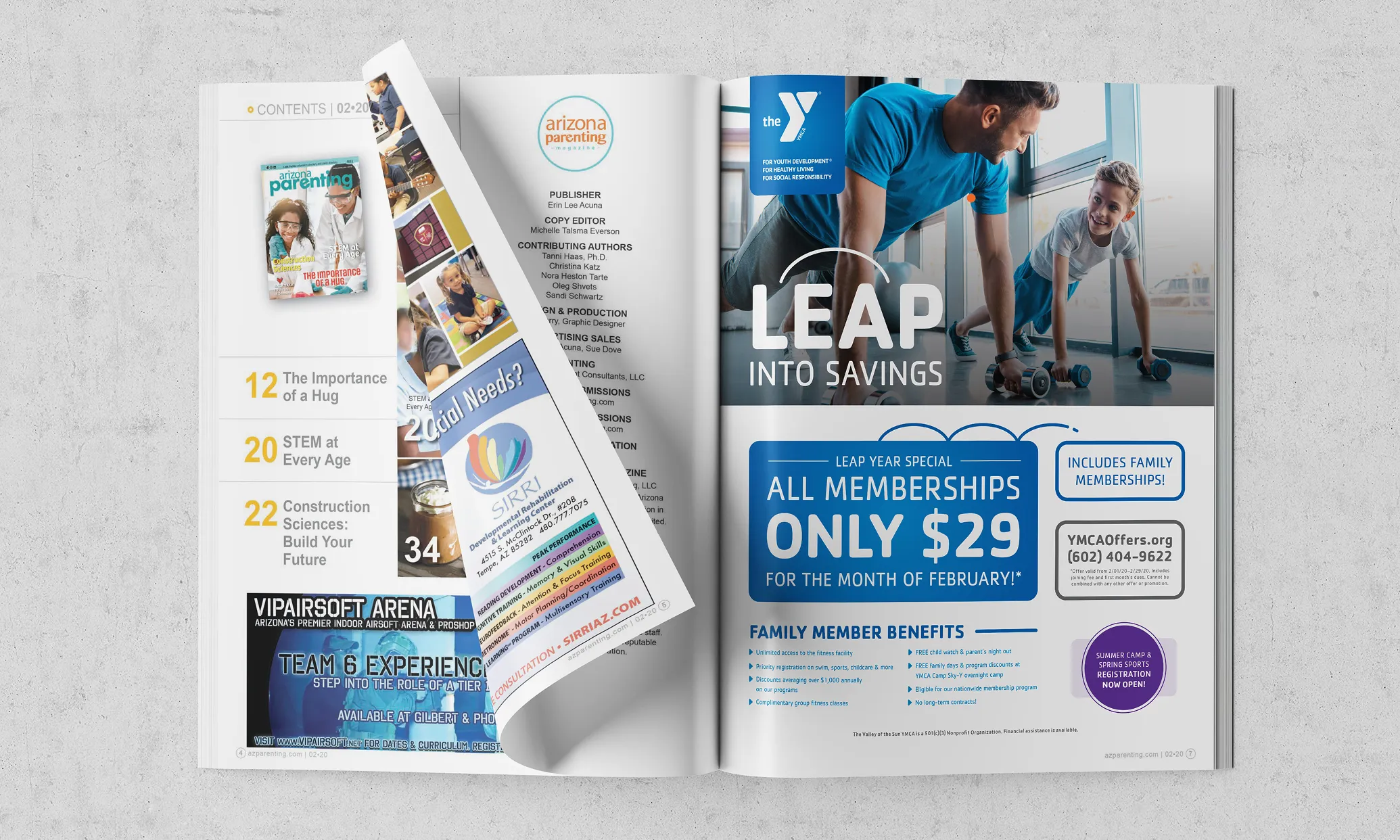
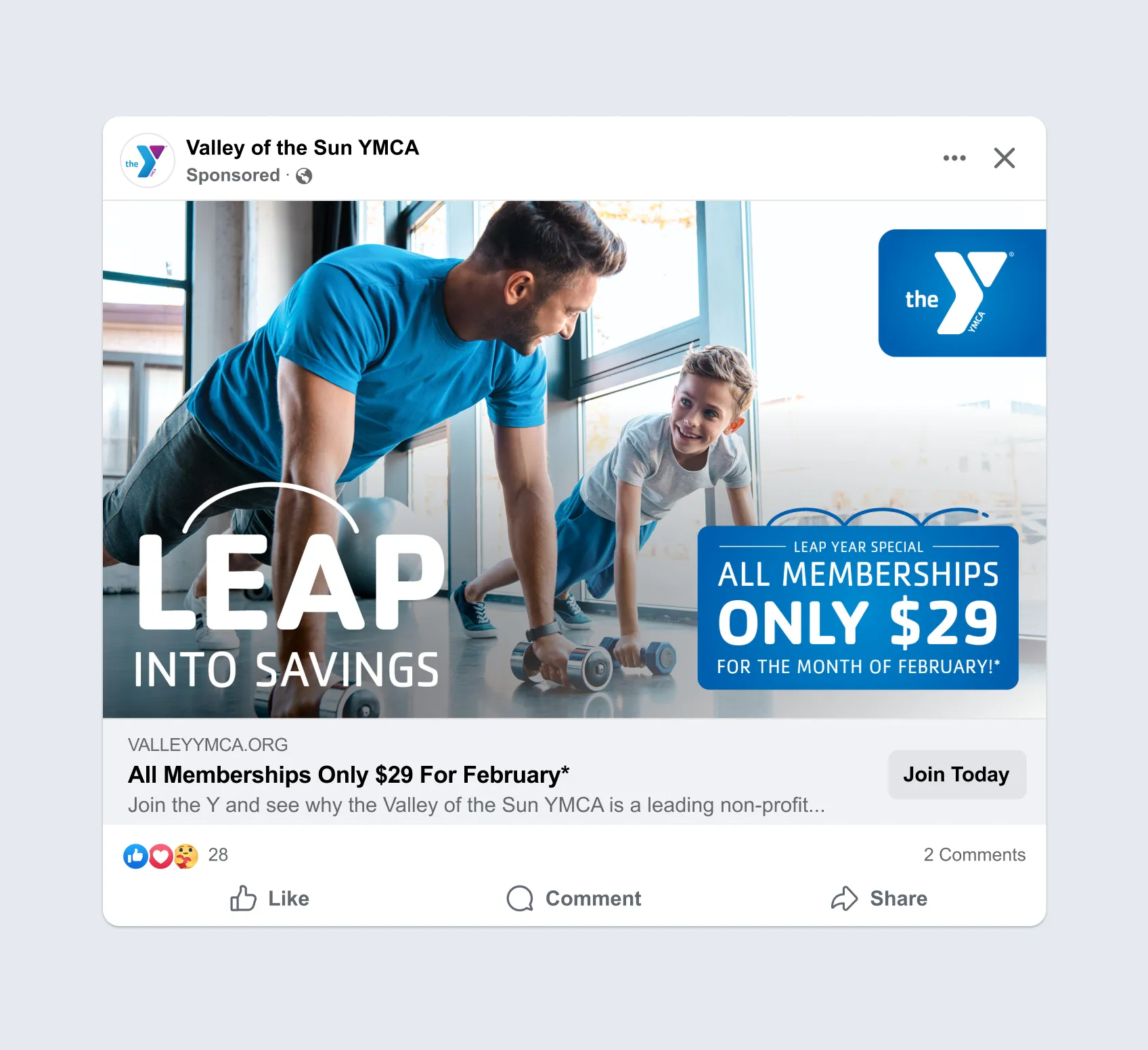
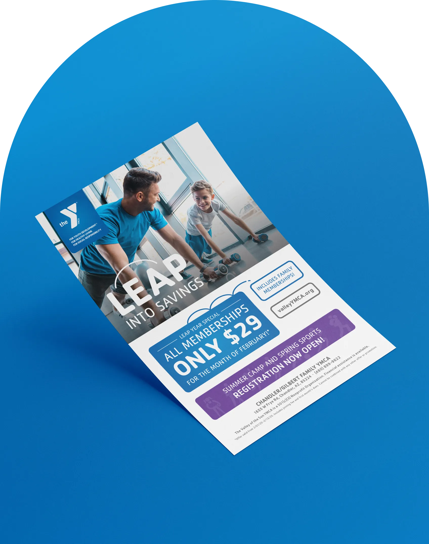
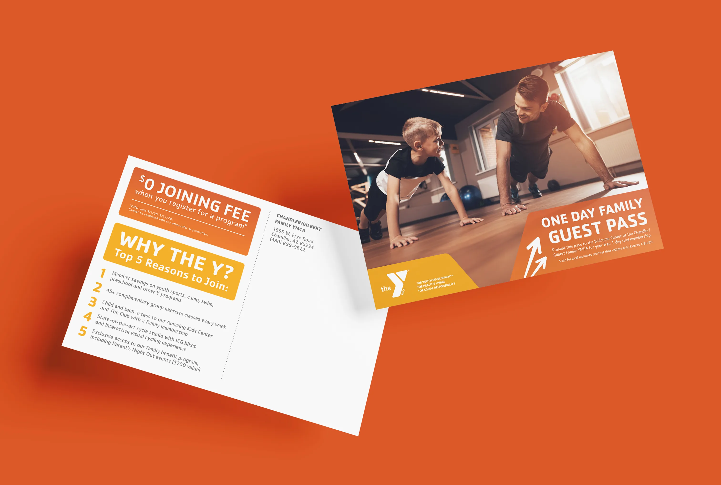
While January’s campaign focused on emotional identity, this campaign leveraged a calendar event with a lighthearted play on words and leaping lines to drive action. The limited-time deep discount creates a sense of urgency for potential members who missed the January rush. Photography reinforces the Y’s family-friendly and active atmosphere, while subtle gradients add modernism. Marketing assets also encourage registration for youth programs to help showcase all the Y has to offer.
%20(1).webp)
.webp)
Core brand
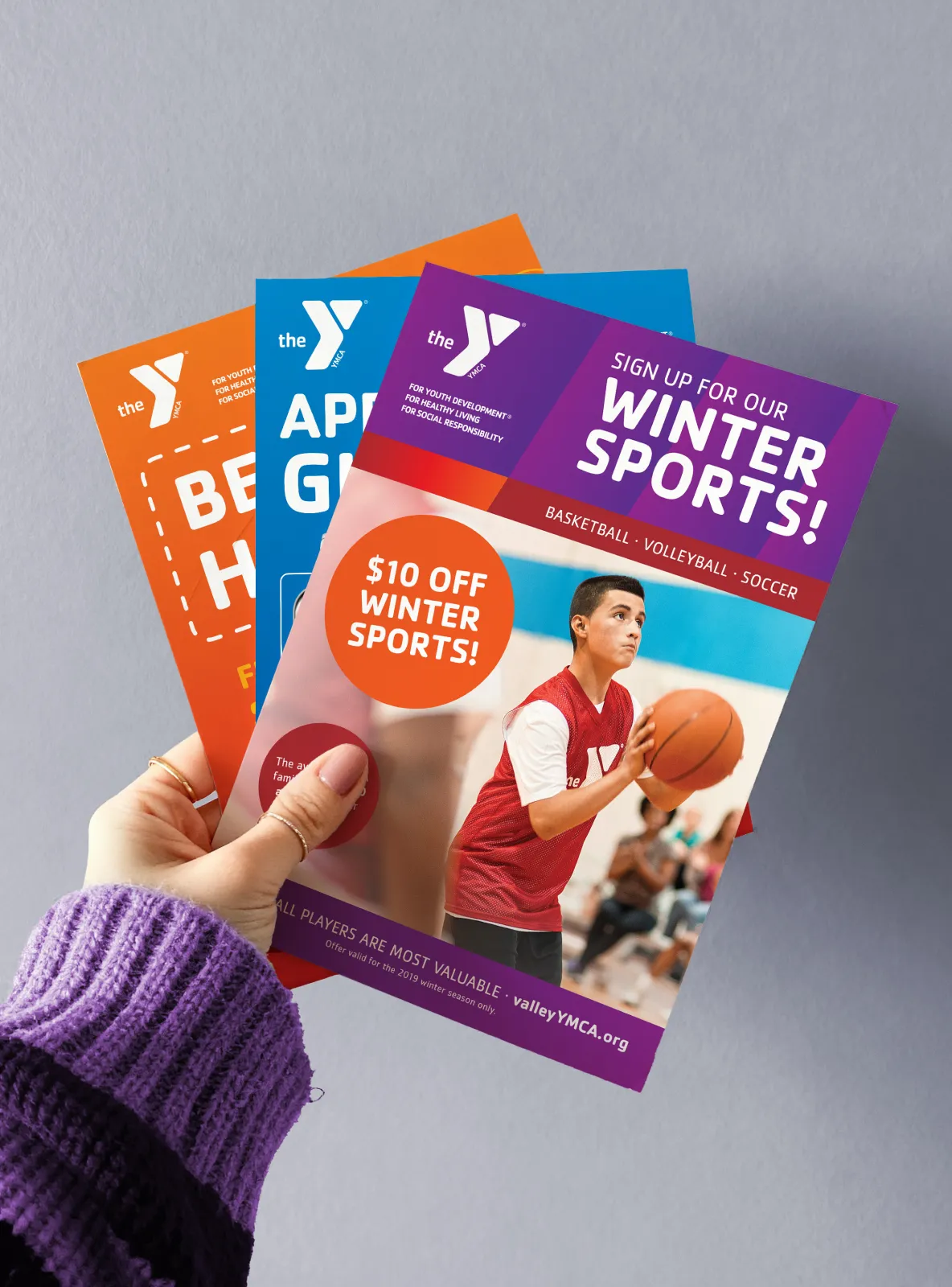
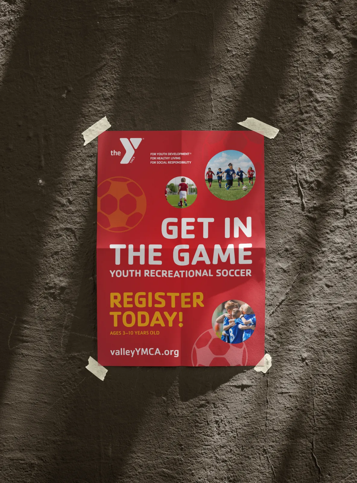
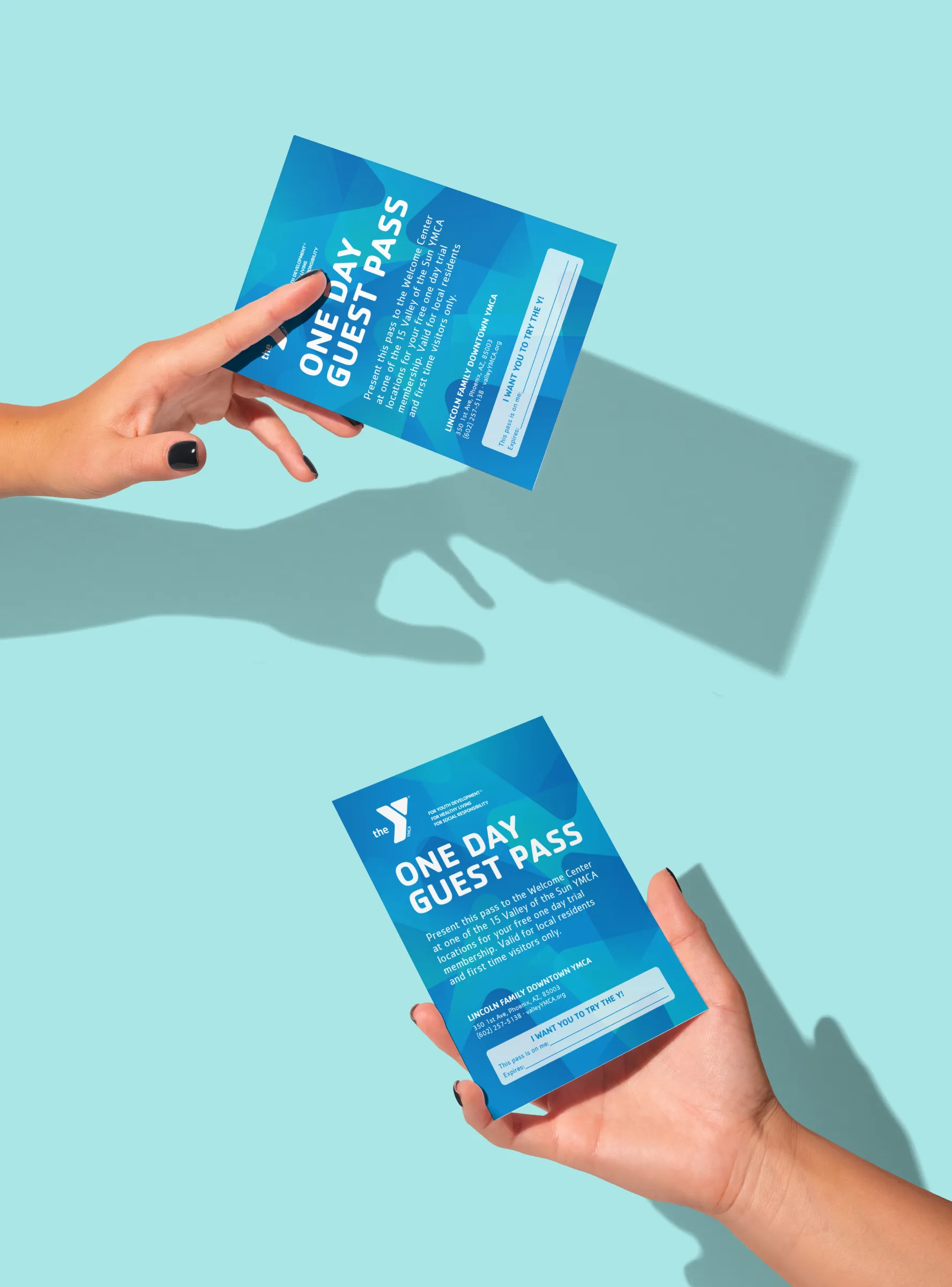
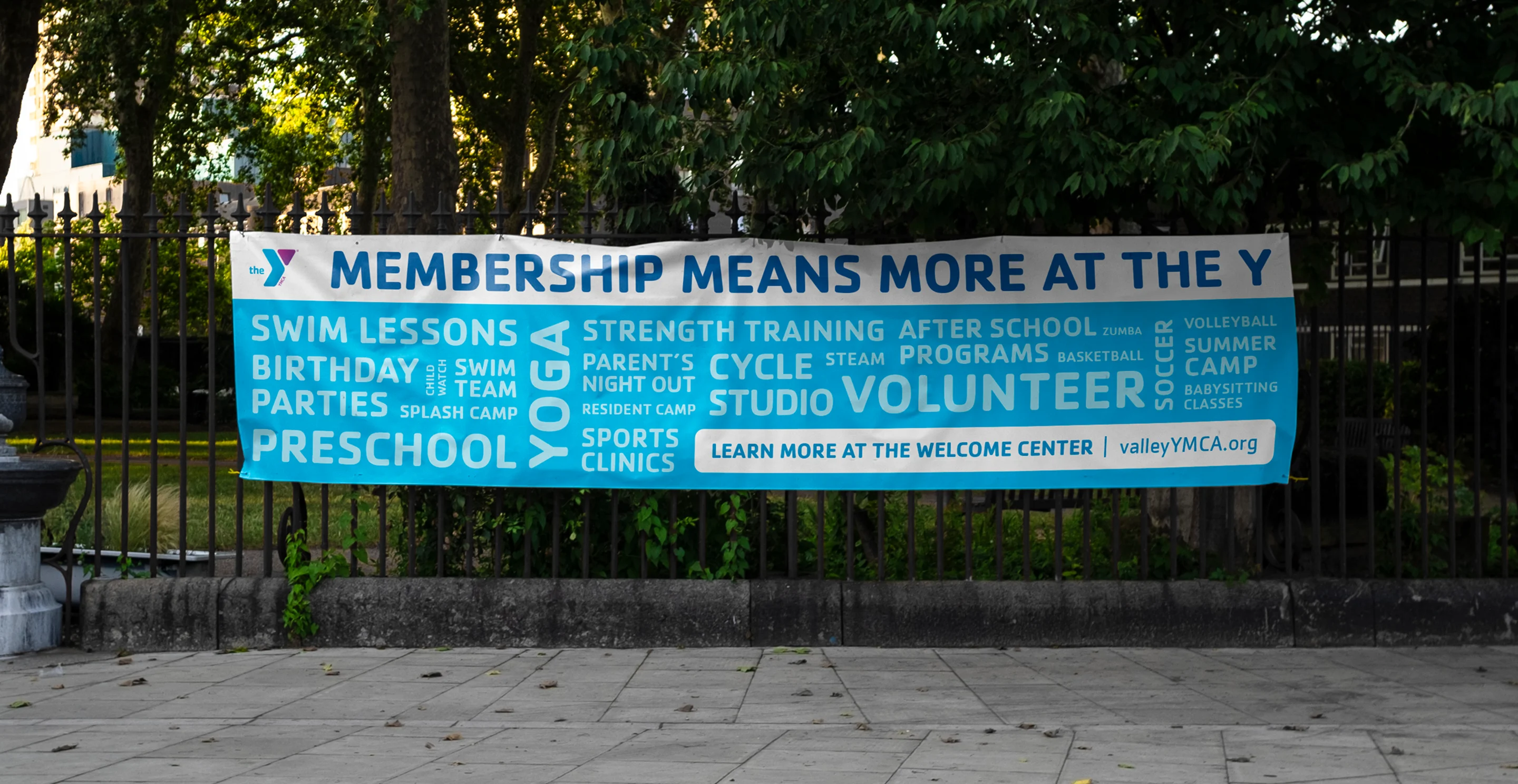
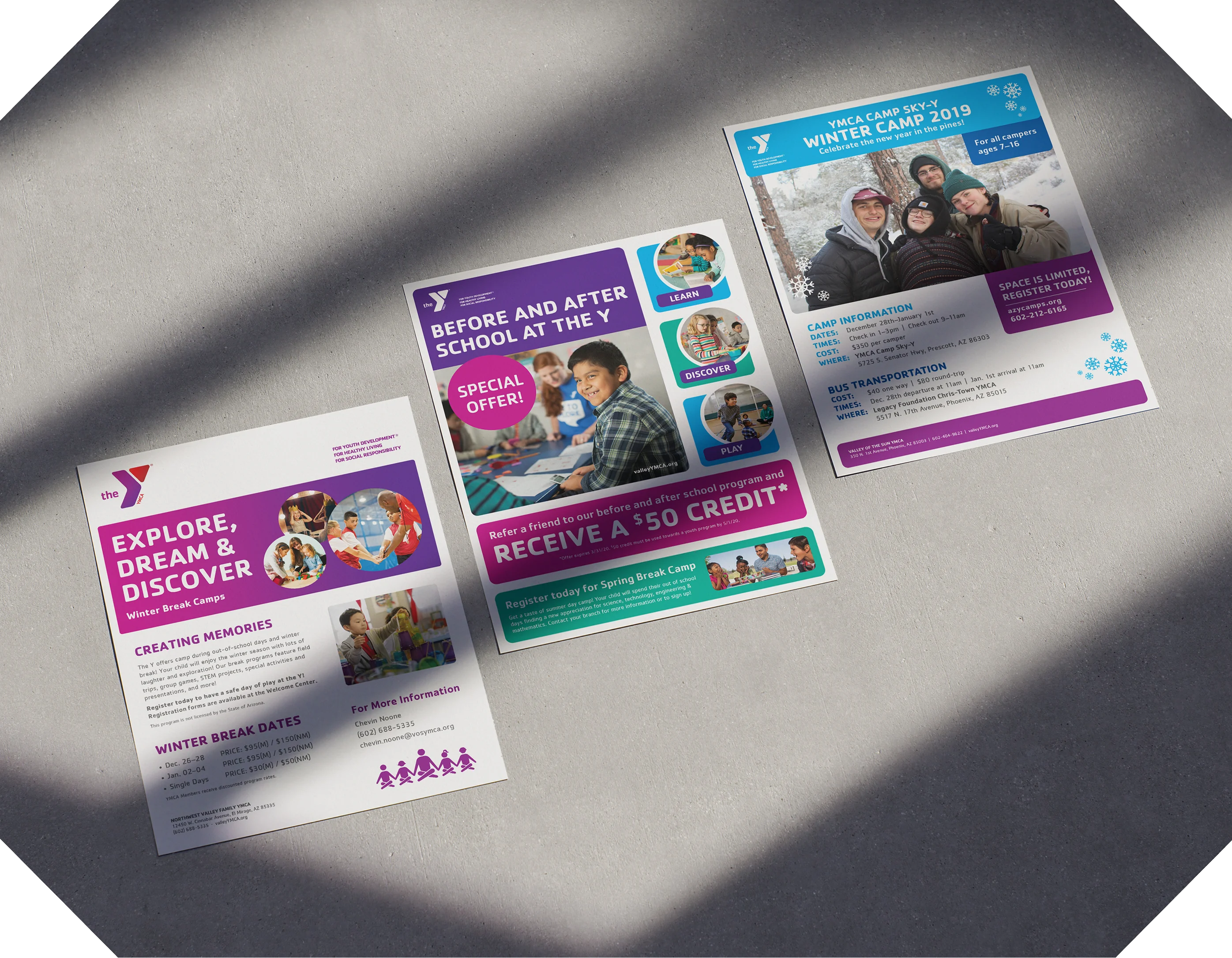
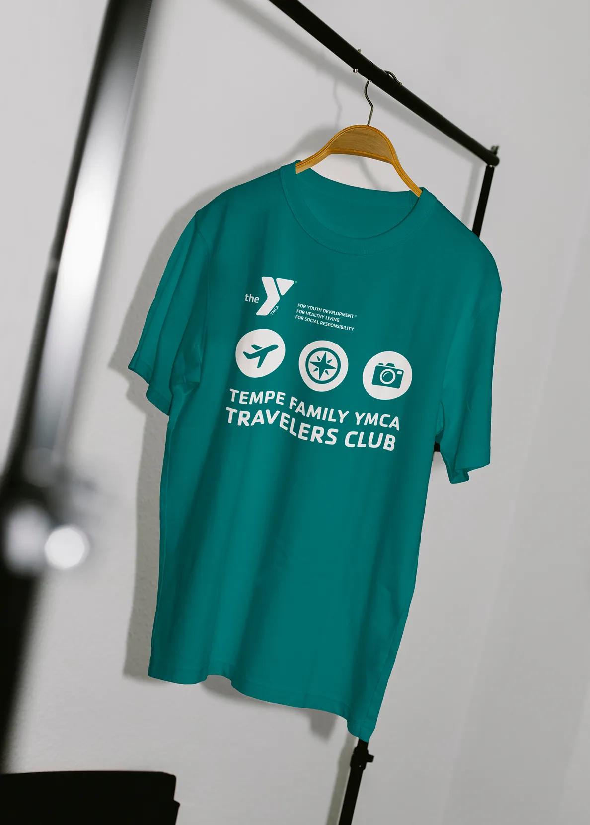
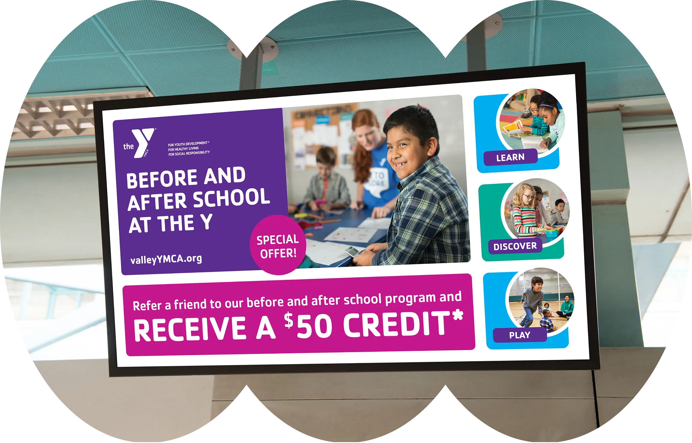
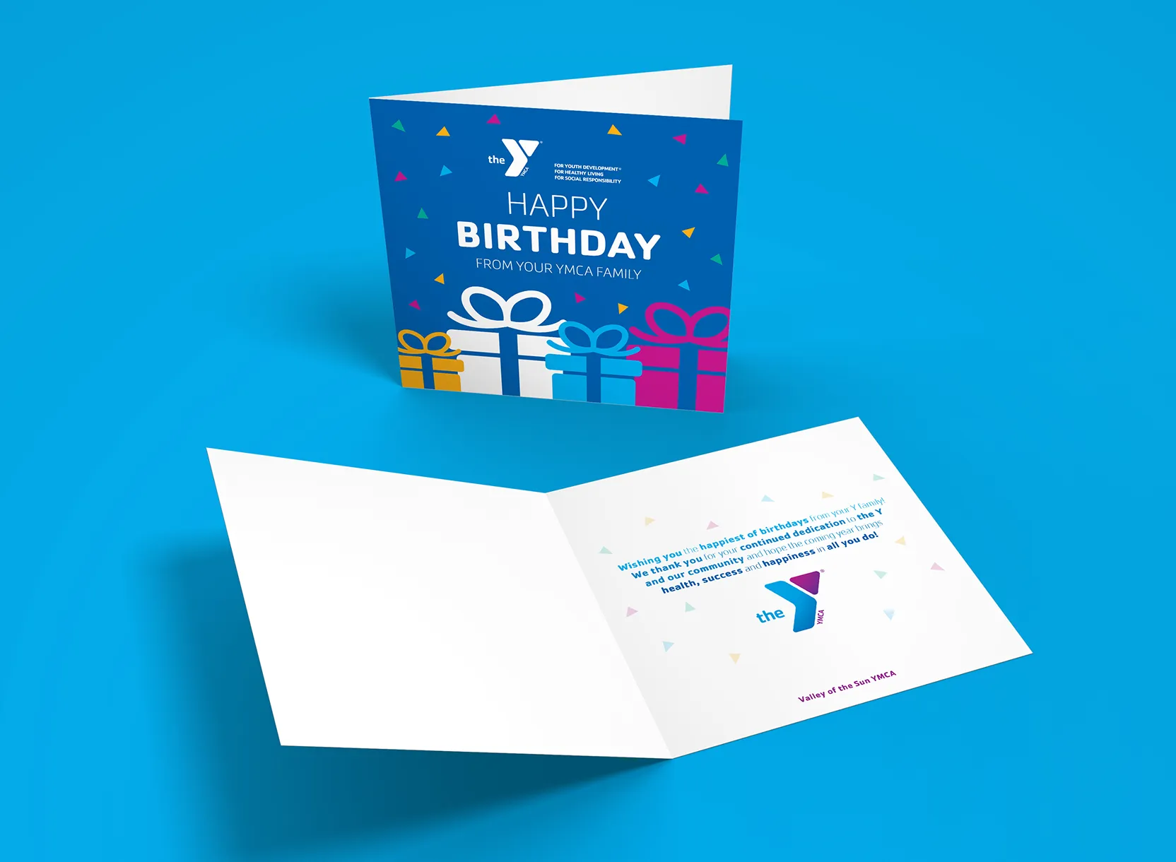
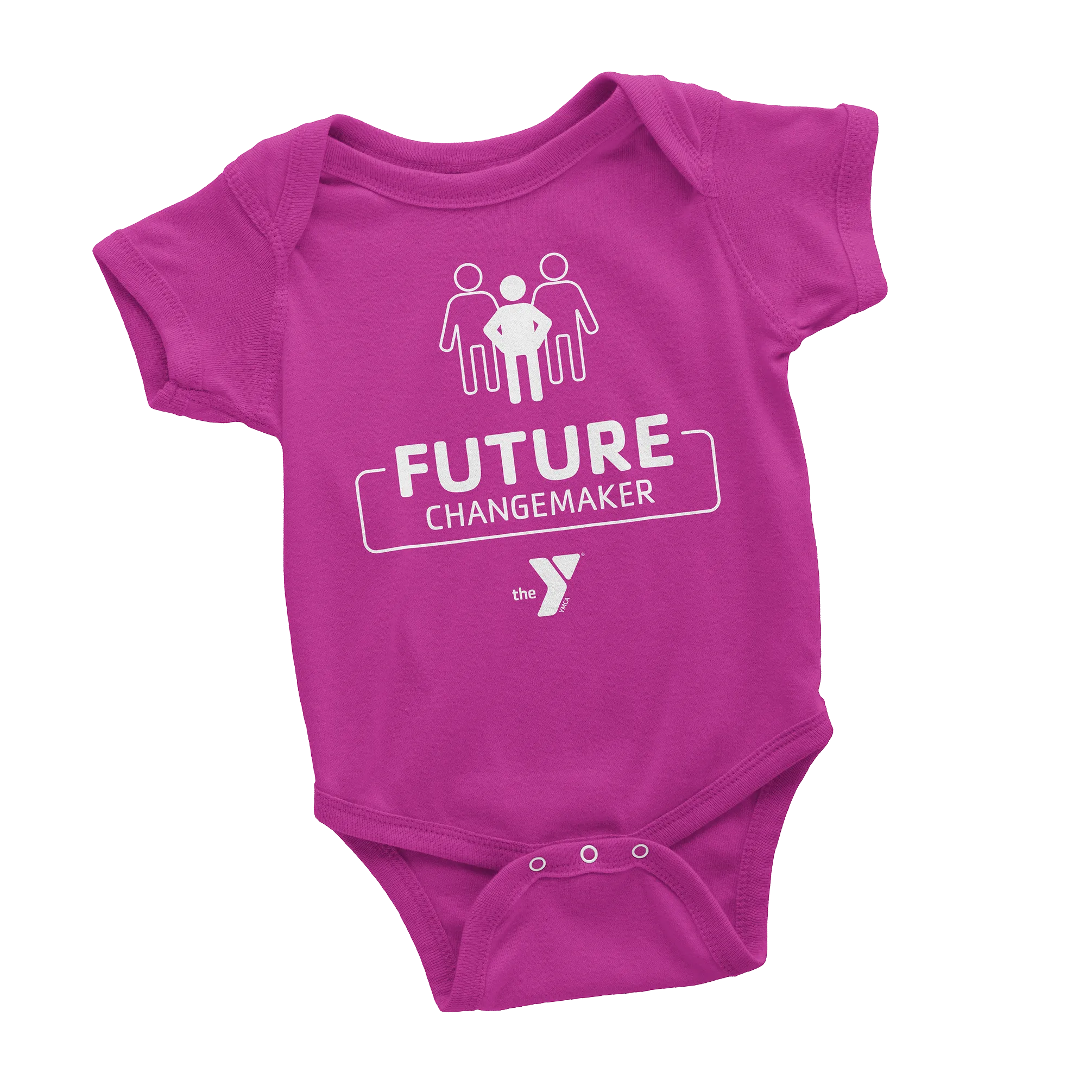
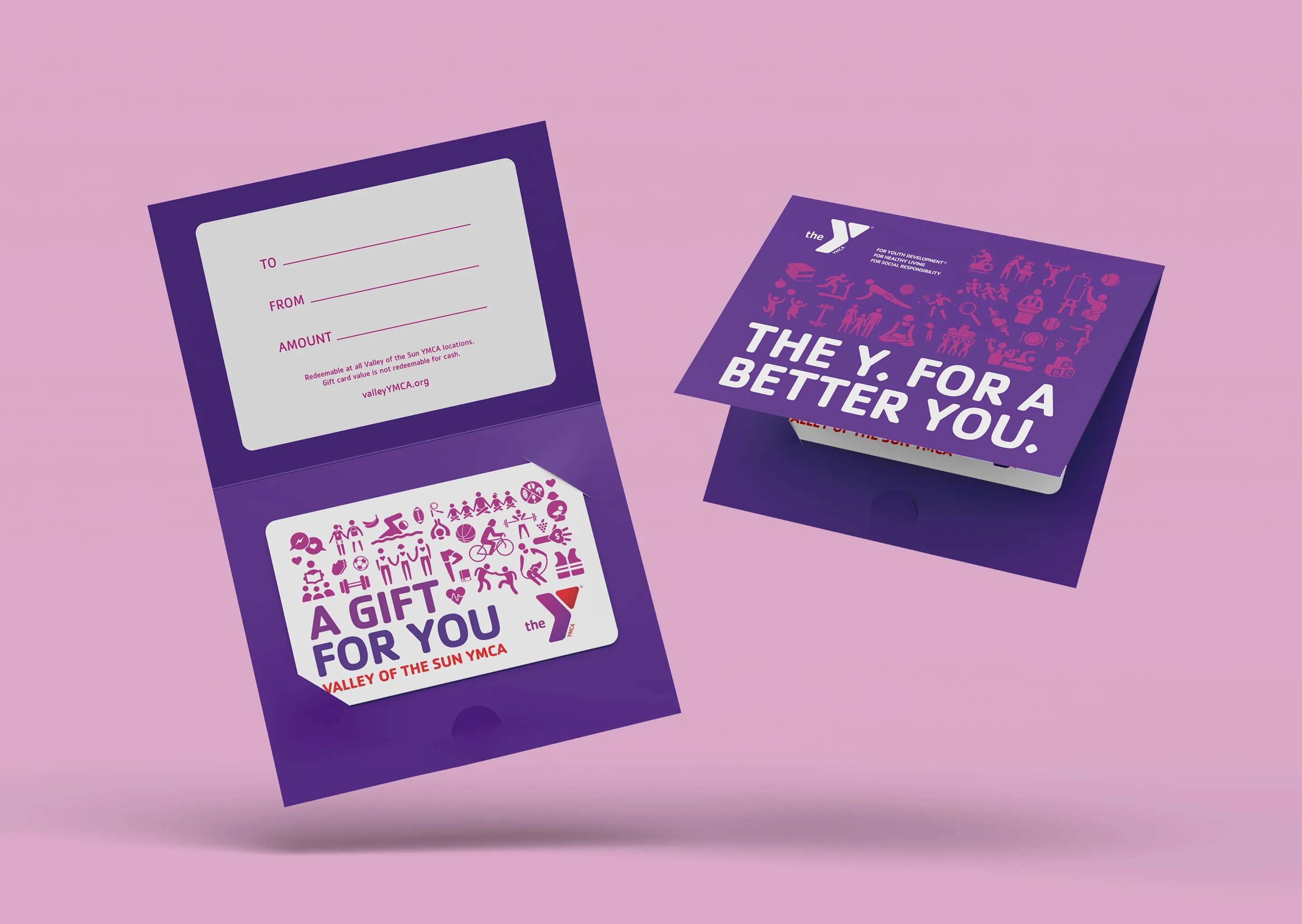
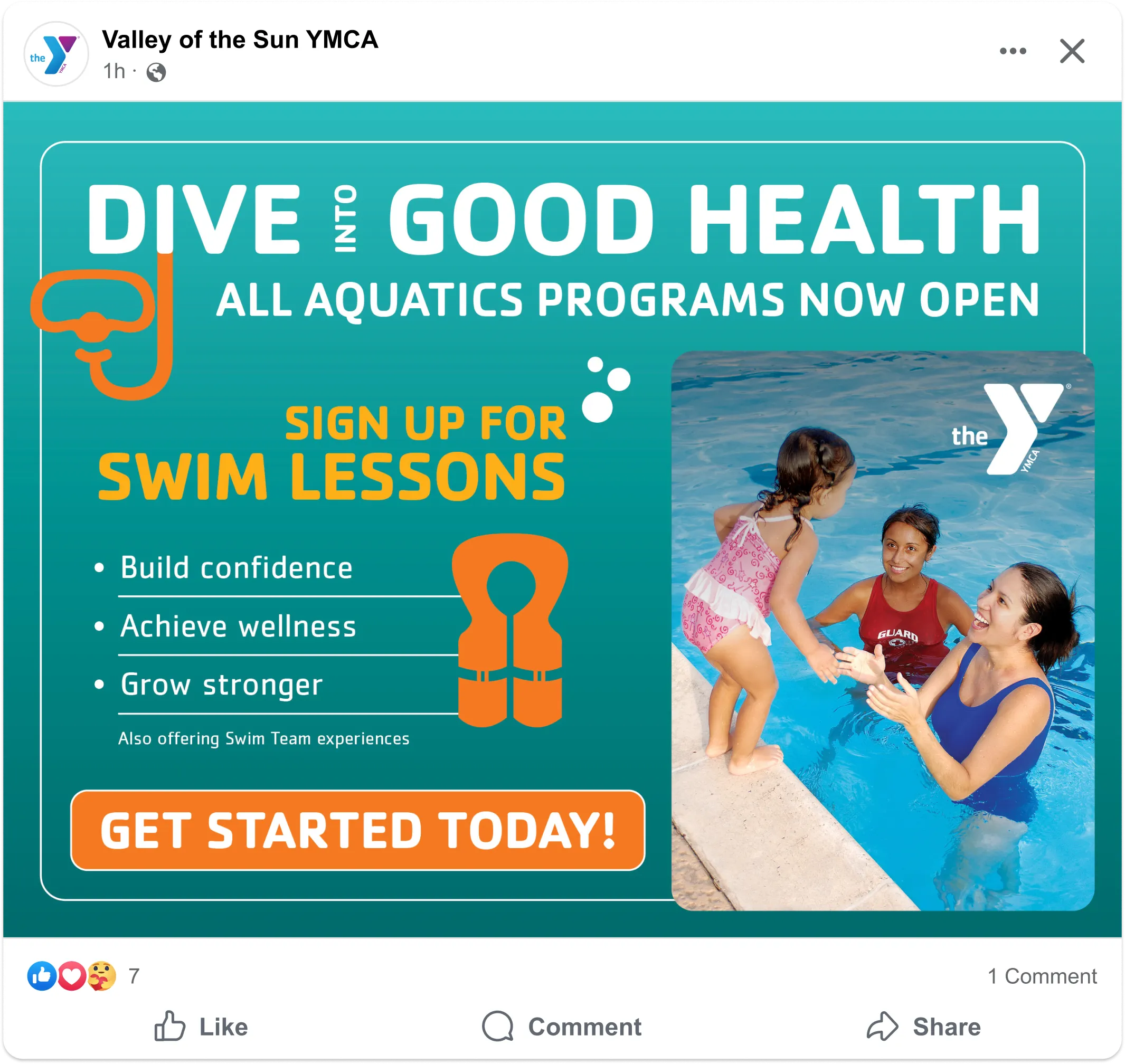
With a focus on clean layouts, bright colors, and bold typography, I created lasting work for programs and initiatives that lacked key branding. I prioritized photography that showcases positivity and connectivity, capturing the essence of a nurturing and thriving community. My work expanded the organization’s design reach and ensured the Y showed up professionally and consistently for the people they serve.

.webp)
.webp)
.webp)

.webp)
.webp)
.webp)
.webp)
.webp)
.webp)
Tempe’s Spooky Sprint 5K
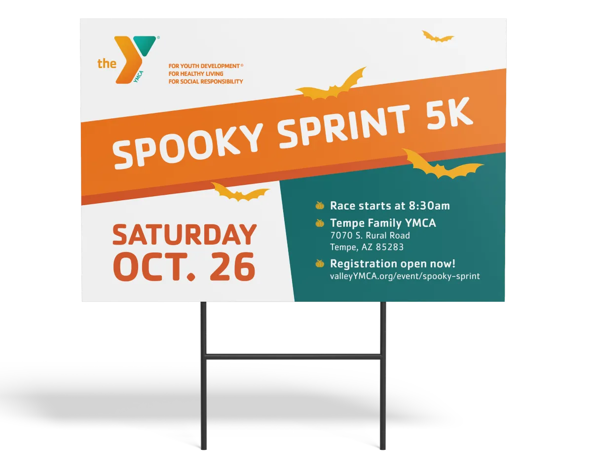
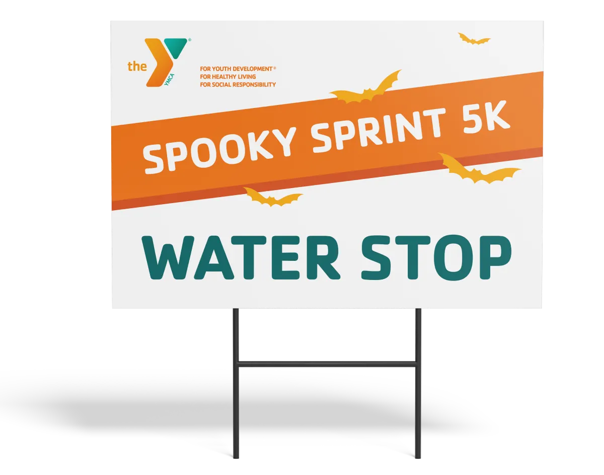
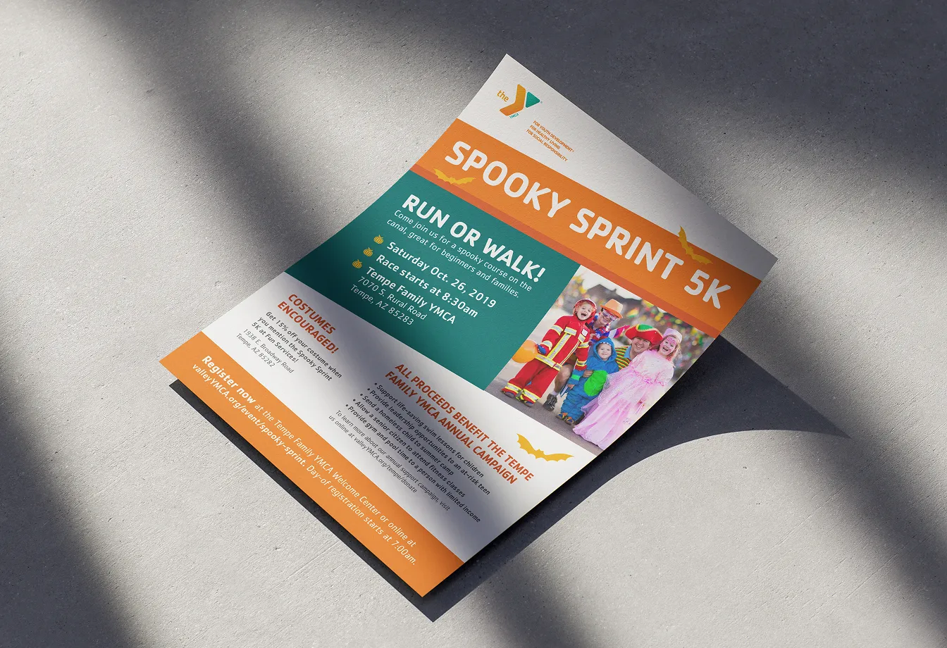
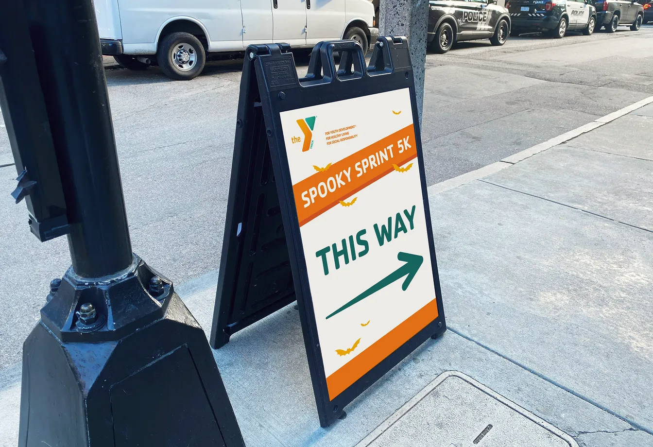
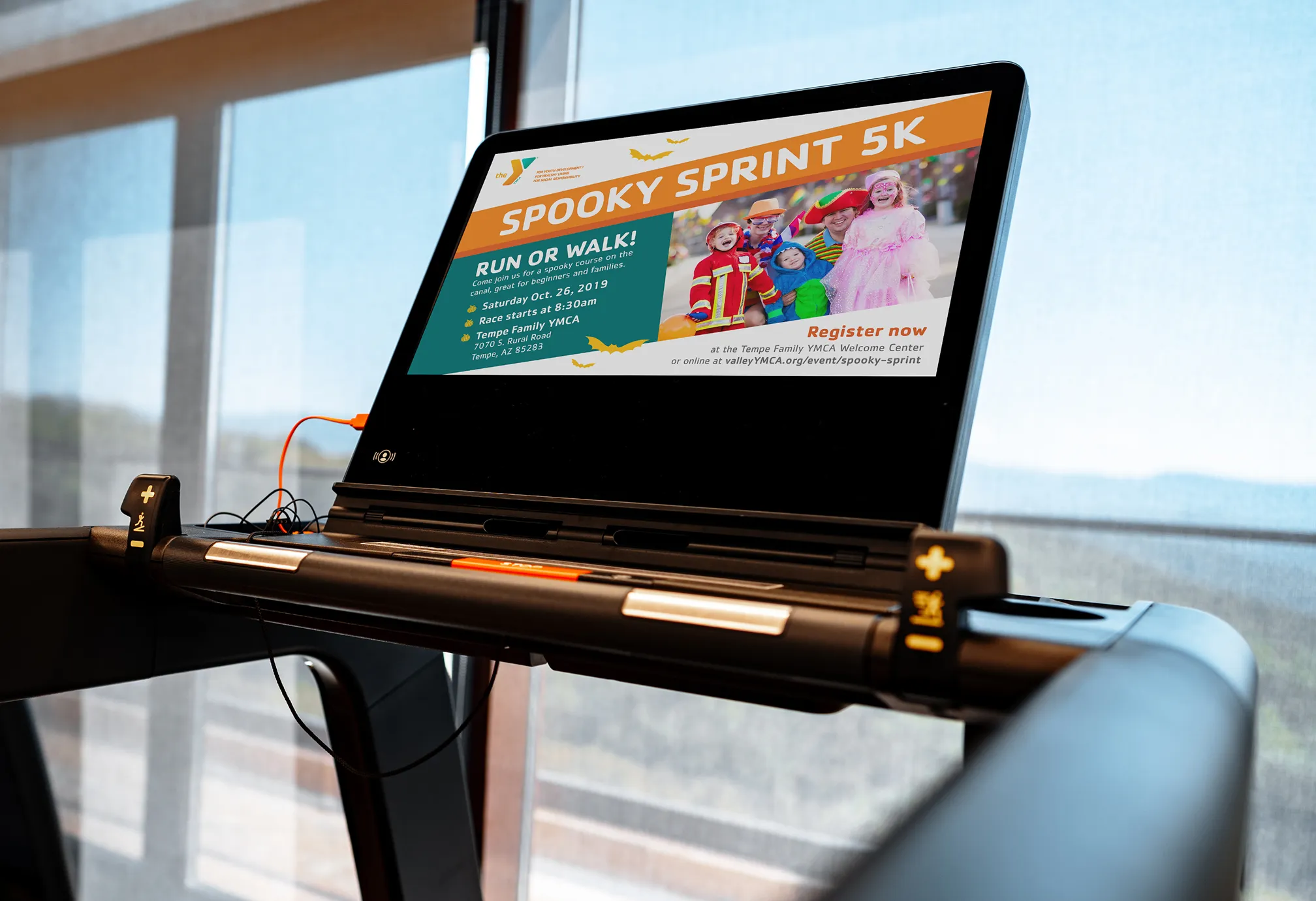
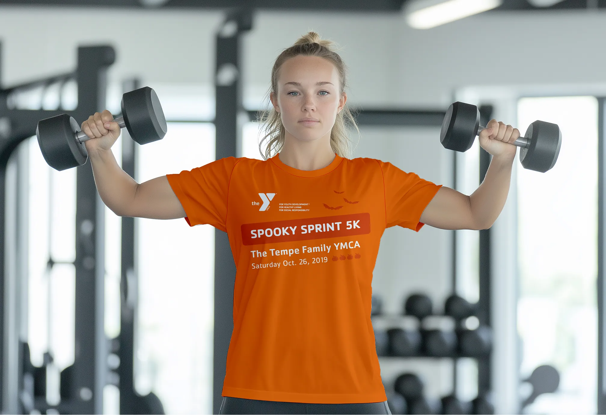
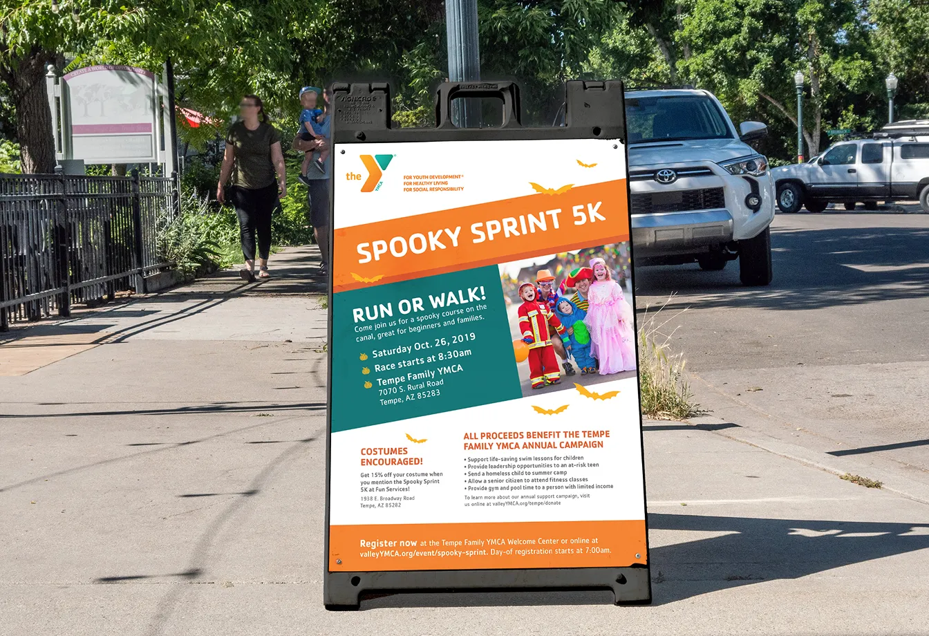
Bright orange and forest green create a friendly autumn vibe for the event, without the heavy or dark tones typical of Halloween. Simple bat silhouettes add playfulness for families, while the
clean layouts keep the core message scannable. This pairs with photography of costumed families, reinforcing an
"all-abilities” event.
The first 5K event attracted over 300 runners, bringing in significant fundraising revenue to support local families. By establishing a recognizable identity in year one, I created a scalable system that reduced future costs. What started at a standalone 5K has since grown into a larger fall festival, with this branding still setting the tone today.
The first 5K event attracted over 300 runners, bringing in significant fundraising revenue to support local families. By establishing a recognizable identity in year one, I created a scalable system that reduced future costs. What started at a standalone 5K has since grown into a larger fall festival, with this branding still setting the tone today.
Child abuse prevention
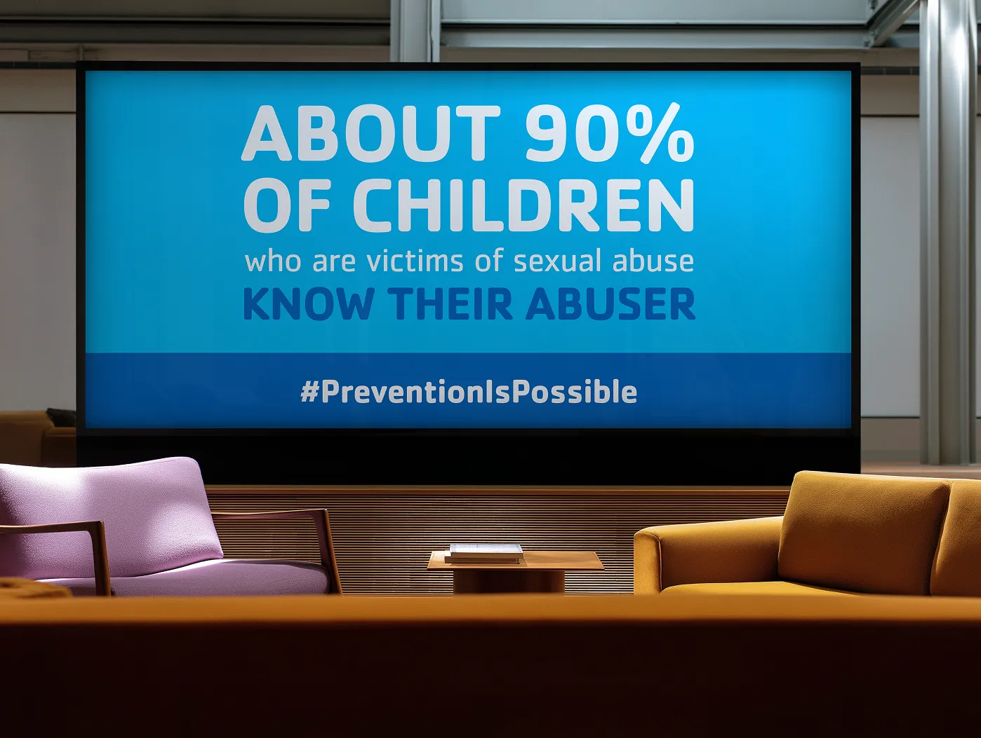
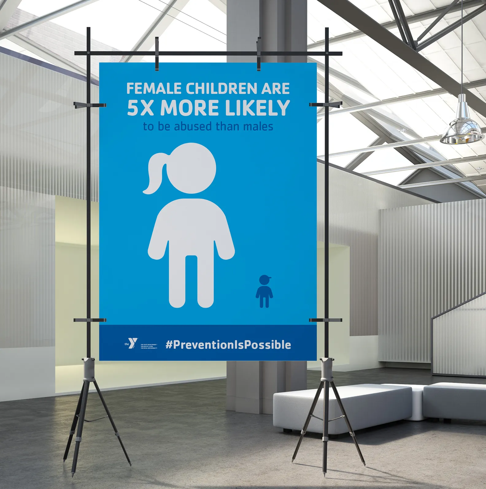
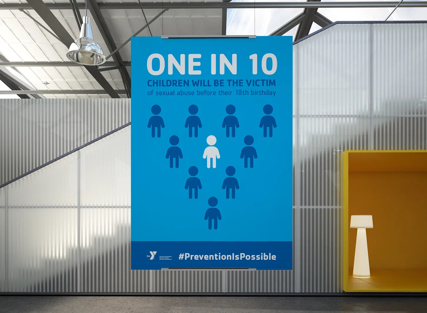
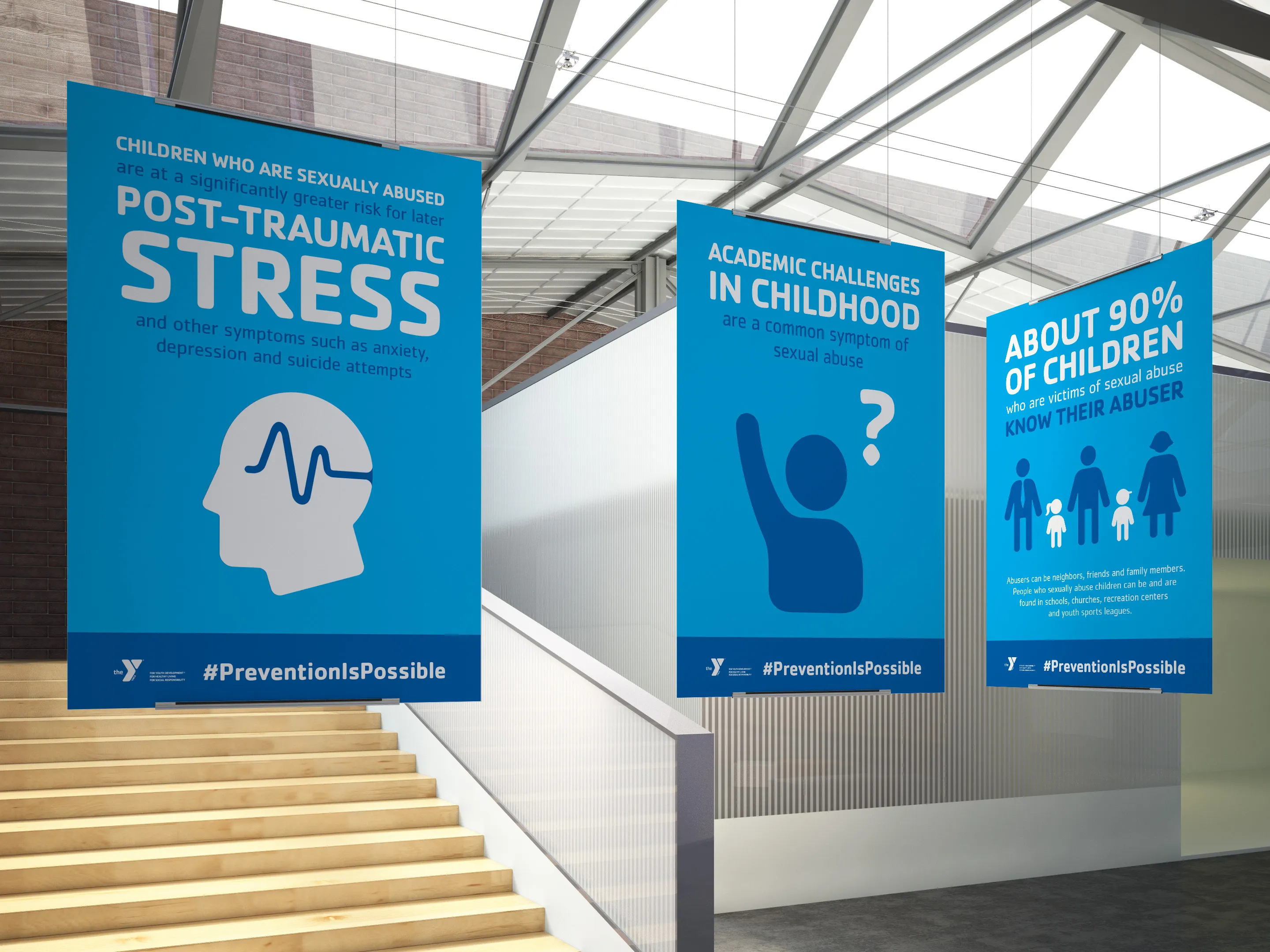
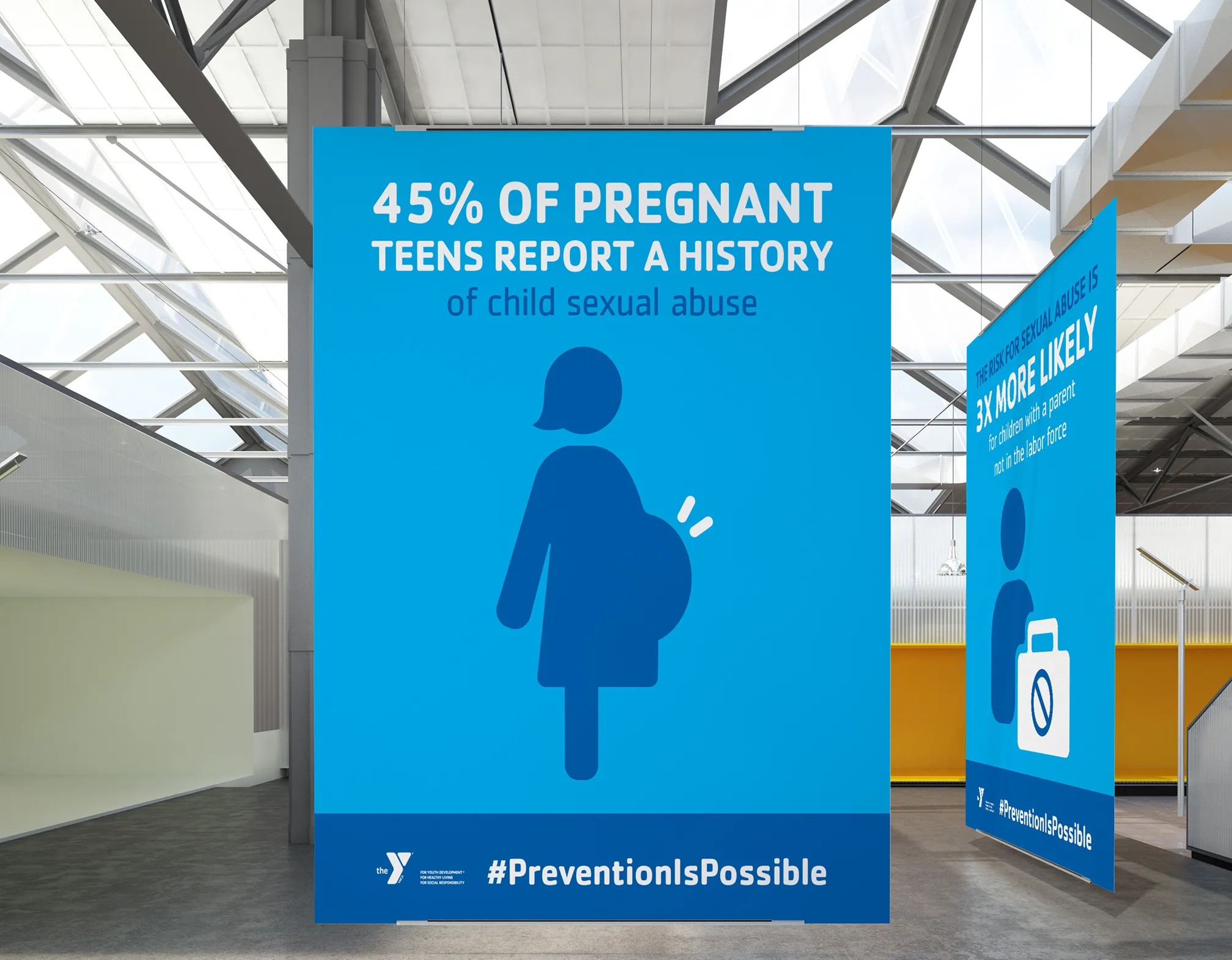
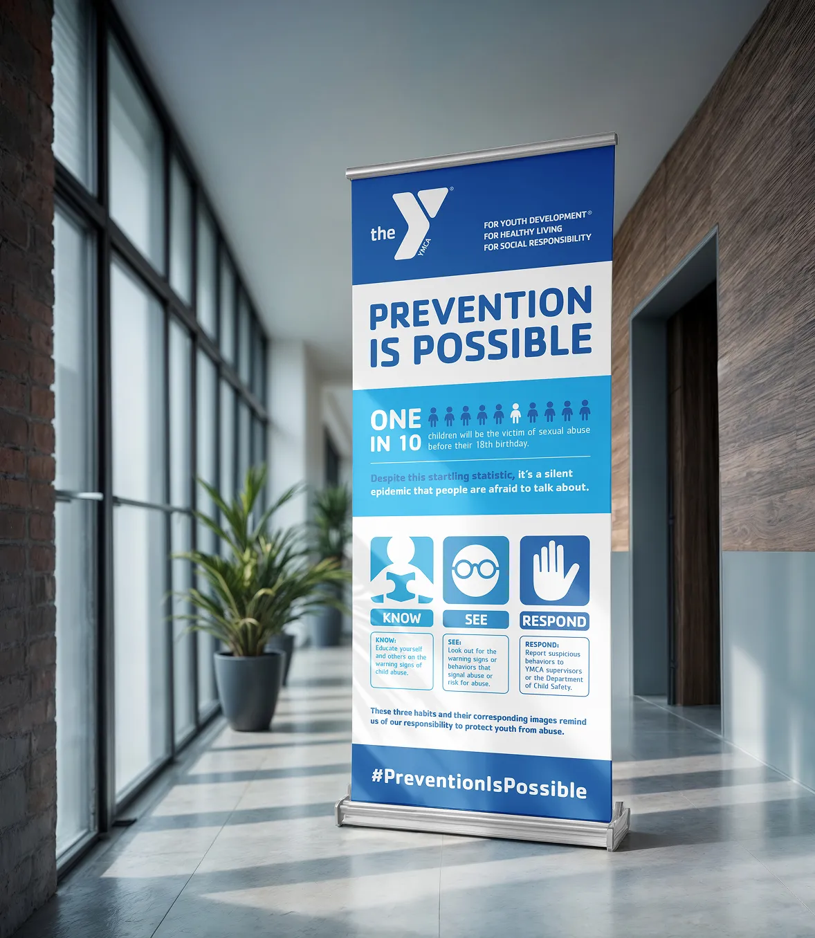
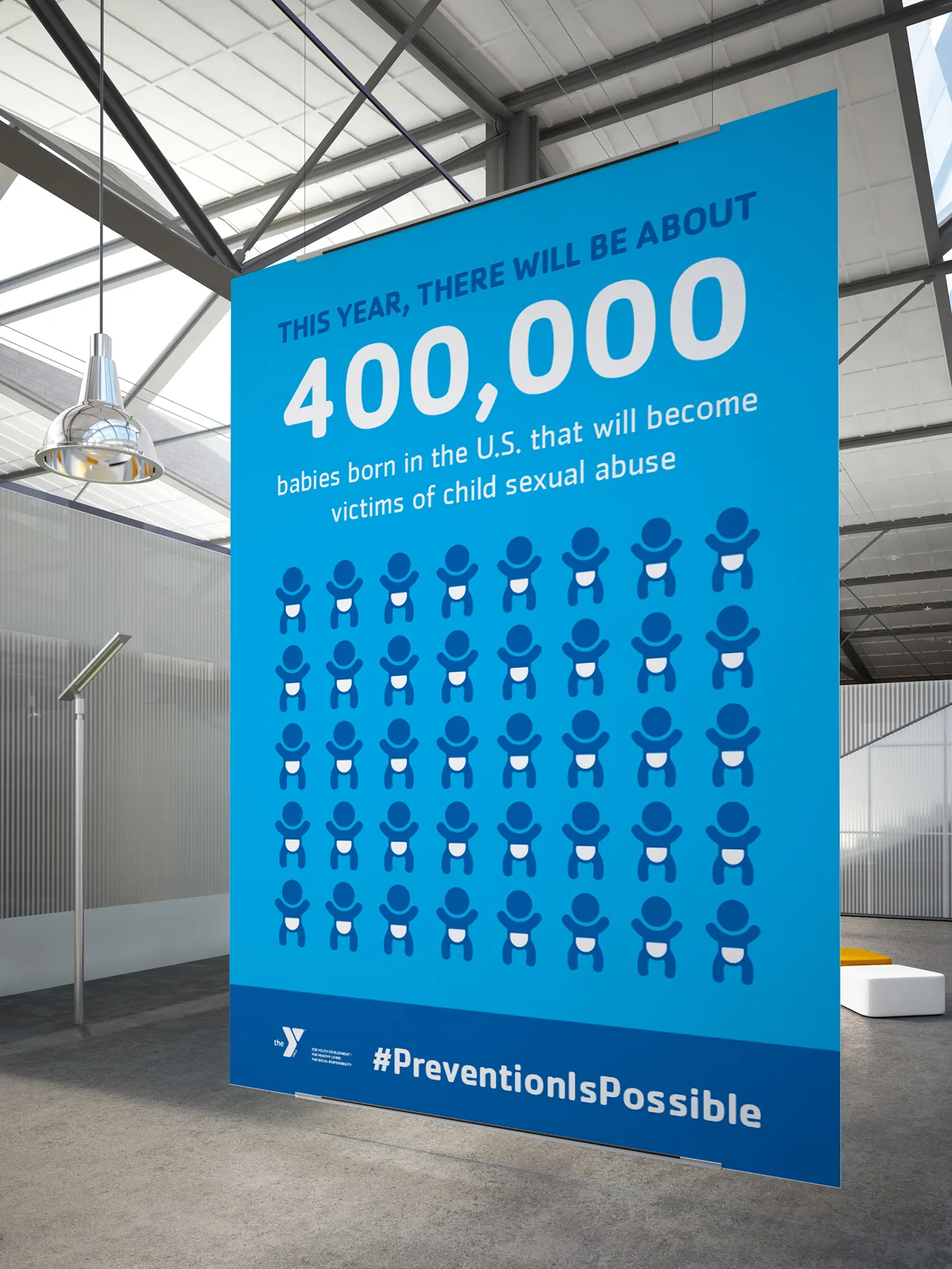
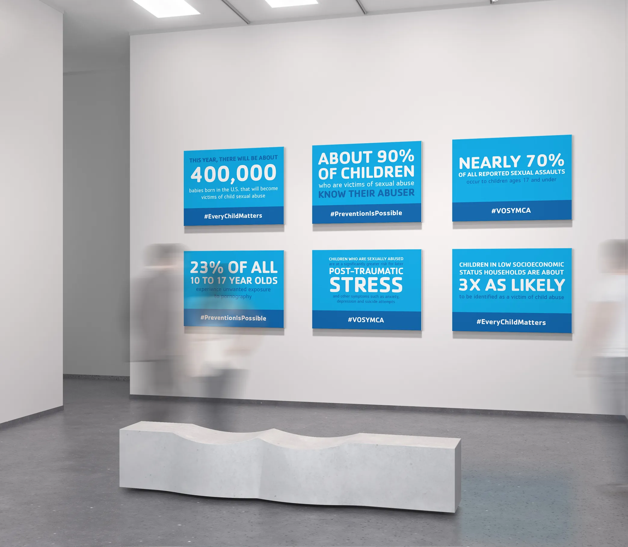
Discussing child abuse prevention can be uncomfortable, but it is necessary to empower the community to work together. To get adults to take action, the information must be reputable enough to trust but accessible enough to digest.
Infographics, statistic boards, and banners all played a role in the information design for this campaign. The blue color palette fosters authority and credibility, while illustration is used as a storytelling device. I visualized why the work the Y is doing matters, and the materials reinforced the Y’s commitment to safety by building trust around a sensitive topic. These long-lasting educational resources were designed to be reused for annual training and awareness efforts.
Infographics, statistic boards, and banners all played a role in the information design for this campaign. The blue color palette fosters authority and credibility, while illustration is used as a storytelling device. I visualized why the work the Y is doing matters, and the materials reinforced the Y’s commitment to safety by building trust around a sensitive topic. These long-lasting educational resources were designed to be reused for annual training and awareness efforts.
Impact
Scaling mission-driven marketing
I designed marketing materials reaching over 100,000+ Arizona families across 16 locations—improving community engagement statewide.
70+ modular marketing design templates
I launched a robust template library, helping staff save time and stay on-brand while reducing program launch timelines by 1–2 weeks.
+$683K in program service revenue
Strategic marketing design enabled YOY revenue growth for health, youth, and social programs—driving mission support and enrollment.
High-volume program and event support
I managed an organization-wide creative queue and produced marketing assets for 45+ events and 250+ programs with professional materials.
$1.1M (+16%) YOY increase in contributions
Membership campaigns backed the contribution rise by bringing in new sign-ups and increasing the lifetime value of the member community.
Enhancing perceived brand value
I modernized brand visuals to reflect the Y’s heart and community, boosting public trust and employee pride.
Credits
VP of Operations
Katie Smetana
Katie Smetana
Sr. Director of Marketing
Ryan Knak
Ryan Knak
Exec. Director of Mktg. & Comms
Shelby Tuttle
Shelby Tuttle
Marketing Manager
Alex Schmitt
Alex Schmitt
Photography courtesy of
Valley of the Sun YMCA & Y-USA
Valley of the Sun YMCA & Y-USA
Marketing Manager
Alex Schmitt
Alex Schmitt
Photography courtesy of
Valley of the Sun YMCA
& Y-USA
& Y-USA
VP of Operations
Katie Smetana
Katie Smetana
Sr. Director of Marketing
Ryan Knak
Ryan Knak
Exec. Director of Mktg.
& Comms
Shelby Tuttle
& Comms
Shelby Tuttle
Wait, there’s more...

Northern Arizona University
Higher Education
Fostering a 3.67% one-year retention lift by supporting student successt
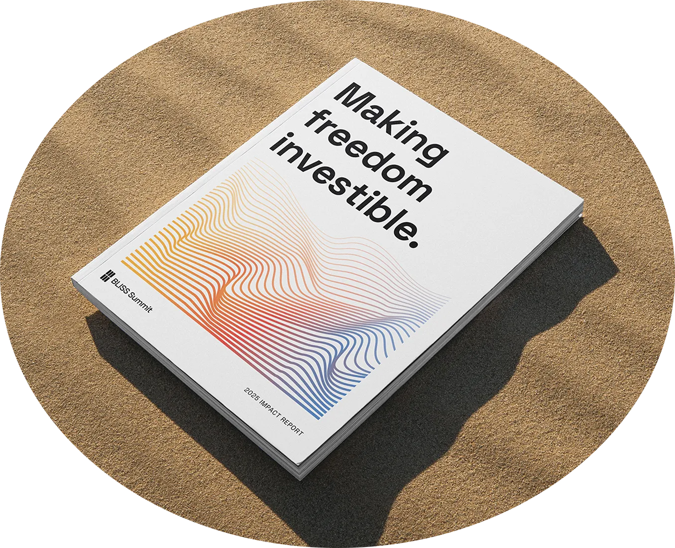
BLISS Summit
Civic Action Forum
Building investor confidence and brand authority through
annual report art directiont
.webp)
Lemon & Leaf
Beverage Retail (CPG)
How a designer’s love for lemonade curbed shopping
cart abandonment t
Let’s make something remarkable