Lemon & Leaf
How a designer’s love for lemonade curbed shopping cart abandonment
How a designer’s love for lemonade curbed shopping cart abandonment
TYPE
Beverage Retail (CPG)
PERSONALITY
Energetic, Playful, Stylized
SERVICES
Creative Direction
Content Strategy
Logo & Identity
Brand Guidelines
Web & UX/UI Design Packaging Design Illustration
Social Design
Content Strategy
Logo & Identity
Brand Guidelines
Web & UX/UI Design Packaging Design Illustration
Social Design
ROLE
Art Director and Lead Designer
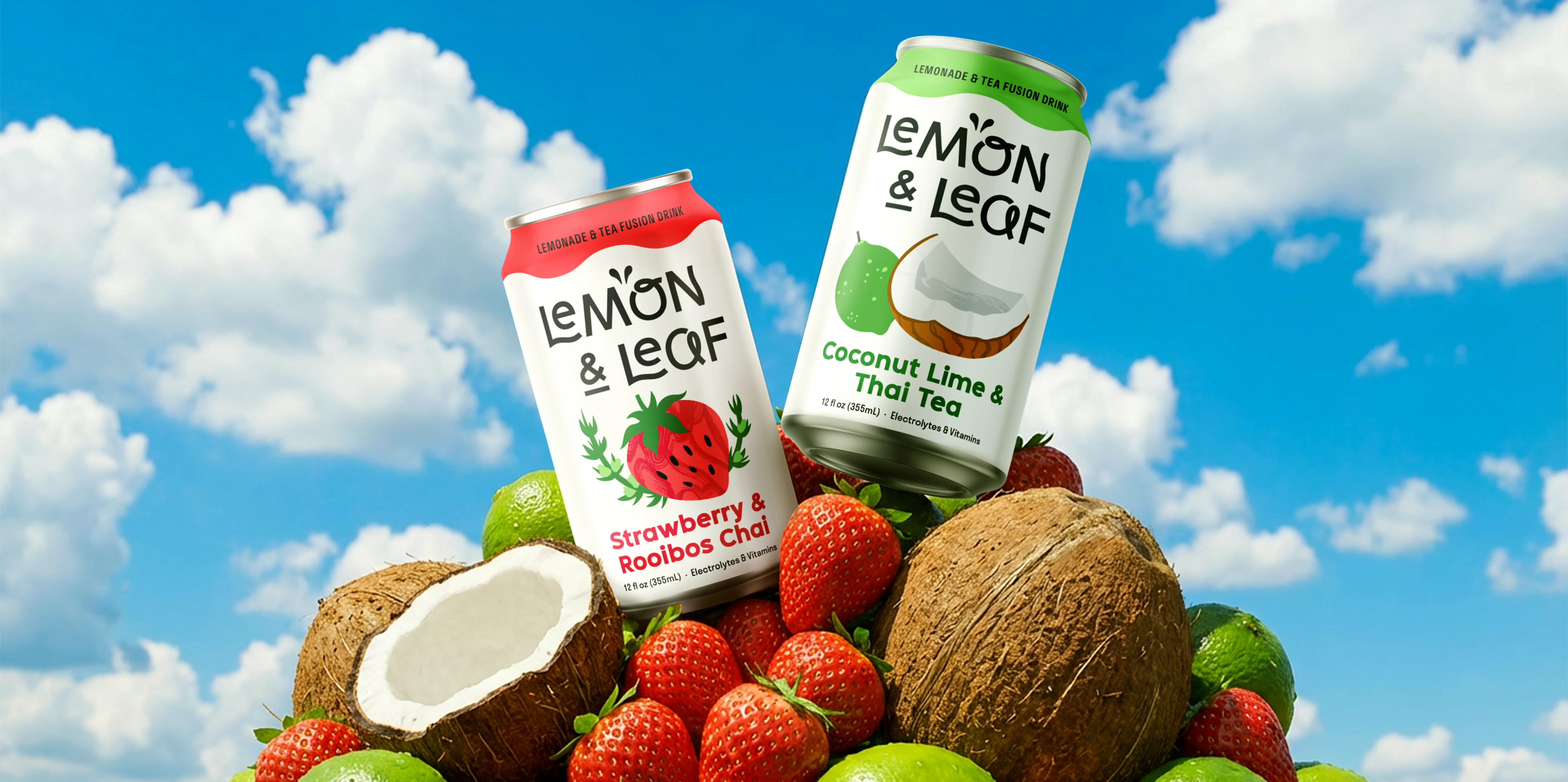
Lemon & Leaf is a conceptual beverage brand specializing in lemonade and tea fusions. They’re inspired by global ingredients, communal experiences, and social responsibility. They’ve crafted a product and market reputation defined by positivity, playfulness, and curiosity.
Lemon & Leaf was designed to fill an underserved market niche, and to solve for UX/UI shortcomings seen in competing direct-to-consumer beverage websites.
Lemon & Leaf was designed to fill an underserved market niche, and to solve for UX/UI shortcomings seen in competing direct-to-consumer beverage websites.
%20(1).webp)
.webp)
%20(1).webp)
.avif)
Strategy
Introduction
Hi, I’m the designer who loves lemonade 👋 It’s a classic American refreshment—bright, tart, sugary, nostalgic. While I love the classics, sometimes I wish there were more varieties available, but you almost always see the same flavor choices in stores and on shelves.
That lack of variety sparked the idea for a new drink company. I was inspired by one of my favorite restaurants in Phoenix that has a hatch chili yuzu lemonade. It’s savory, vegetal, and warming—I’ve never found another lemonade like this one, and I wanted to build a brand that puts unique drinks like this into the hands of everyday consumers.
That lack of variety sparked the idea for a new drink company. I was inspired by one of my favorite restaurants in Phoenix that has a hatch chili yuzu lemonade. It’s savory, vegetal, and warming—I’ve never found another lemonade like this one, and I wanted to build a brand that puts unique drinks like this into the hands of everyday consumers.
%20(1).webp)
Project objectives
Build a beverage brand for an underserved niche
I also love mixing lemonade with iced tea. At the time of project launch, the ready-to-drink (RTD) landscape lacked a major player dedicated solely to the tea-lemonade blend. The companies that do offer a tea-lemonade blend always have the same flavor profiles with no greater wow factor. So, I set out to build a conceptual beverage brand specializing in lemonade and tea fusions inspired by flavors from around the world.
Solve UX and UI shortcomings of identified competitors
Competitor analysis revealed that many direct-to-consumer beverage websites suffer from unclear product-finding paths, as well as checkout environments that are complex or have no visual brand identity—all factors likely contributing to shopping cart abandonment. To resolve this and set my brand up for success, I focused on lowering the perceived effort of the checkout by minimizing steps, building trust, increasing user engagement, and maintaining a branded environment.

Customer Profile
Age
18–24 and 25–44
Gender
Any
Education
HS Diploma/GED
Income
>$45,000
Location
United States
Goals
- Seeking new flavors and culinary experiences
- Seeking inventive, high quality drinks to share with friends and family
Motivations
- Having influence in online and/or in-person “foodie” groups
- Belonging to a brand “fan club” or subscription
- Personalized retail experiences
Concerns
- Intimidated by complex mixology at home
- Finding reliable product and food reviews
- Confusing online checkout processes
- In-store availability
Interests
- Community and meeting new people
- Recycling and sustainability
- Social media
- Travel and exploring different cities
Target audience
The new beverage brand would target socially active, cosmopolitan “foodie” consumers who seek new flavors to share with others. They’re bored by one-note sugary sodas, but intimidated by complex mixology at home. They want a fun beverage that’s convenient, but doesn’t sacrifice flavor depth.
Competitor analysis
The market lacks a specialist for the tea-lemonade blend, leaving the category divided between broader competitors. After analyzing product lines and market segments, I identified AriZona Beverages as the direct competitor, accompanied by indirect competitors Calypso (only lemonade) and Pure Leaf (only tea).
Analysis revealed a gap in the market: Pure Leaf lacks flavor excitement, AriZona lacks premium ingredient perception, and Calypso is viewed as a high-sugar treat. This allows Lemon & Leaf to enter as a sophisticated, fun daily drink with added health benefits like vitamin and electrolyte content.
UX/UI analysis
After reviewing competitor brand design, site functionality, and checkout flow, it became clear that the Lemon & Leaf visual identity and website needed to bridge the gap between aesthetics and utility—combining a clean visual hierarchy with a frictionless, native checkout flow that the current market lacks.
Visual brand design
AriZona
Calypso
Pure Leaf
Uncluttered design with white space
Organized, easily navigable content
Fonts and graphics used consistently
Complimentary color combinations
Clear product-finding paths
Few calls to action, styled similarly
Range of product types on home
Bespoke product imagery on home
Site functionality
AriZona
Calypso
Pure Leaf
Clear navigation, menus, and footers
Site search feature
Locate products in-store
Product reviews available
Support and contact information
Social responsibility info available
Social media links
Unique selling point on home
Checkout flow
AriZona
Calypso
Pure Leaf
Native checkout on site
Limiting checkout distractions
Visual identity present in checkout
Progress indicators
Form fields labeled
Clear rules for data entry formats
Completed steps collapse or hide
Non-critical fields deprioritized
.webp)
.webp)
%20(1).webp)
%20(1).webp)
.webp)
%20(1).webp)
.webp)
%20(1).webp)
%20(1).webp)
%20(1).webp)
%20(1).webp)
%20(1).webp)
%20(1).webp)
%20(1).webp)
%20(1).webp)
%20(1).webp)
%20(1).webp)
.webp)
Competitor web designs
Information architecture
I established the site structure early, mapping out entry points across the header and footer navigation. Form follows content: by finalizing the structure before starting the visual design, I ensure that the site design serves communication goals and user needs.
.webp)
%20(1).webp)
User task flow
For this project, I focused on a straightforward task flow where the user enters the website from the home page, adds a product to the cart, and checks out.
%20(1).avif)
.webp)
Creative
.webp)
.webp)
.webp)
.webp)
.webp)
.webp)
Web exploration
After mapping out the content and flow of website pages, I jumped into sketches to explore how to best communicate the information and organize the checkout form fields.
Home wireframe
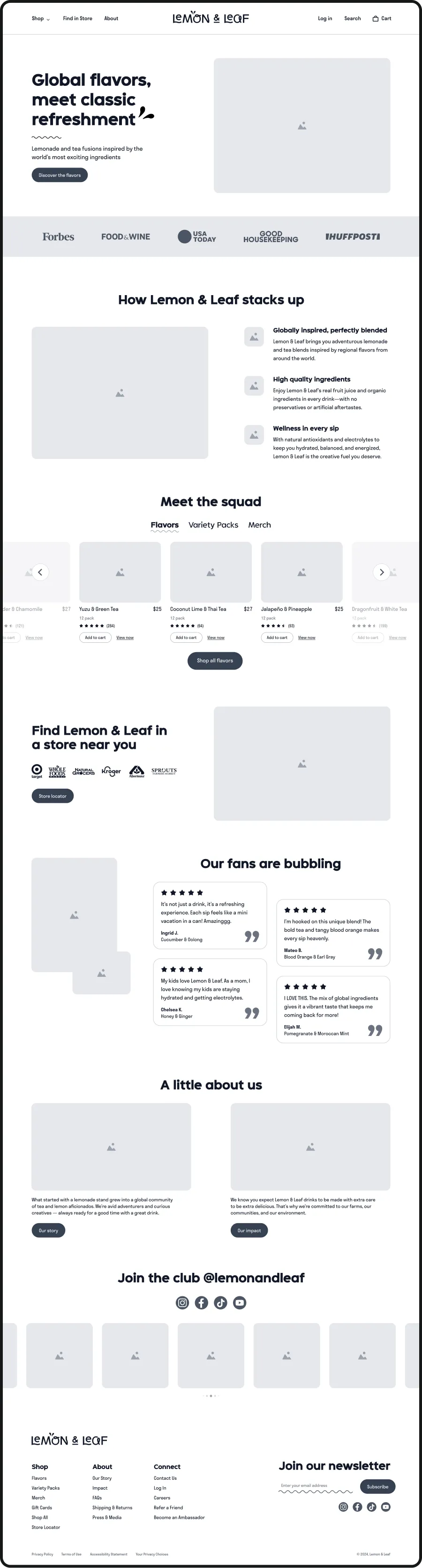
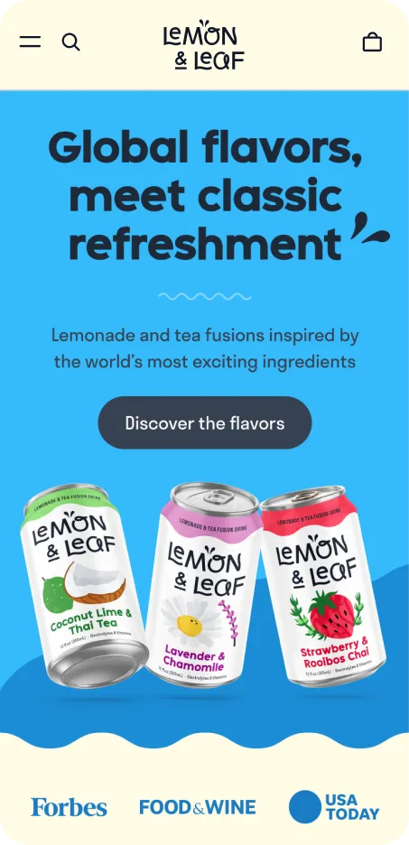
I focused on clarifying product-finding paths, ensuring users can navigate intuitively via search, store locators, or curated collections depending on their intent. This includes a tabbed product carousel that shortens the path to purchase—users can preview key product data and add items to their cart directly from the home page.
The home page also highlights important brand pillars including social responsibility, origin stories, and community engagement to align with the values of the target audience.
The home page also highlights important brand pillars including social responsibility, origin stories, and community engagement to align with the values of the target audience.

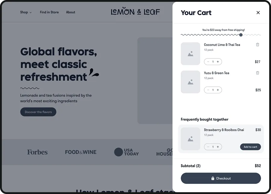
Cart overlay wireframe
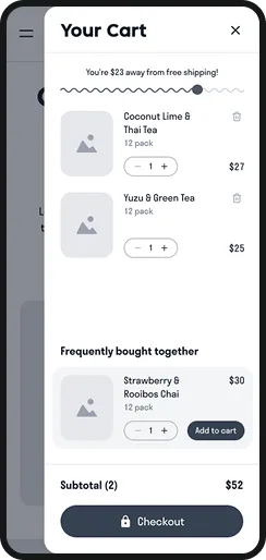
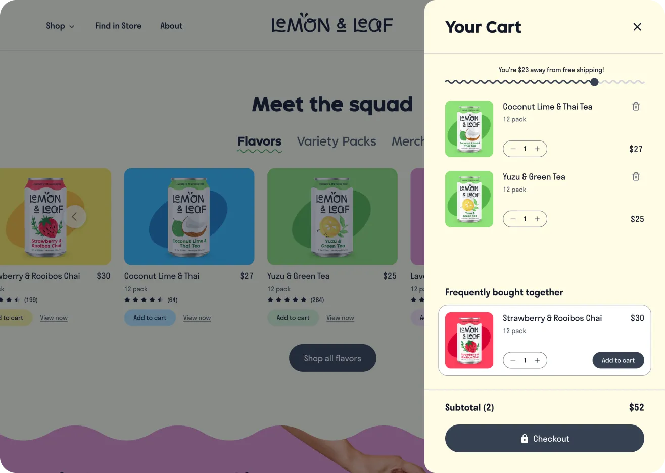
The cart preview drawer opens when a user adds a product to their cart or clicks the cart icon in the nav menu. This provides immediate feedback and allows users to review their selection(s) without navigating away from the shopping experience.
I also integrated cross-sell opportunities and a free shipping incentive to encourage additional sales early on—ensuring the final checkout flow remains streamlined and distraction-free.
I also integrated cross-sell opportunities and a free shipping incentive to encourage additional sales early on—ensuring the final checkout flow remains streamlined and distraction-free.
Checkout wireframe
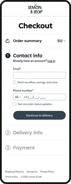
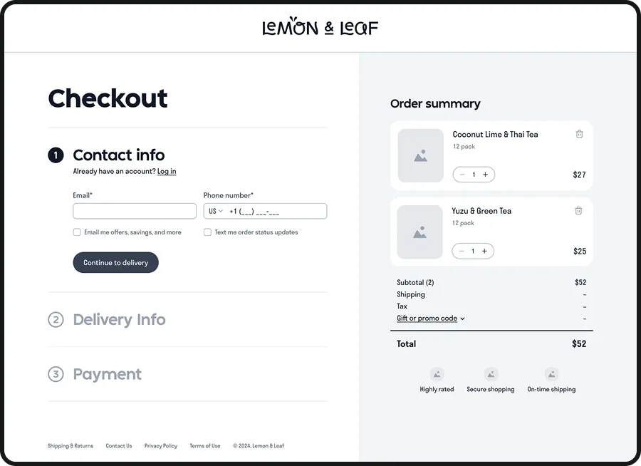
To minimize cart abandonment, I designed a checkout flow that prioritizes brand immersion and reduces cognitive load. Instead of relying on Shopify checkout templates like our competitors, I extended the site's visual system (including typography, grids, and iconography) to the payment phase to maintain user confidence.
To lower perceived effort, I removed unnecessary navigation links and adopted a three-step accordion layout—showing progress indicators, progressively disclosing information, and preventing form fatigue. Features like default guest checkout, input masks, and deprioritized promo code fields further minimize friction, while trust indicators provide the final reassurance needed to convert.
To lower perceived effort, I removed unnecessary navigation links and adopted a three-step accordion layout—showing progress indicators, progressively disclosing information, and preventing form fatigue. Features like default guest checkout, input masks, and deprioritized promo code fields further minimize friction, while trust indicators provide the final reassurance needed to convert.
Order confirmation wireframe
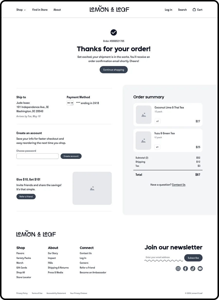
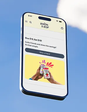
Beyond standard order verification, the goal for this page was to increase user engagement and post-purchase retention. To ensure the experience remained open-ended, I integrated several decision paths for continued interaction. This includes a 'Continue shopping' CTA, a streamlined account creation feature, and referral program access. Additionally, the full navigation links return here to encourage further exploration of the site.

.webp)
.webp)
.webp)
.webp)
.webp)
.webp)
.webp)
High fidelity web design
The website uses a consistent, curated visual language to build trust with a warm and positive vibe. A dopamine-inducing palette invokes playfulness, positioning the drink as a lifestyle accessory. Fluid wave motifs mimic the product to guide the user’s eye. Quirky display fonts and clean sans-serifs create a hierarchy that is easy to scan, but full of character. The result is a digital experience that feels as vibrant as the beverage itself.
%20(1).webp)
.webp)
%20(1).webp)
%20(1).webp)
%20(1).webp)
%20(1).webp)
%20(1).webp)
.webp)
%20(1).webp)
%20(1).webp)
%20(1).webp)
%20(1).webp)
%20(1).webp)
Logo design
The logo uses letterforms that are both geometric, but also wavy with loops and swoops. This plays with the contrasting concepts of the brand being fun yet sophisticated, or polished yet exploratory. The mixed case logo appears more friendly and provides a contemporary and refined look for balance. A subtle graphic mirrors a liquid splash or fruit seeds, providing a conceptual nod to the product.
%20(1).webp)
.webp)
%20(1).webp)
%20(1).webp)
.webp)
.webp)
.webp)
.webp)
.webp)
Packaging and illustration
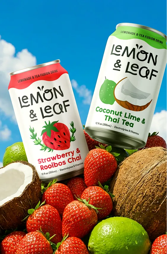
The can design is centered around illustrations with clean vectors and handmade textures to signal craft quality and natural ingredients. This again mirrors the playful yet sophisticated brand personality. The wave motifs communicate refreshment, while the white space and simple layout stands out from the noise of beverage aisles. The result is a friendly, bold, and easy to scan product design and packaging that promises a multi-sensory flavor journey.
.webp)
.webp)


%20(1).webp)


%20(1).webp)
%20(1).webp)
.webp)
.webp)
.webp)
%20(1).webp)
.webp)
%20(1).webp)
%20(1).webp)
%20(1).webp)
%20(1).webp)
%20(1).webp)
Style guide
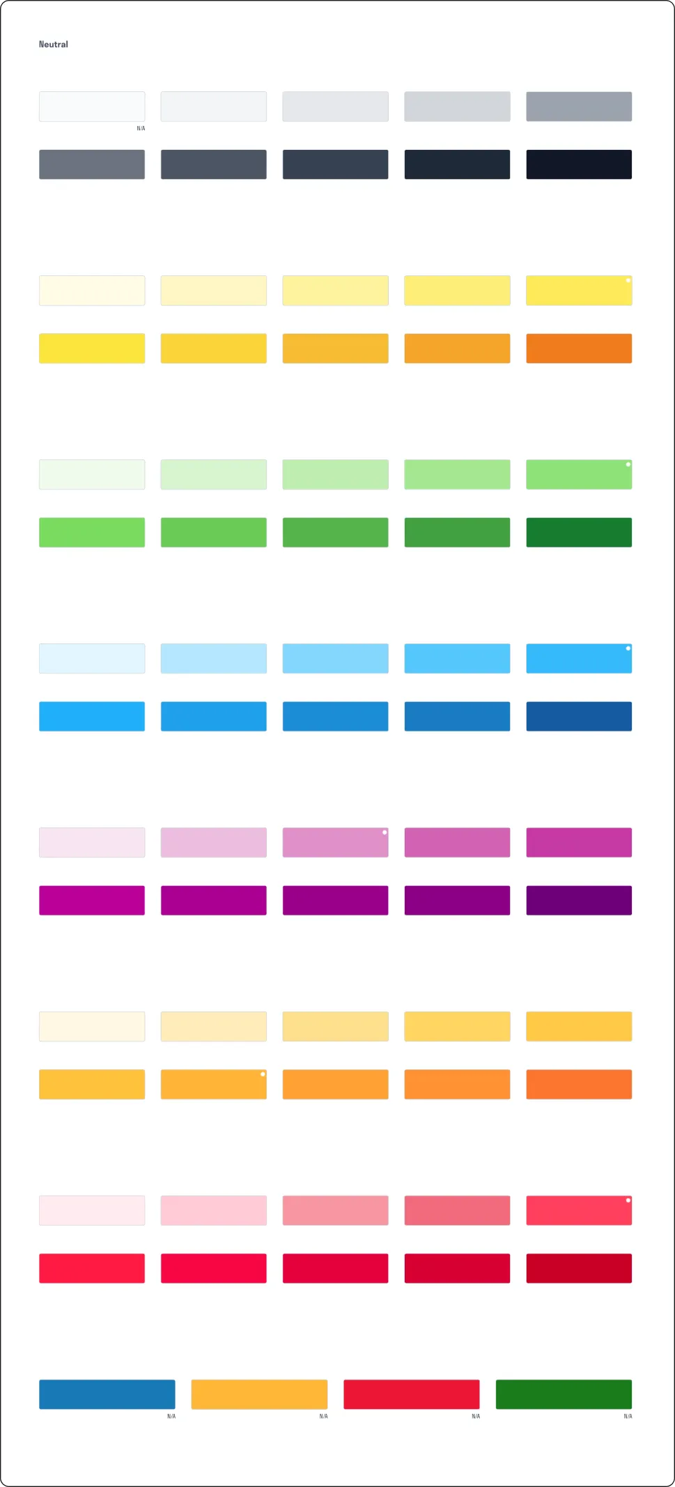
I created a scalable design system—defining brand and semantic colors, responsive typography, and interactive components that comply with WCAG standards. This library ensured visual consistency and streamlined UI iteration and development.
.webp)
.webp)
Color guide
.webp)
Headings guide for desktop
.webp)
Headings guide for mobile
%20(1).webp)
Paragraph guide
.webp)
4px scale spacing system
.webp)
Primary buttons with 50% corner radius
.webp)
.webp)
Desktop 1280px grid with 20px gutter and
mobile 375px grid with 20px gutter
mobile 375px grid with 20px gutter
Impact
A new UX benchmark
I designed a competitive UX that is above the RTD market baseline—
removing friction and raising the bar for usability standards.
Capturing more sales
I replaced overwhelming checkouts with a branded, distraction-free flow that lowers user effort, builds trust, and prevents cart abandonment.
A strategic design edge
I built a user journey that is cleaner than AriZona, friendlier than Pure Leaf, and has a better branded checkout than Calypso.
Attracting fans, not just customers
By crafting a personable brand voice, I created an engaging
environment that fosters genuine community and loyalty.
Category disruption
This loud and proud B2C identity fills a distinct void in the RTD
beverage market and challenges established competitors.
Branding built for scale
I established a style guide and component library to ensure
visual consistency across all brand touchpoints.
Scope of work
1/2
Wait, there’s more...
.webp)
Paradox’s Client Board
HR User Conference
Creative direction for a 5-star talent collective and a microsite with a 37.7% WAU/MAU rate t
%20(1).webp)
Root + River
Brand Strategy Studio
Transforming educational marketing content for deeper client engagementt
.webp)
Valley of the Sun YMCA
Community & Wellness Nonprofit
A $683K program service revenue boost derived from mission-driven designt
Let’s make something remarkable