Root + River

Transforming educational marketing content for deeper client engagement
FOR
Root + River
TYPE
Brand Strategy Studio
PERSONALITY
Whimsical, Spirited, Illustrative
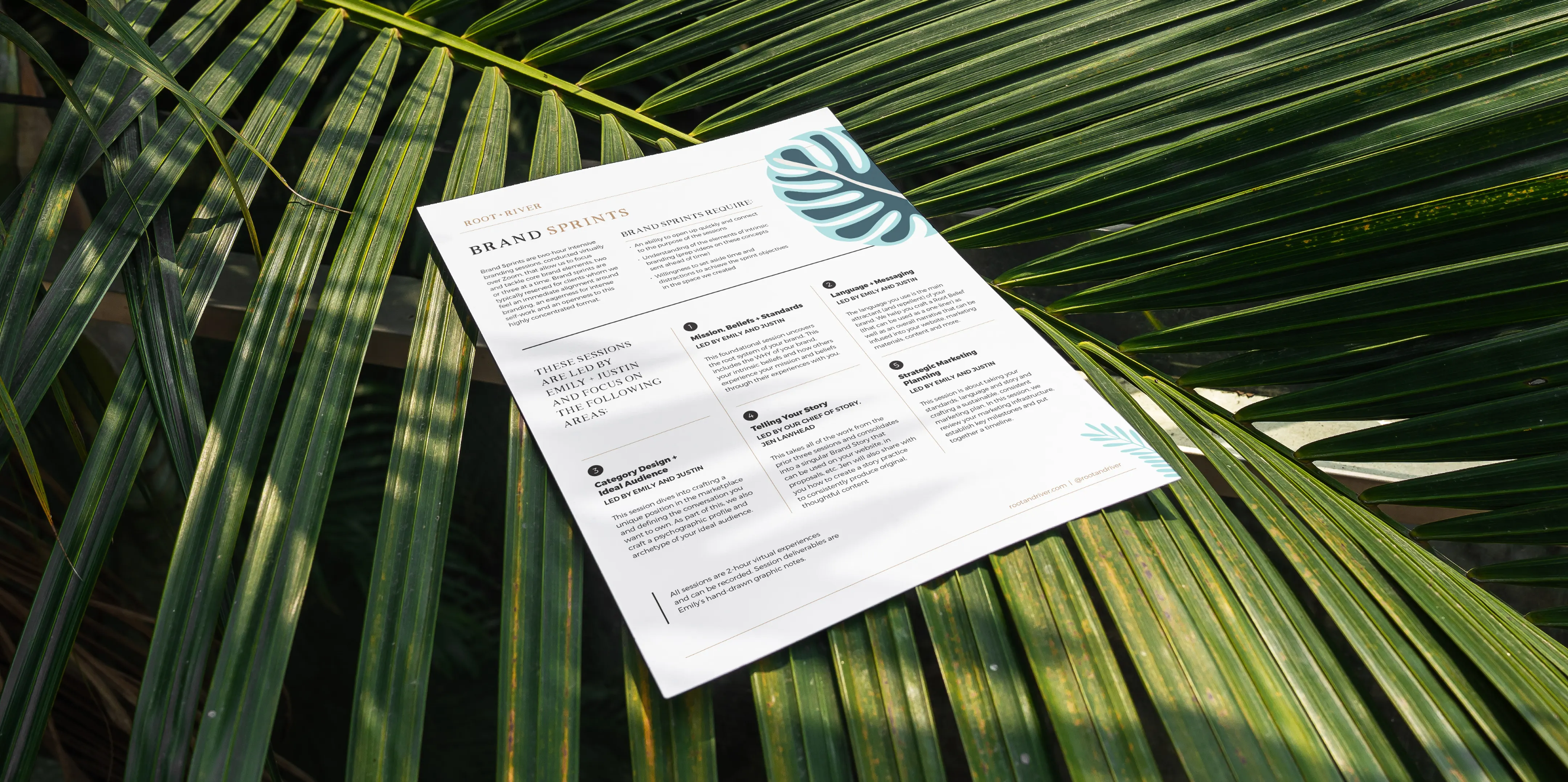
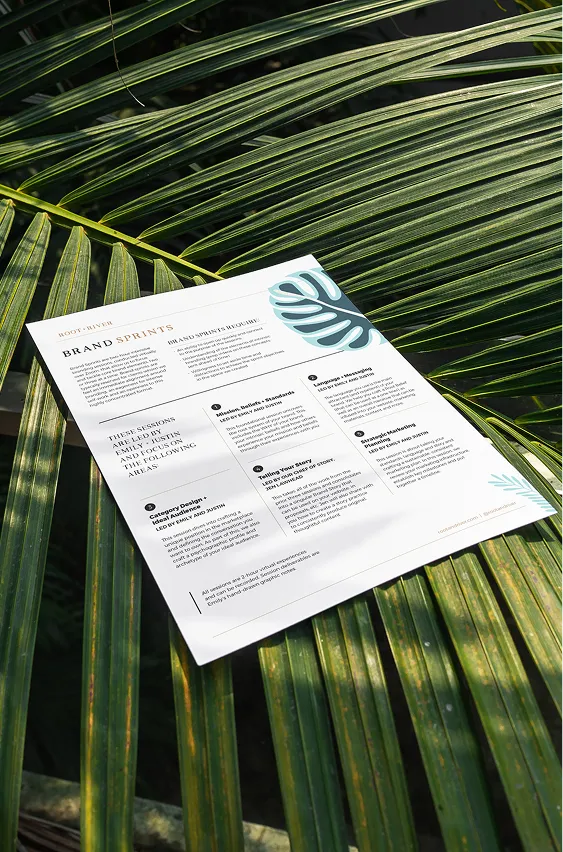
A printed Root + River document resting on palm fronds in dappled sunlight.A printed Root + River document resting on palm fronds in dappled sunlight.
SERVICES
Information Design
Sales Collateral
Logo & Identity
Campaign Assets
Presentation Design
Illustration
Social Design
Email Graphics

Root + River is a brand strategy studio specializing in intrinsic branding. They partner with mission-driven clients to develop brand strategy, spirit, and storytelling to unlock authentic, values-based experiences.

Root + River needed visual support to help market their offerings to various audiences. This required a flexible design approach for distinct program identities and targeted assets that all reinforced the core brand.
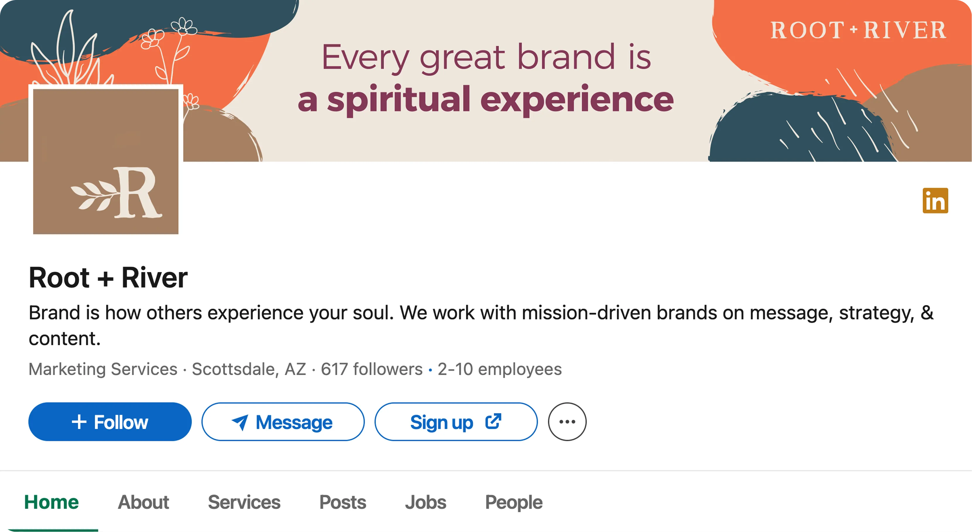
The Root + River LinkedIn page, its banner reading "Every great brand is a spiritual experience."
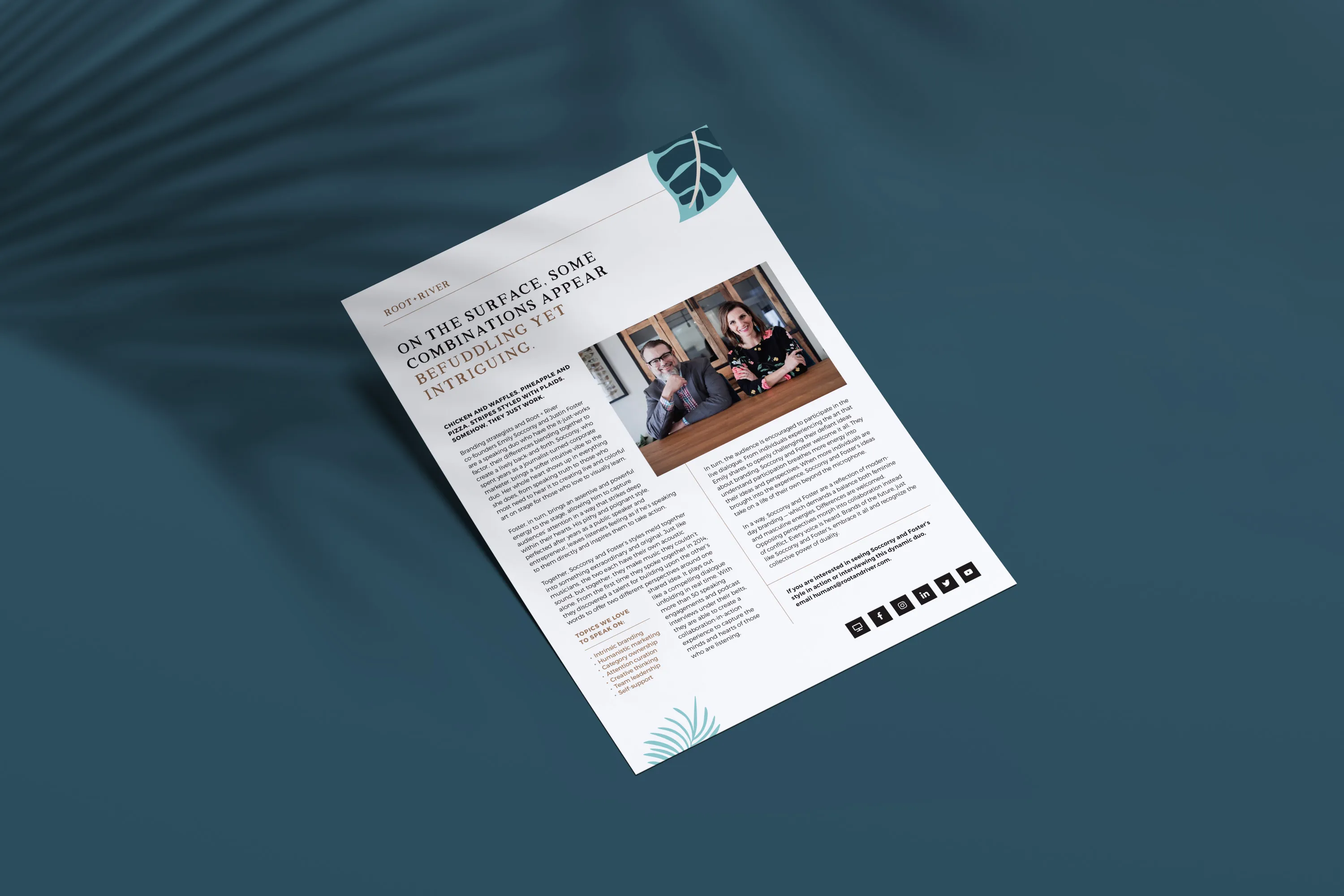
A printed Root + River sheet with photographs, on a dark teal surface with palm shadows.
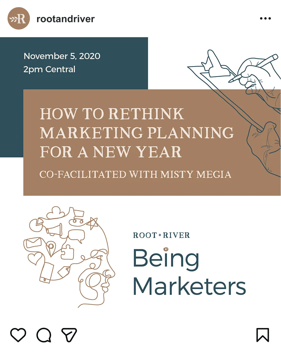
A Root + River Instagram post promoting a session on rethinking marketing planning for a new year.

Strategy

Being Marketers

“Being Marketers” is Root + River’s membership community for CMOs and marketing leaders. Its purpose is to help humanistic marketers navigate the dual pressures of brand leadership and personal well-being. With exclusive content and facilitated discussions, this community helps members learn about emerging topics, make inspired decisions, and care for their teams and themselves.

To truly resonate, the design for this community needed to blend human connection and executive clarity. I planned for an identity that felt premium and intelligent, but also authentic and supportive to validate the leader behind the marketer.


Four members of the Root + River team posing together in a studio portrait.An illustration of scattered burgundy petals.
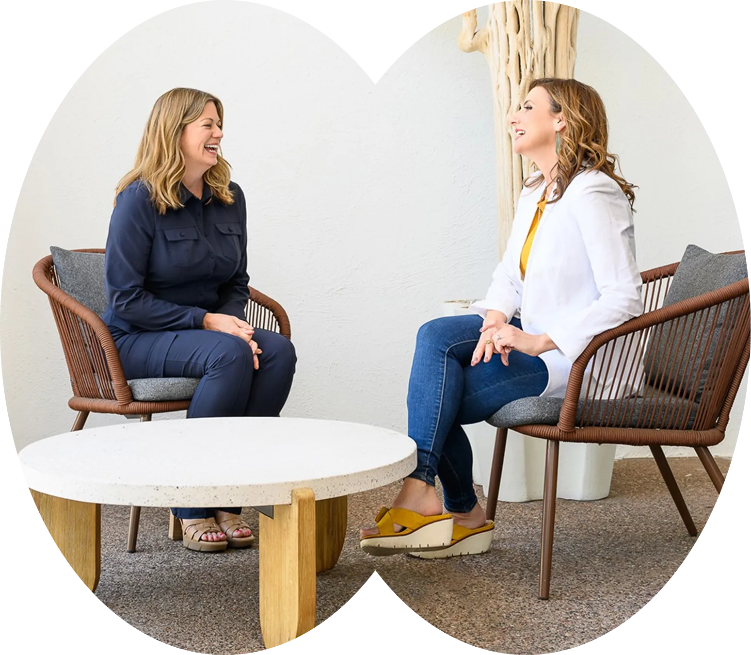
Two women in conversation in armchairs, shown in arched crops.
Brand Therapy

For those who are wrestling with how to brand or market, a Brand Therapy consultation is the answer. This private diagnostic session guides overwhelmed clients from confusion to confidence with a tailored marketing plan. Instead of an intimidating, large-scale strategy, this session is an accessible first step—offering a high-value, low-pressure way to solve a problem and see what it’s like to work with Root + River.

My goal for Brand Therapy was to design a look and feel that spoke to three key narratives: validation (it’s okay to feel stuck), expertise (this is a safe, expert-led space), and transformation (you’ll leave feeling relieved and with an actionable plan in hand).

Marketing one-sheets

Root + River needed a suite of marketing documents to guide clients through their sales funnel. This included a speaker sheet to build founder awareness, a set of sell-sheets for their offerings, and B2B service menu repackaged for channel partners. While each piece targeted a unique need, all were unified under the same Root + River methodologies.

My solution was to build the design strategy around the brand's name itself, using visual metaphors of nature and flow to reinforce the "Root + River" concept. Part of the challenge was balancing text-heavy content with the need for a single-page format that was easy to scan and share.
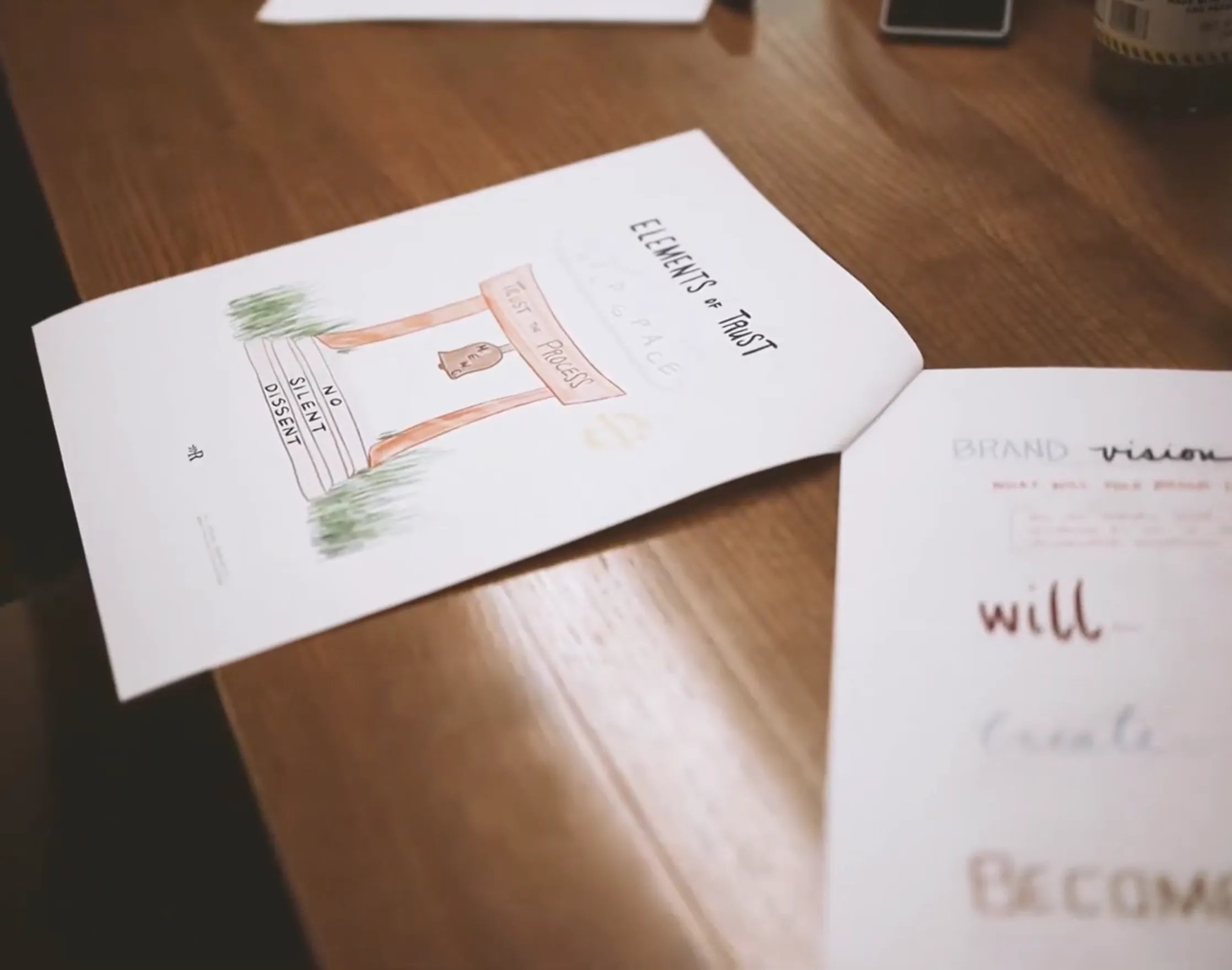
An open notebook on a wooden table with handwritten words in marker.An illustration of scattered cream-coloured petals.
A woman and a man in conversation during a session, seated in armchairs.
Core brand

Root + River’s soulful brand is designed to evoke emotions. Their core identity reflects spiritual philosophies, builds trust through sincerity, and is highly flexible with various typefaces and colors. Root + River needed additional marketing materials in their core brand style—including strategy decks, advertisements, email graphics, social posts, and more—to support their mission.

Creative

The Being Marketers logo printed on textured card above a dark teal band.
Being Marketers

The visual identity for Being Marketers speaks to the strategic leader and the heart behind the role. The “marketer” is represented by modern typography and an authoritative color palette, while the “being” comes to life through flowing, hand-drawn illustrations.

This concept is captured in the primary logo, which uses a single line connecting the chaos of marketing into one artistic, human form. This thinking extends to the BM monogram, where editorial letterforms are softened with an organic and plant-like flourish—reinforcing growth and authenticity. Together, these elements represent a premium and intelligent community that is deeply and approachably human.

The Being Marketers BM monogram embossed on textured white paper.
The Being Marketers BM monogram, its letterforms joined by a leafy flourish, in teal on cream.The Being Marketers BM monogram in tan on a dark teal background.
A repeating pattern of fine line icons including envelopes, hearts, charts and tools.
An email compose window with empty recipient and subject fields.A Being Marketers banner reading "Being an effective marketer begins by knowing and loving oneself."
A phone on a glass table showing a Root + River article, beside a printed page.
A circular "Being Marketers Member" badge with a laurel wreath and the Root + River monogram.
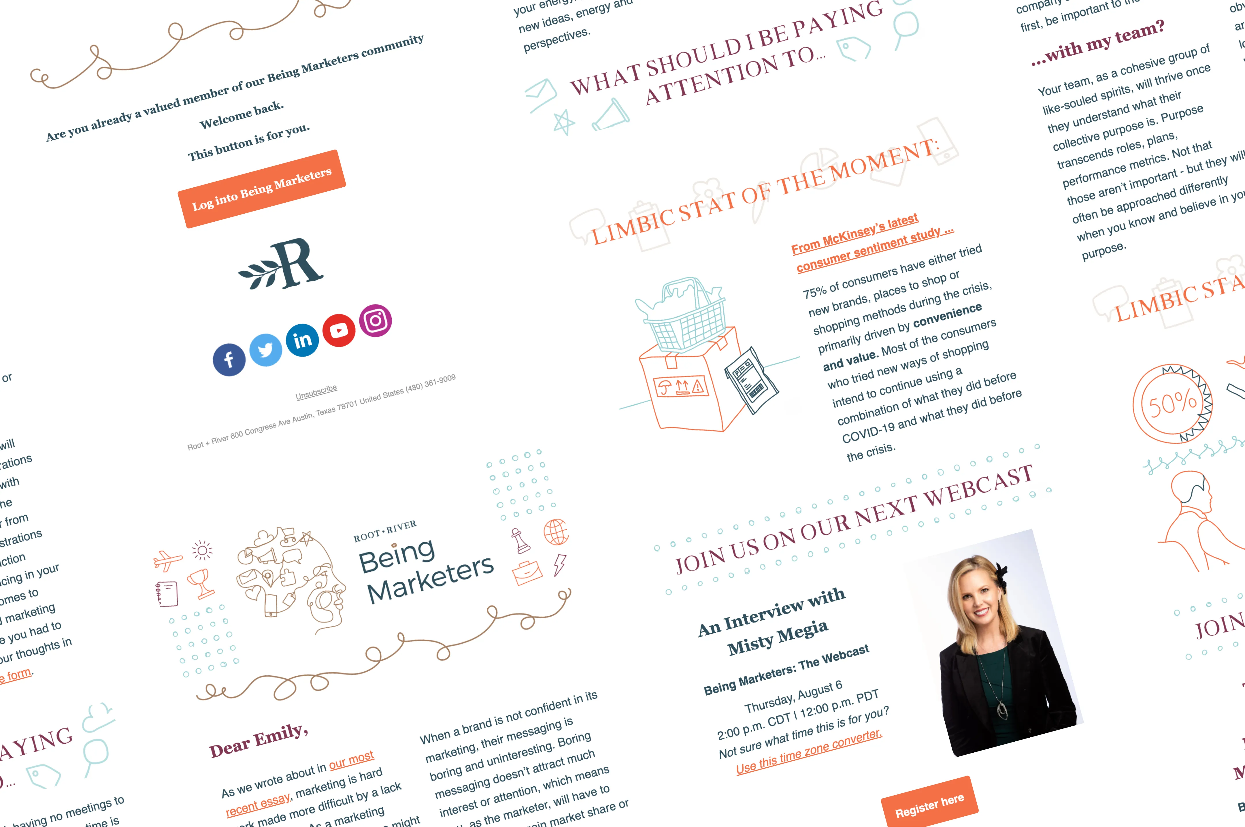
A collage of Being Marketers email newsletters with illustrations and webcast invitations.A collage of Being Marketers email newsletters with illustrations and webcast invitations.
Brand Therapy
Brand Therapy’s visual identity acts as an antidote for an audience under stress. The design is calm, organic, and minimalist, blending a soft, therapeutic feel with an air of professional expertise. This balance is visible in the typography, where credible serifs and handwritten fonts work together. The color palette reinforces this, leaning into the warmer and lighter tones of the brand palette to convey comfort and familiarity.

Simple line-art illustrations and thoughtful photography symbolize the journey: finding clarity, achieving growth, and getting back to a state of flow. Airy layouts make the content easy to digest—perfect for an already overwhelmed audience. Every element of the campaign is designed to lower stress, build trust, and signal relief.
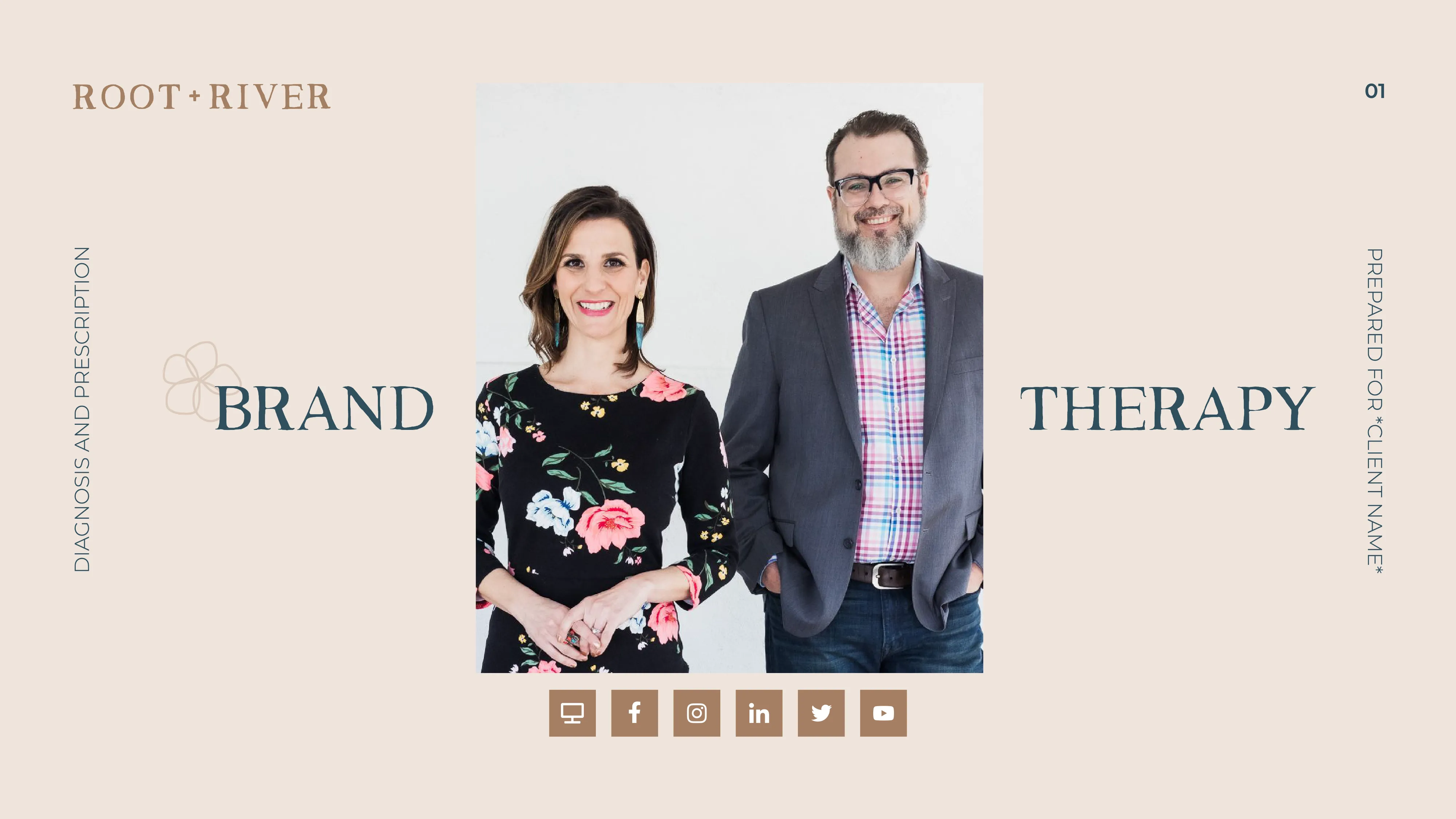
A Brand Therapy deck cover with a photograph of the two Root + River founders.
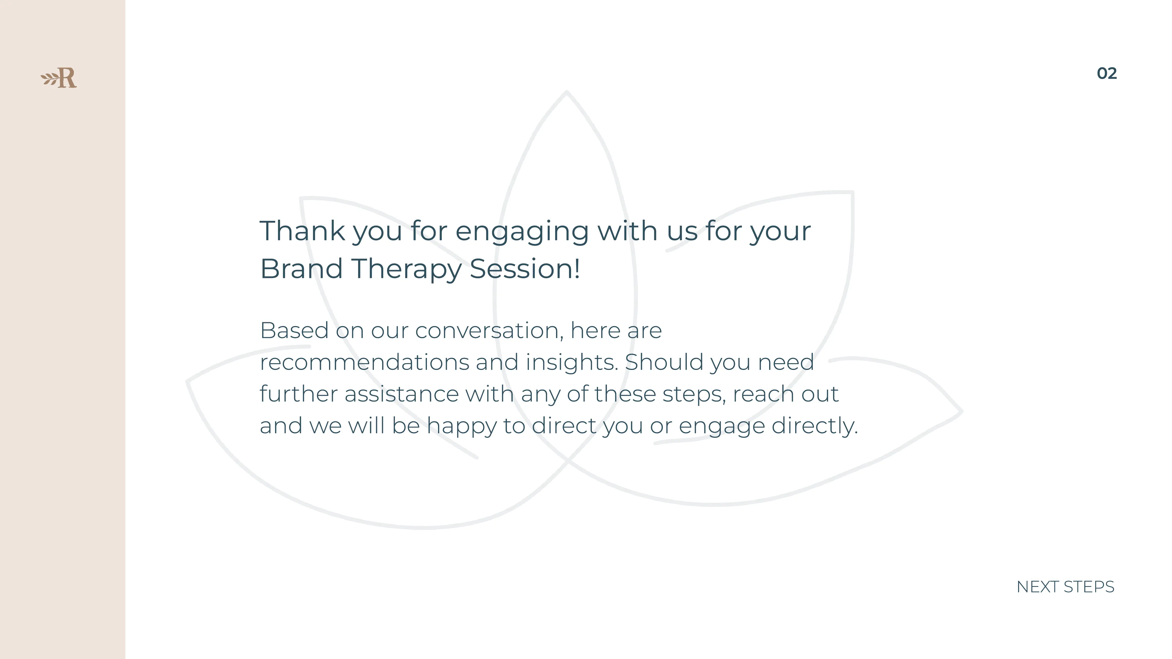
A Brand Therapy slide thanking the client for engaging in their session and offering next steps.
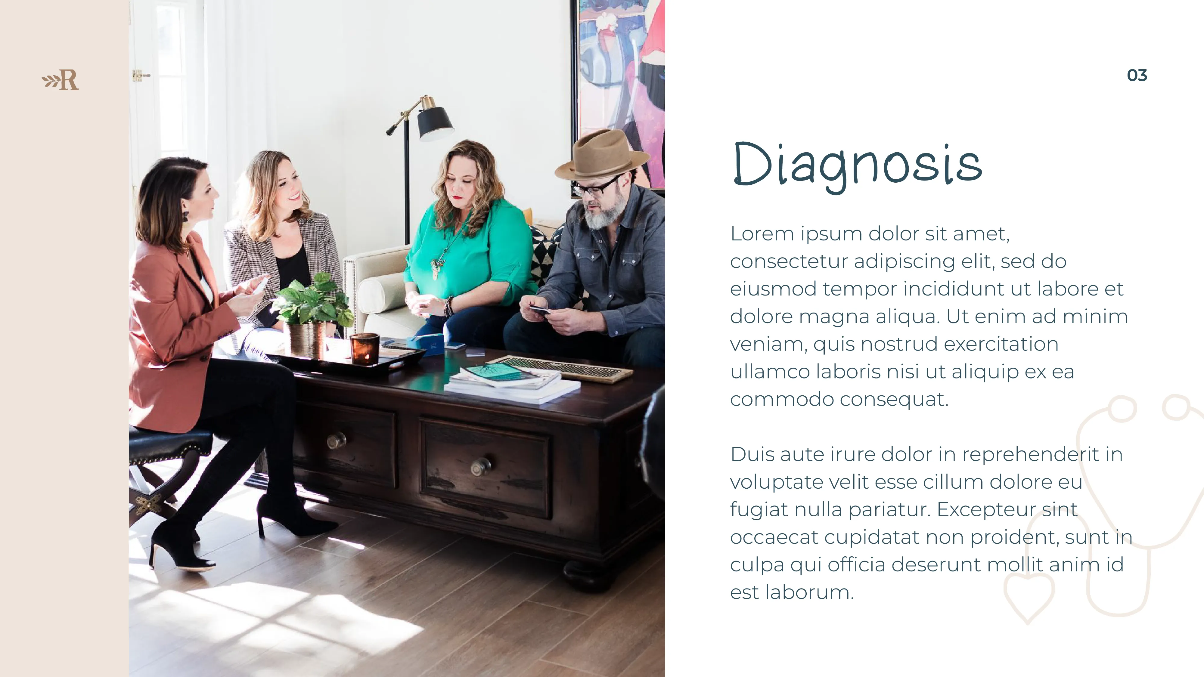
A Brand Therapy slide headed "Diagnosis", with a photograph of a team working at a table.
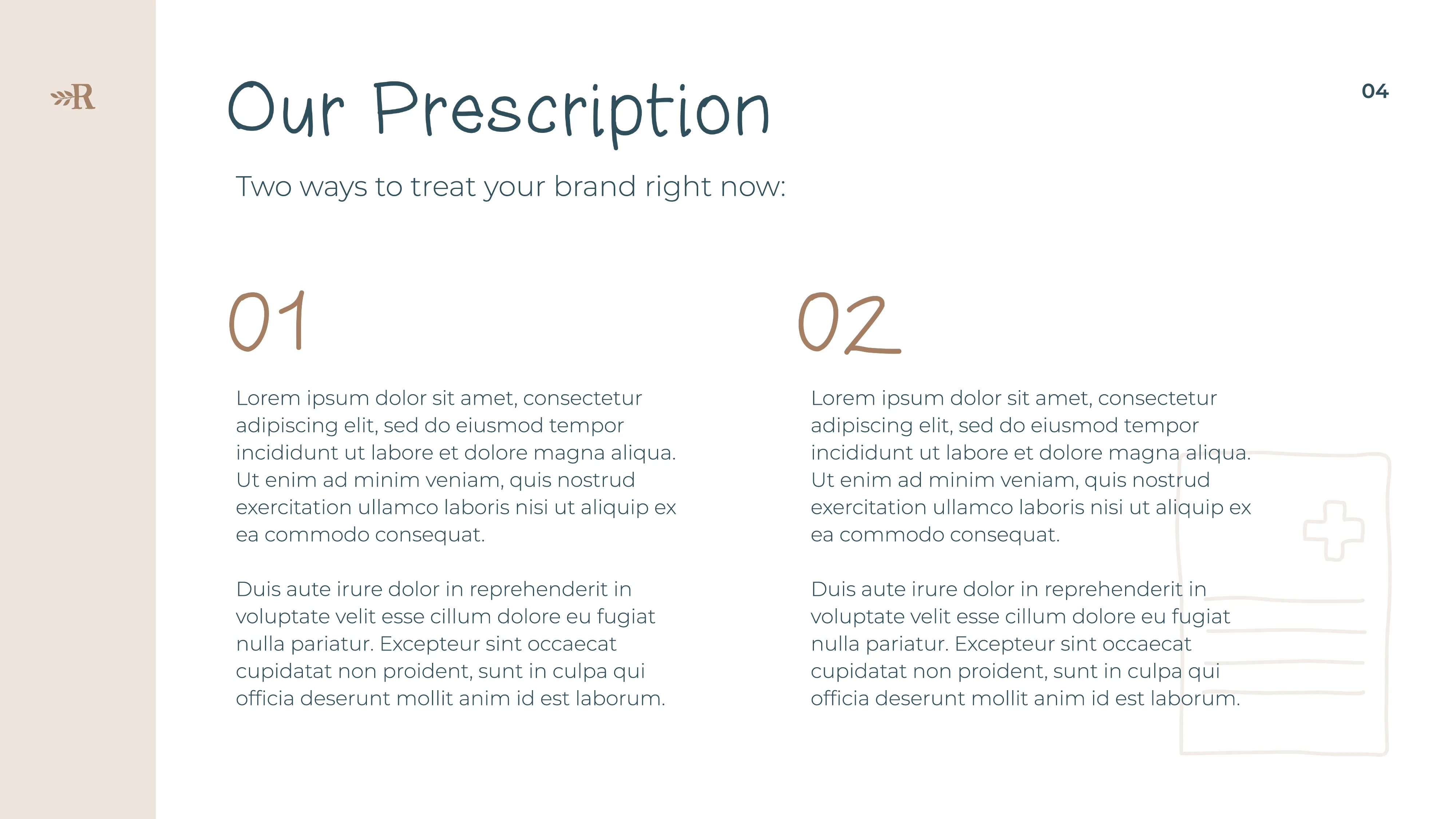
A Brand Therapy slide headed "Our Prescription", offering two numbered ways to treat the brand.
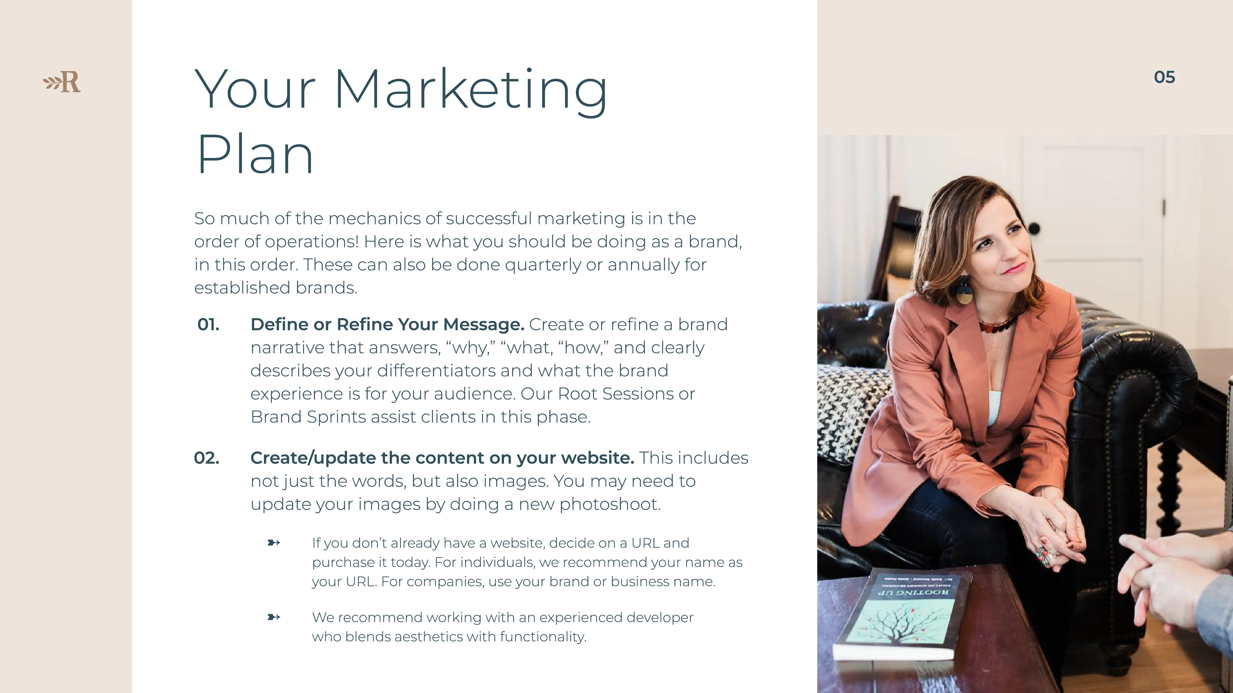
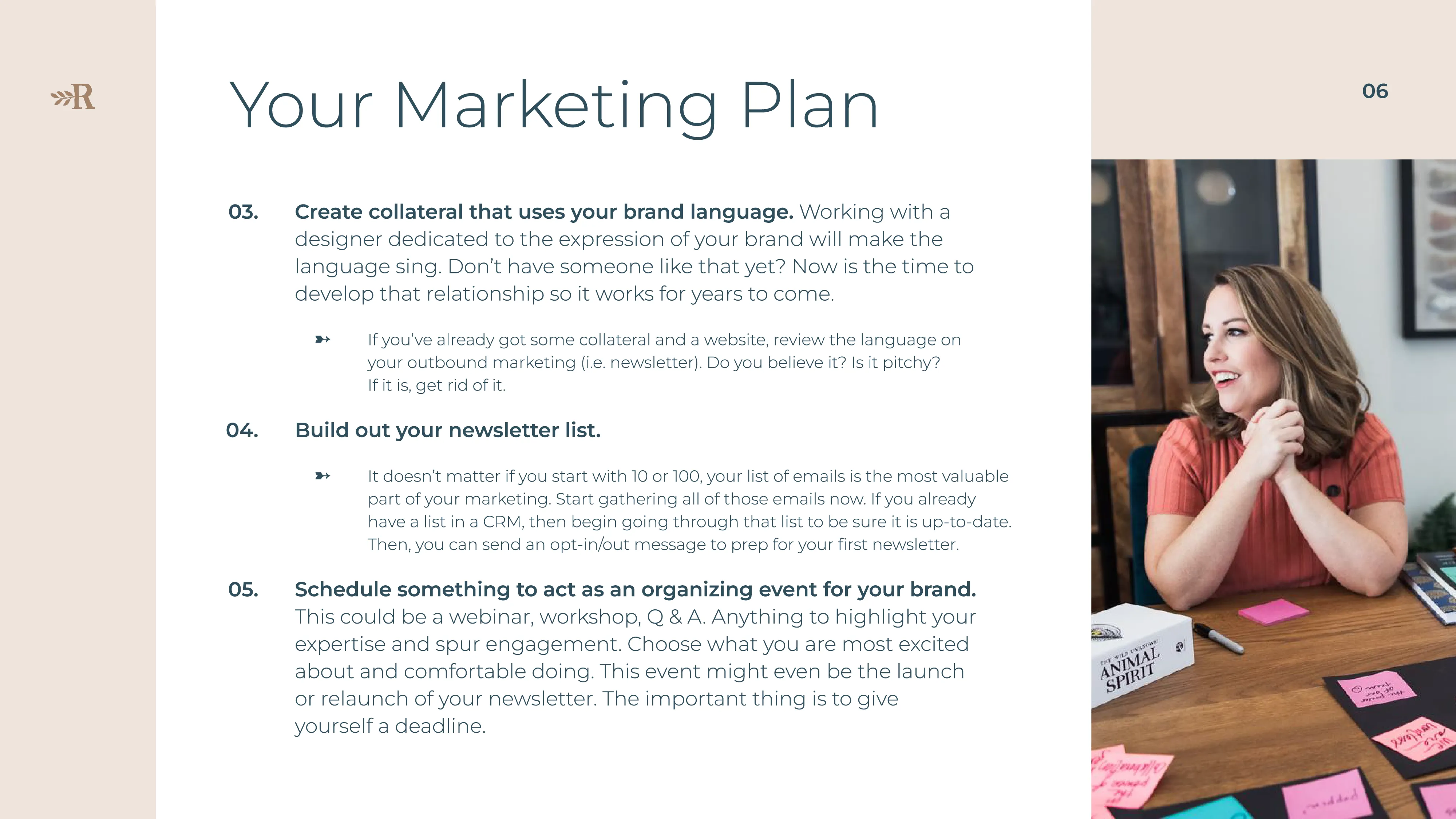
A Brand Therapy slide headed "Your Marketing Plan", beside a photograph of a woman in an armchair.
A second "Your Marketing Plan" slide listing numbered recommendations for the client.
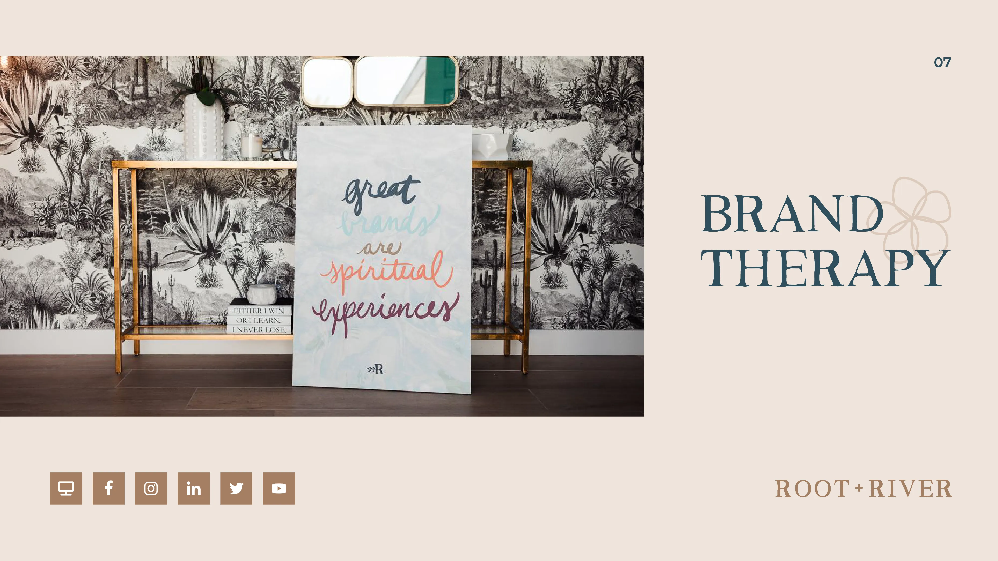
A Brand Therapy closing slide with a framed sign reading "great and spiritual experiences".
A laptop on a glass table displaying a Root + River Brand Therapy page.
Three women talking around a table in a bright room, shown in arched crops.
Marketing one-sheets
Marketing collateral that feels “salesy” can easily cause an audience to tune out. This design solution translated the "Root + River" name into visual brand metaphors in a way that feels natural, not transactional. The "Root" is represented by organic, botanical illustrations that evoke growth and intuition. The "River" is represented with white space to create a natural flow that guides the reader’s eye through the content.

The organic feel is balanced with a functional structure. I implemented strong hierarchies and multi-column layouts to organize text-heavy content, making it easy to navigate and follow. The result is a premium and elevated collateral set designed to communicate value and influence sales—while feeling more editorial and story-driven, and less like “selling.”
A printed Root + River one-sheet on a glass table, headed with a speech-bubble mark.
A printed Root + River one-sheet on a glass table, headed with a leaf illustration.
Two printed Root + River documents standing against a dark teal backdrop.
Core brand
The spirited color palette and whimsical visuals from the larger design system makes the decision-making process feel like an emotional connection rather than a business deal. My work for the core brand relies more heavily on the full color palette to allow sub-brands to have more distinct color stories. Here, I focused on designing for brand immersion so Root + River could show their soul.
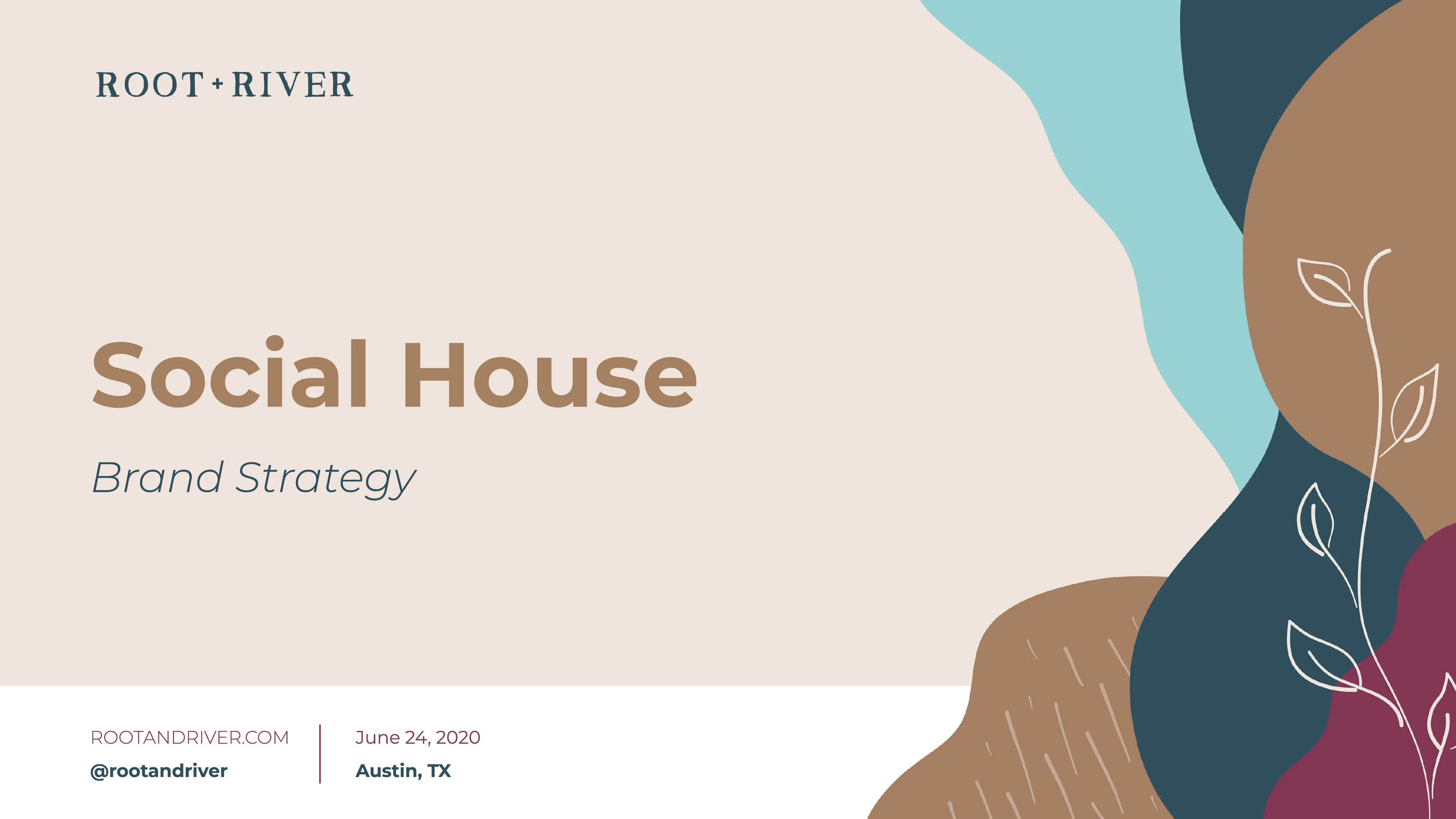
A Root + River title slide reading "Social House — Brand Strategy".
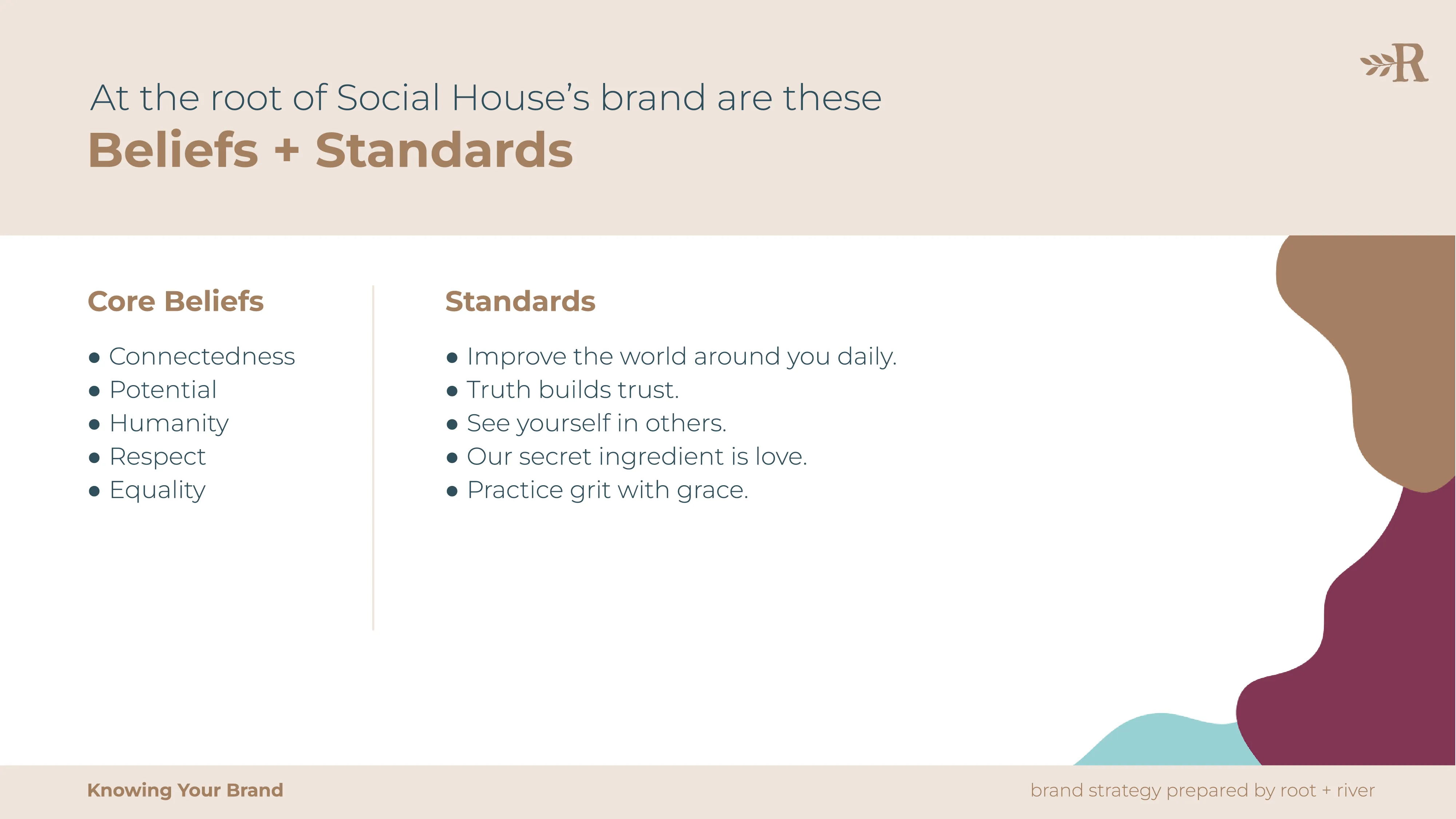
A brand strategy slide headed "Beliefs + Standards", listing core beliefs alongside standards.
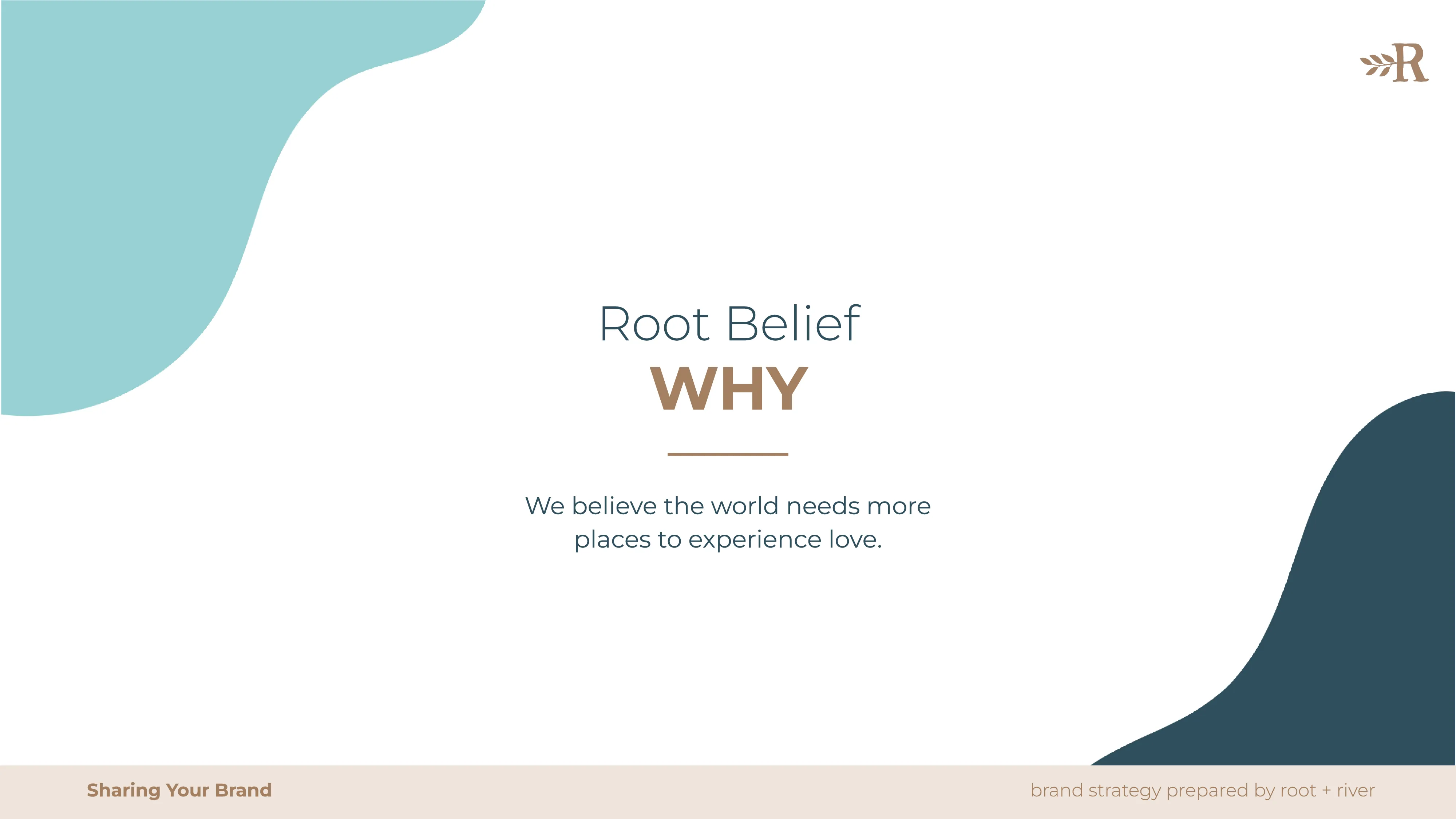
A brand strategy slide headed "Root Belief: Why", set against organic teal and cream shapes.
A Root + River title slide reading "Social House — Brand Strategy".
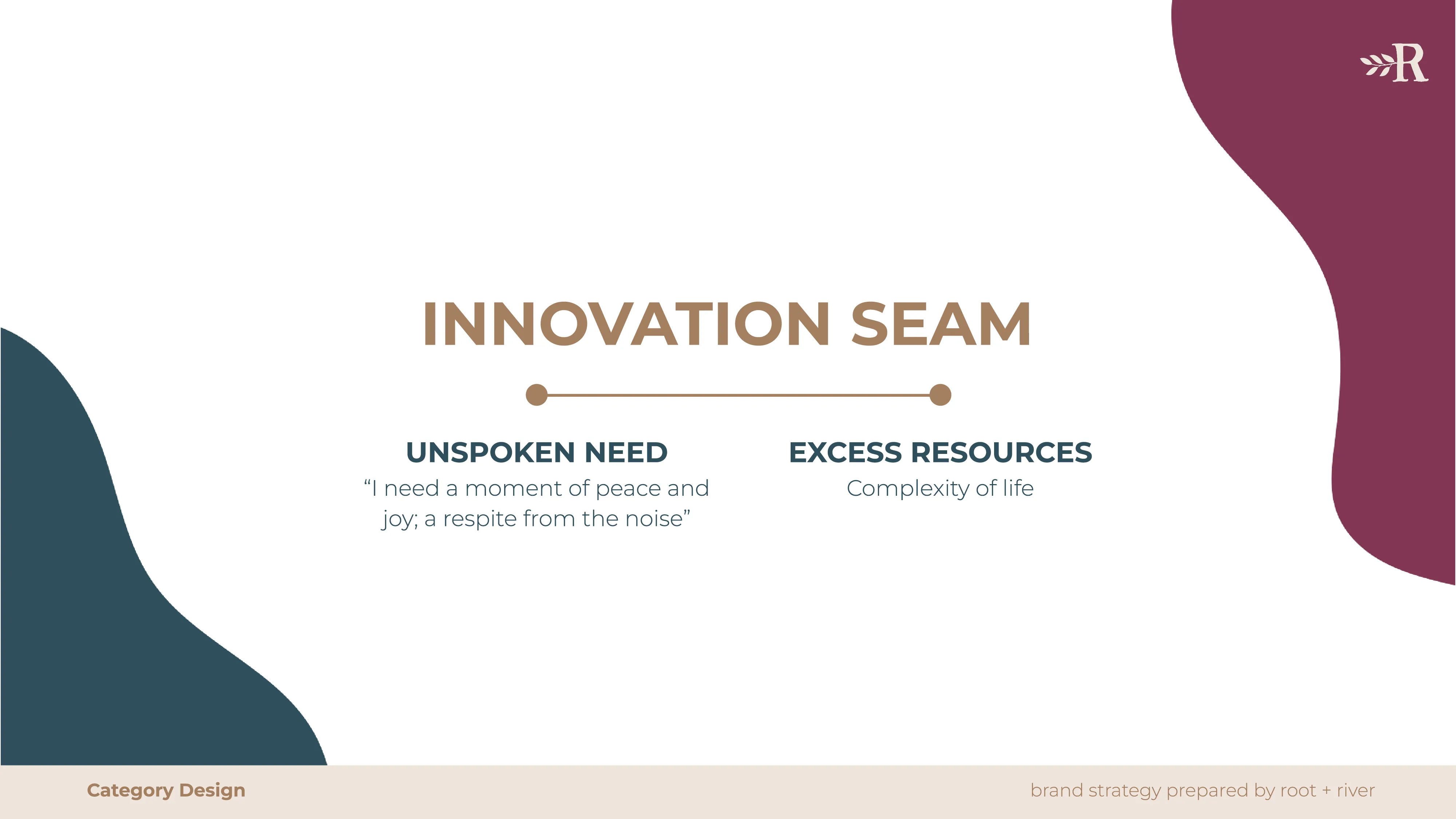
A brand strategy slide headed "Innovation Seam", contrasting unspoken need with excess resources.
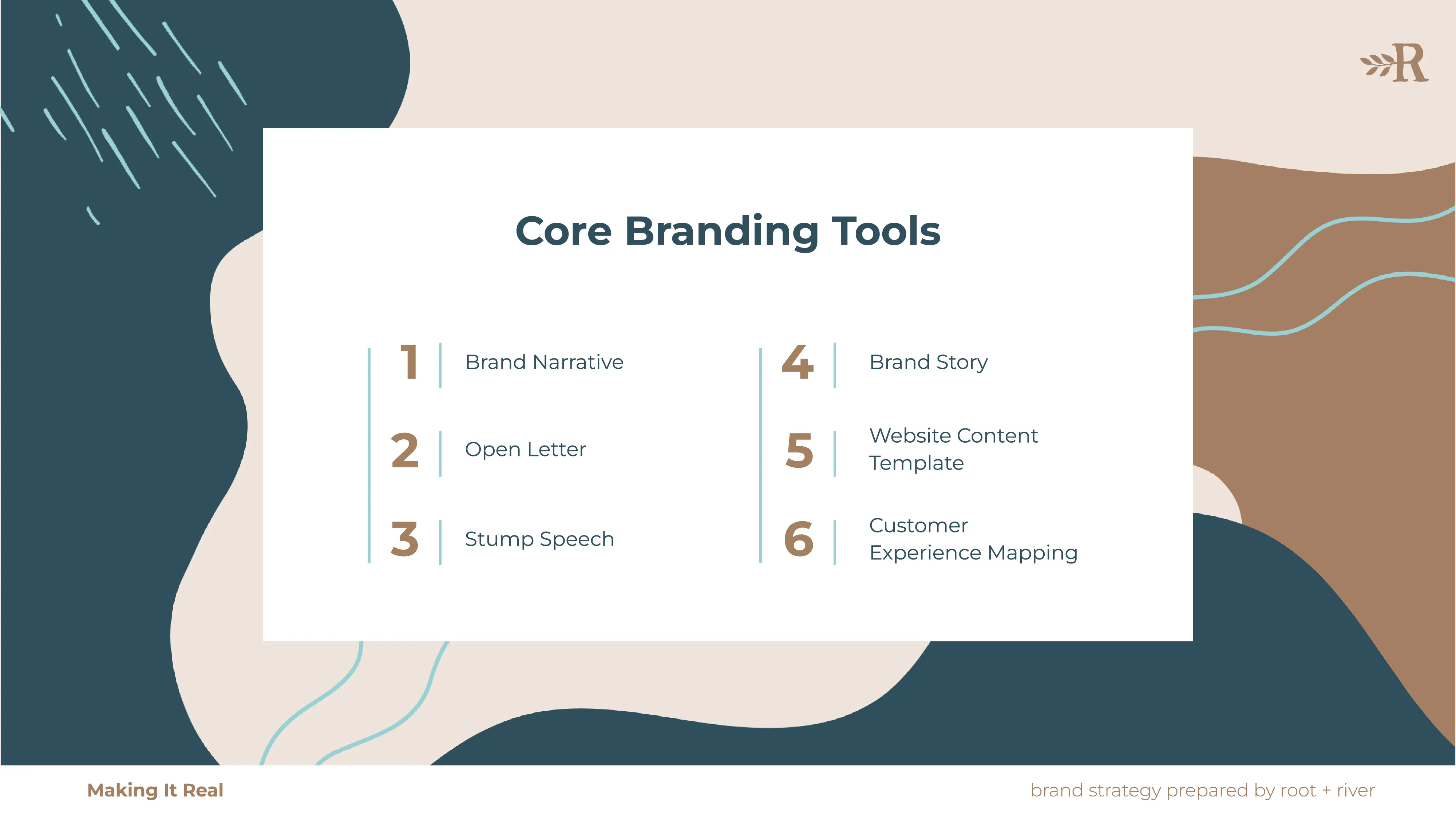
A brand strategy slide headed "Core Branding Tools", listing six numbered deliverables.
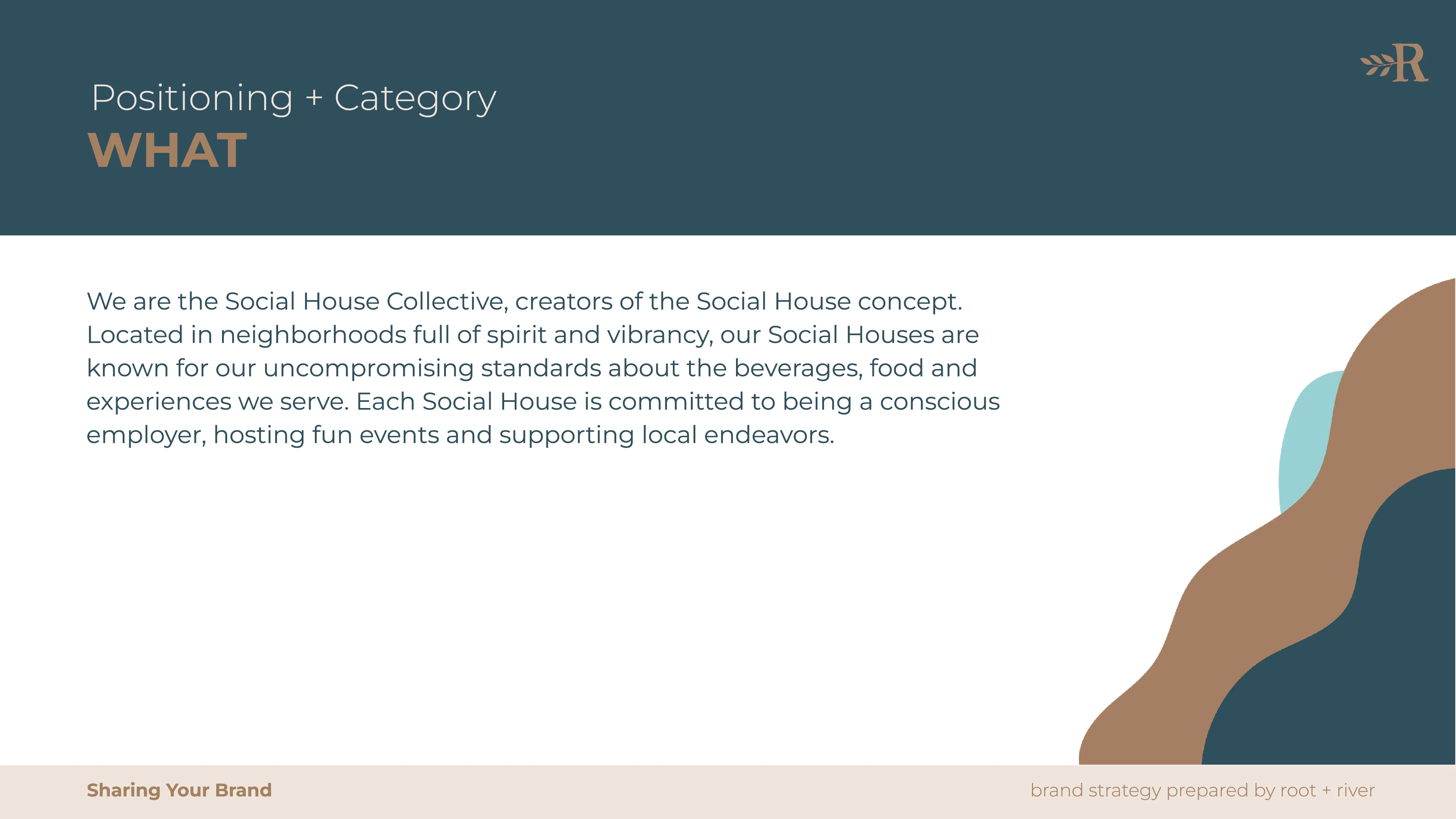
A brand strategy slide headed "Positioning + Category: What", describing the Social House Collective.
A brand strategy slide headed "Innovation Seam", contrasting unspoken need with excess resources.
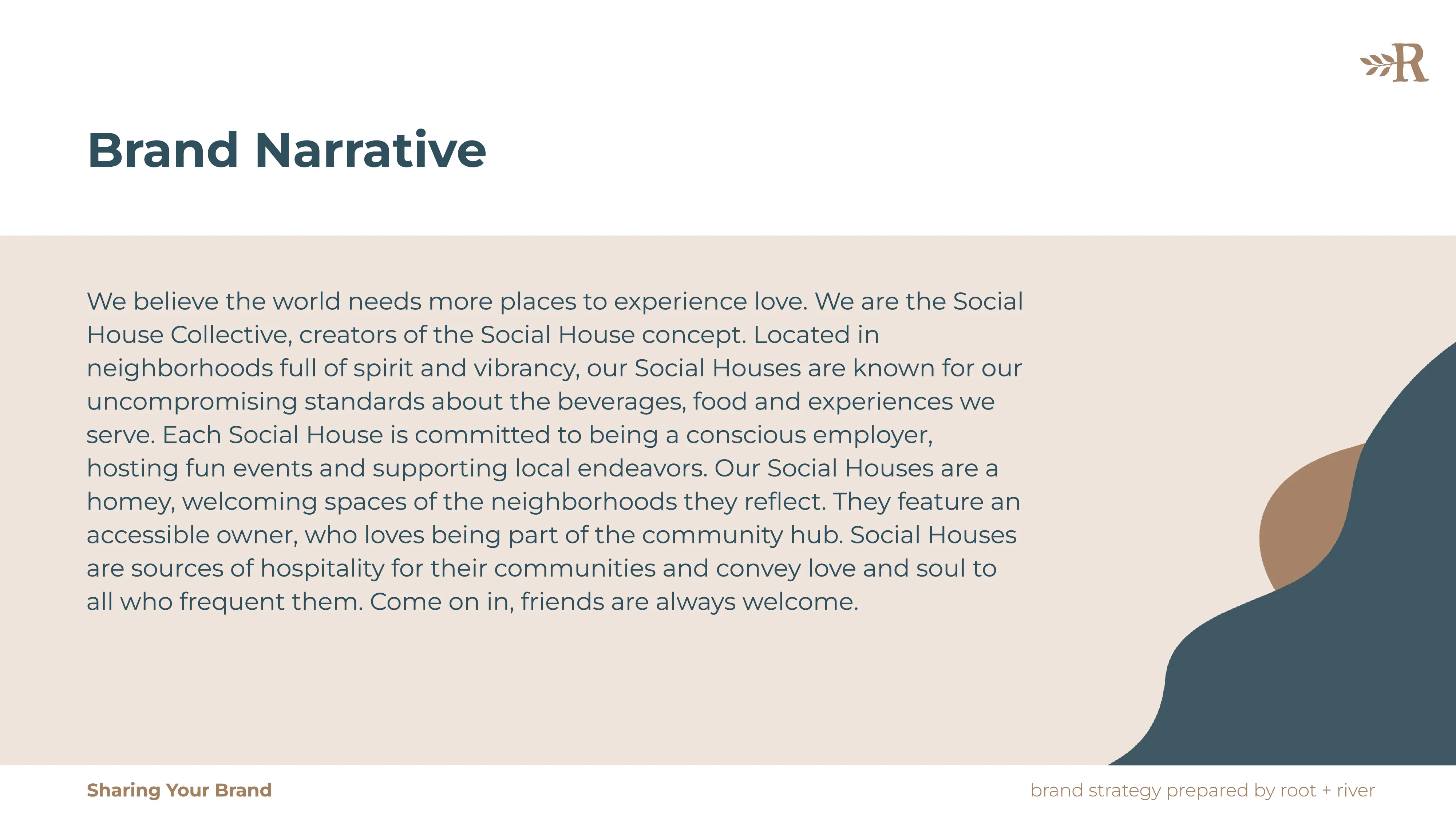
A brand strategy slide headed "Brand Narrative", setting out the brand's story in full.
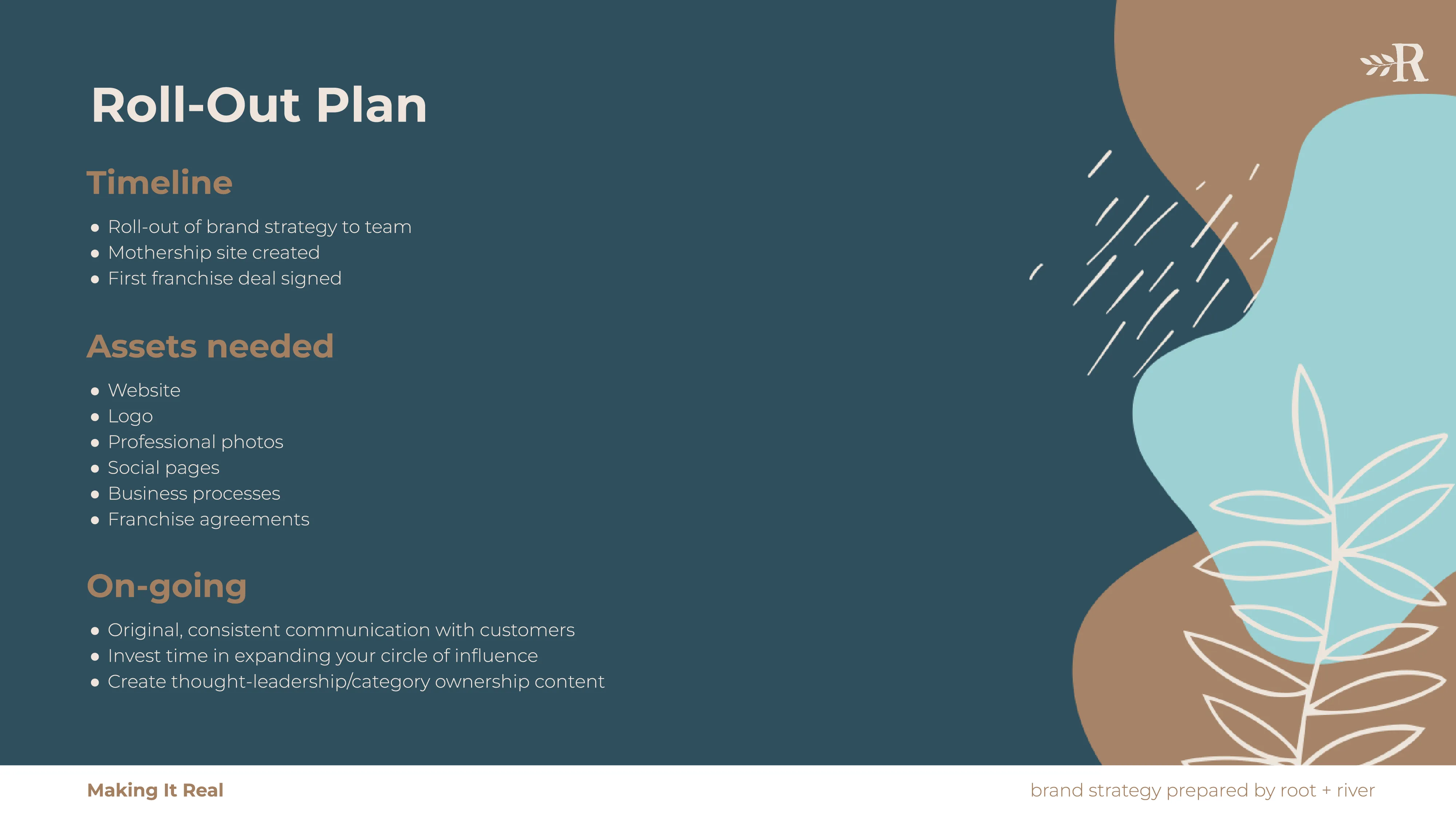
A brand strategy slide headed "Roll-Out Plan", with a timeline, assets needed and ongoing work.
A closing slide reading "Thank You! Root + River" with a botanical line illustration.
A brand strategy slide headed "Brand Narrative", setting out the brand's story in full.
A laptop on a glass table displaying a Root + River article page.
Four people talking around a table with laptops in a bright room.A person sketching a mind map on a tablet while a colleague looks on.
A banner announcing that "Rooting Up: Essays on Modern Branding" is available on Kindle.
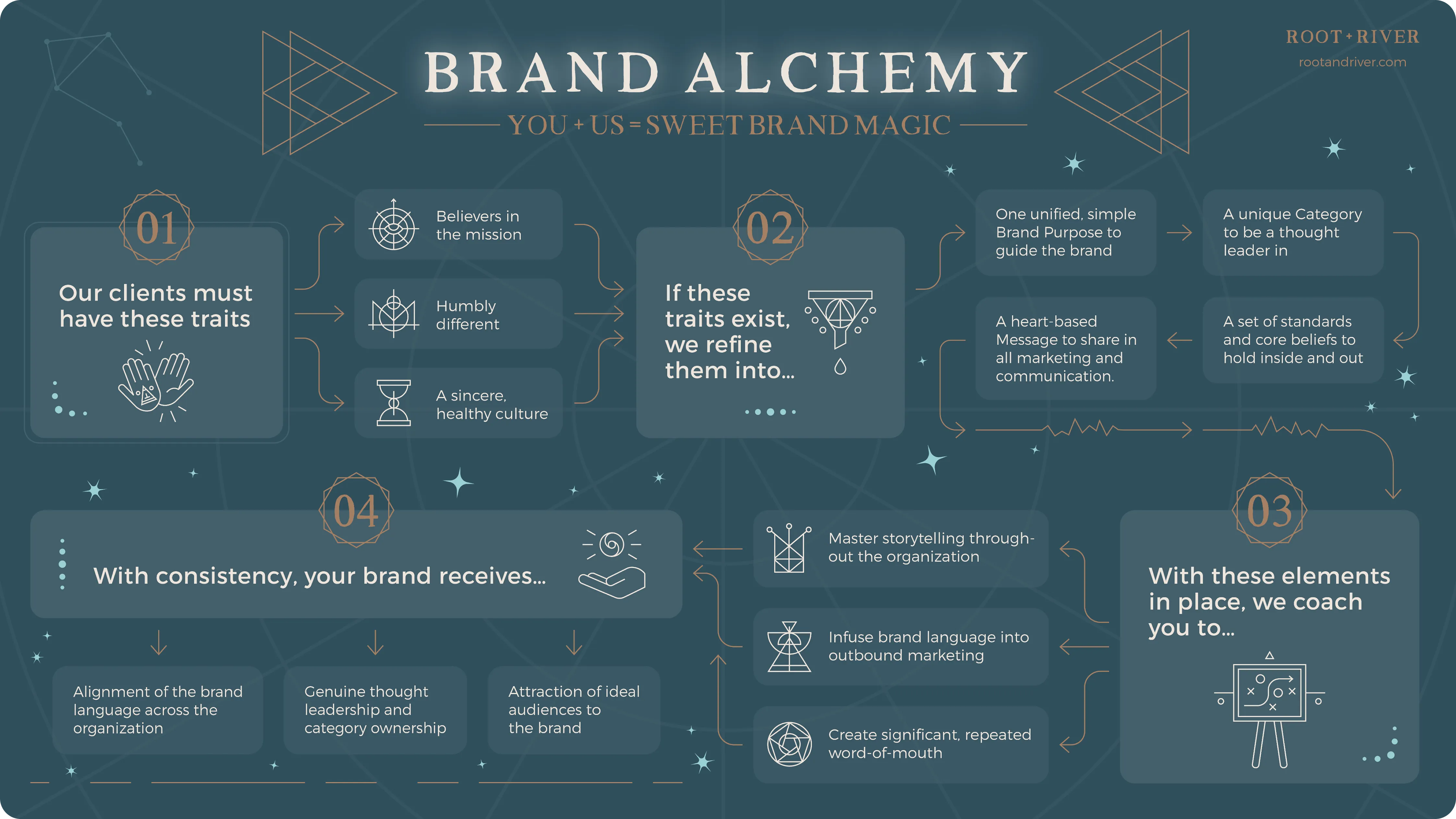
A dark teal "Brand Alchemy" infographic with numbered steps and geometric symbols.
A row of line-drawn symbols including an eye, a triangle, an aperture and an hourglass.Line illustrations of clapping hands, a funnel with a droplet, and an open palm.

Impact

Maddie Moe is a skilled designer that’s eager to learn and grow—she did a lot of internal projects for us and we were super pleased with her work. She is also an awesome person with an old soul.
Justin Foster, Co-Founder & Strategist at Root + River
Justin Foster,

Co-Founder & Strategist at Root + River
Maddie Moe’s art direction truly brought the report to life. She delivered a beautiful visual system that the client is now carrying into additional materials. The project involved a complex stakeholder environment, and she navigated an evolving process with confidence—she knows when to be flexible or when to defend creative decisions. The client was thrilled working with her and with the final result.
Matt Twohig, Producer partnered with Cultivator Content Labs
Alli Mitchell,
Sr. Event Marketing Specialist at Paradox
1/2
Invoking credibility and client engagement
Marketing materials were designed to attract ideal clients, build trust, and resonate emotionally—ultimately inspiring engagement and action.
Soulful consistency at scale
I ensured every touchpoint was an authentic reflection of the core brand, fostering long-term loyalty in audiences.
Bridging spirit with sales needs
I built flexible, distinct visual systems for Root + River’s programs, empowering them to market diverse offerings to targeted audiences.
From designer to trusted partner
Root + River referred my design services to their own clients, showcasing my value as an aligned, high-quality partner.
Credits
Co-Founders & Strategists
Emily Soccorsy & Justin Foster
Chief of Story
Jennifer Lawhead
Chief of Staff
Cat Weise
Outbound Mktg. Manager
Maggie Gentry
Team Photography
Jean Laninga & Studio W Portraits
Co-Founders & Strategists
Emily Soccorsy &
Justin Foster
Chief of Story
Jennifer Lawhead
Chief of Staff
Cat Weise
Outbound Mktg. Manager
Maggie Gentry
Team Photography
Jean Laninga &
Studio W Portraits
Wait, there’s more...
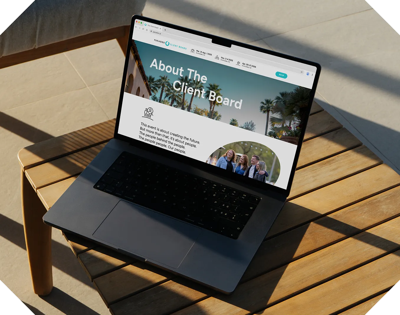
A laptop on a sunlit wooden outdoor table displaying the "About The Client Board" page.
Paradox’s Client Board
HR User Conference
Creative direction for a 5-star talent collective and a microsite with a 37.7% WAU/MAU rate t
Two Lemon & Leaf cans: Strawberry & Rooibos Chai and Coconut Lime & Thai Tea with fruit background.
Lemon & Leaf
Beverage Retail (CPG)
How a designer’s love for lemonade curbed shopping 
cart abandonment t
A YMCA billboard reading "Be Bold. Be Strong. Belong." advertising a $0 joining fee.
Valley of the Sun YMCA
Community & Wellness Nonprofit
A $683K program service revenue boost derived from mission-driven design t
Let’s make something remarkable