BLISS Summit
Building investor confidence and brand authority through annual report art direction
TYPE
Civic Action Forum
PERSONALITY
Disciplined, Modern, Purpose-driven
%20(1).webp)
.webp)
SERVICES
Art Direction
Editorial Design
Publication Design
Print Design
Content Strategy
Event Branding
Production Mgmt.
ROLE
Art Director and Lead Designer
The BLISS Summit convenes activists, artists, political leaders, and philanthropists to invest in global freedom and fight against non-democratic rule. The summit channels capital into civic action through workshops, project pitches, and dialogues that align resources and drive collaboration.
For their 2026 gathering, BLISS needed a strategic impact report that highlighted recent successes and provided a clear case for attendees to commit their time and resources.
%20(1).webp)
.webp)
.webp)
%20(2).webp)
Strategy
Project objectives
Showcase that BLISS is not just a one-off event, but a coordinated capital ecosystem that enables democracy.
Outline 2025 KPIs that measure and illustrate the investments, impact, and reach of the BLISS ecosystem.
Inspire summit attendees to contribute their time, capital, resources, and/or network to freedom-related initiatives.
Elevate the BLISS brand with world-class design that reflects the excellence of their movement.
.webp)
Creative direction
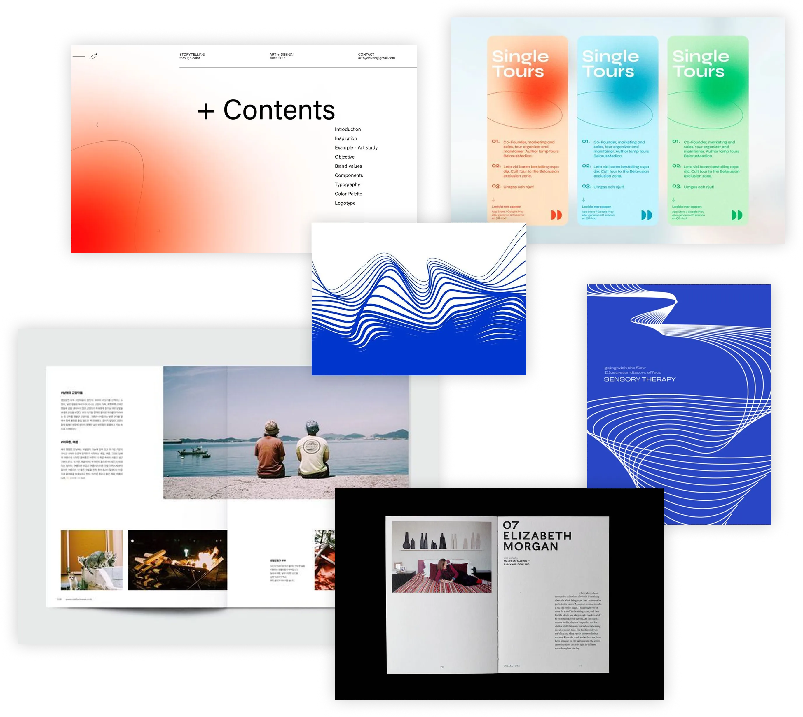
When defining the visual language for the 2025 report, my goal was to match the sophistication of the BLISS movement, addressing the aesthetic constraints of earlier reports. Modernity, white space, and bold typography became key elements in the project’s mood board. In creative explorations with the client, I uncovered their preference for column-based grid layouts and large photo placements, which became key as well.
While full-bleed gradient backgrounds had been heavily used in previous reports, I advocated to replace these with featured gradient graphics for improved legibility and intentional focal points. I also advocated to replace previous 8.5x11” paper sizes with 8x10” for a more harmonious 4:5 aspect ratio, and for a size that feels bespoke and stands out from other letter documents.
Ultimately, I aimed to integrate existing brand elements like gradients, summit photography, and graphic details, while elevating and expanding the brand voice with sophisticated typography and spacious layouts.
While full-bleed gradient backgrounds had been heavily used in previous reports, I advocated to replace these with featured gradient graphics for improved legibility and intentional focal points. I also advocated to replace previous 8.5x11” paper sizes with 8x10” for a more harmonious 4:5 aspect ratio, and for a size that feels bespoke and stands out from other letter documents.
Ultimately, I aimed to integrate existing brand elements like gradients, summit photography, and graphic details, while elevating and expanding the brand voice with sophisticated typography and spacious layouts.
Thoughts on theme
The theme from the 2026 BLISS Summit is “The Truth We Seek:” The world is noisy, chaotic, and polarized—this gathering challenges the community to confront disinformation, polarization, and civic decay through transparency, trust, and long-term investment. So, how do we incorporate this event theme and its abstract ideas into the report’s design?
I planned for clean layouts and clear hierarchies to counter “civic decay” and a “noisy, chaotic world” with structural order. Candid photos showing the people of the BLISS movement would build emotional connection and establish a sense of transparency and dialogue. I conceptualized bold, limited uses of color to convey confidence and authority. Finally, I planned to encourage action by showing what happens after people act—done by visually highlighting and drawing attention to BLISS’s outcomes so far in Latin America and beyond.
I planned for clean layouts and clear hierarchies to counter “civic decay” and a “noisy, chaotic world” with structural order. Candid photos showing the people of the BLISS movement would build emotional connection and establish a sense of transparency and dialogue. I conceptualized bold, limited uses of color to convey confidence and authority. Finally, I planned to encourage action by showing what happens after people act—done by visually highlighting and drawing attention to BLISS’s outcomes so far in Latin America and beyond.
The cutting room floor
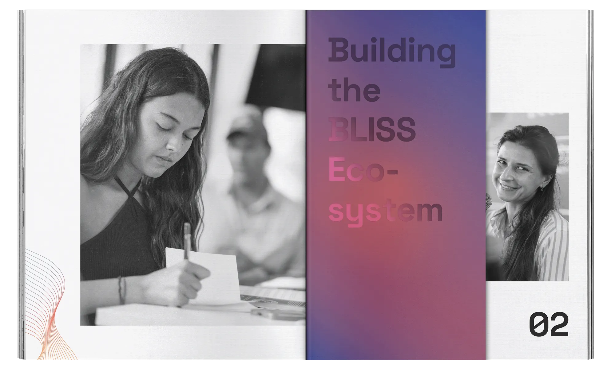
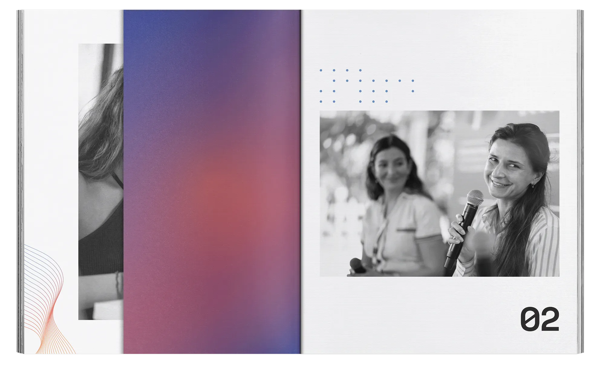
My initial creative proposal included 5x10” tabbed dividers, making it easy to flip to different sections and adding a unique physicality to the report. The intent was to elevate the client’s desire for full-bleed gradient backgrounds with a spot UV or clear foil treatment—creating a high-end contrast between the glossy section titles and colorful matte stock.
The production team appreciated the craft behind the tabbed dividers, but pivoted to keep all page sizes consistent and prioritize production reliability. I later redesigned the divider pages to achieve a similar, premium impact through color and visual layering. The rest of the design elements from the early concepts were approved, and we moved forward towards the final product.
The production team appreciated the craft behind the tabbed dividers, but pivoted to keep all page sizes consistent and prioritize production reliability. I later redesigned the divider pages to achieve a similar, premium impact through color and visual layering. The rest of the design elements from the early concepts were approved, and we moved forward towards the final product.
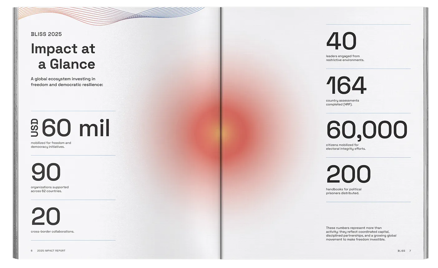
An early layout of impact metrics that later changed with updated copy
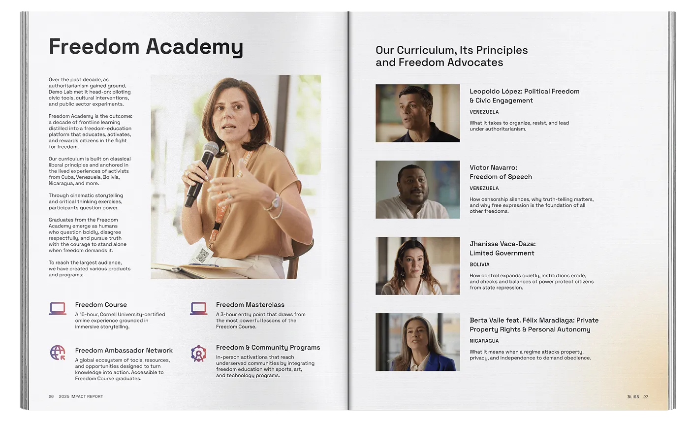
An early layout of program and curriculum content that later changed with updated copy,
client feedback, and photography resources
client feedback, and photography resources
An early layout of program and curriculum content that later changed with updated copy, client feedback, and photography resources
Creative
.webp)
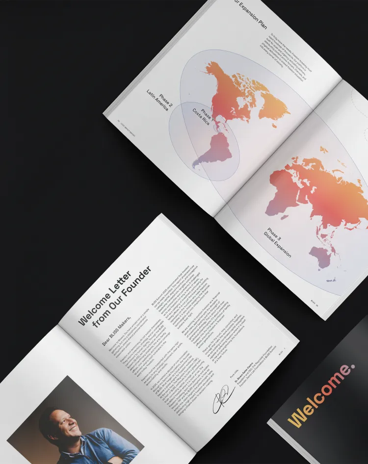
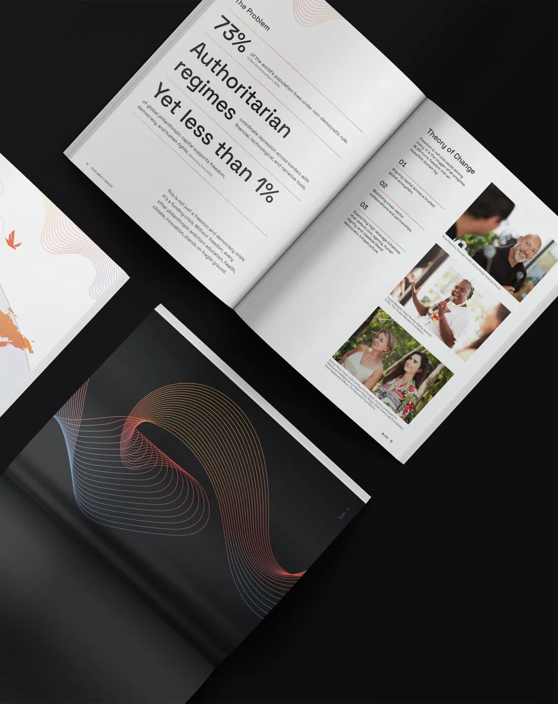
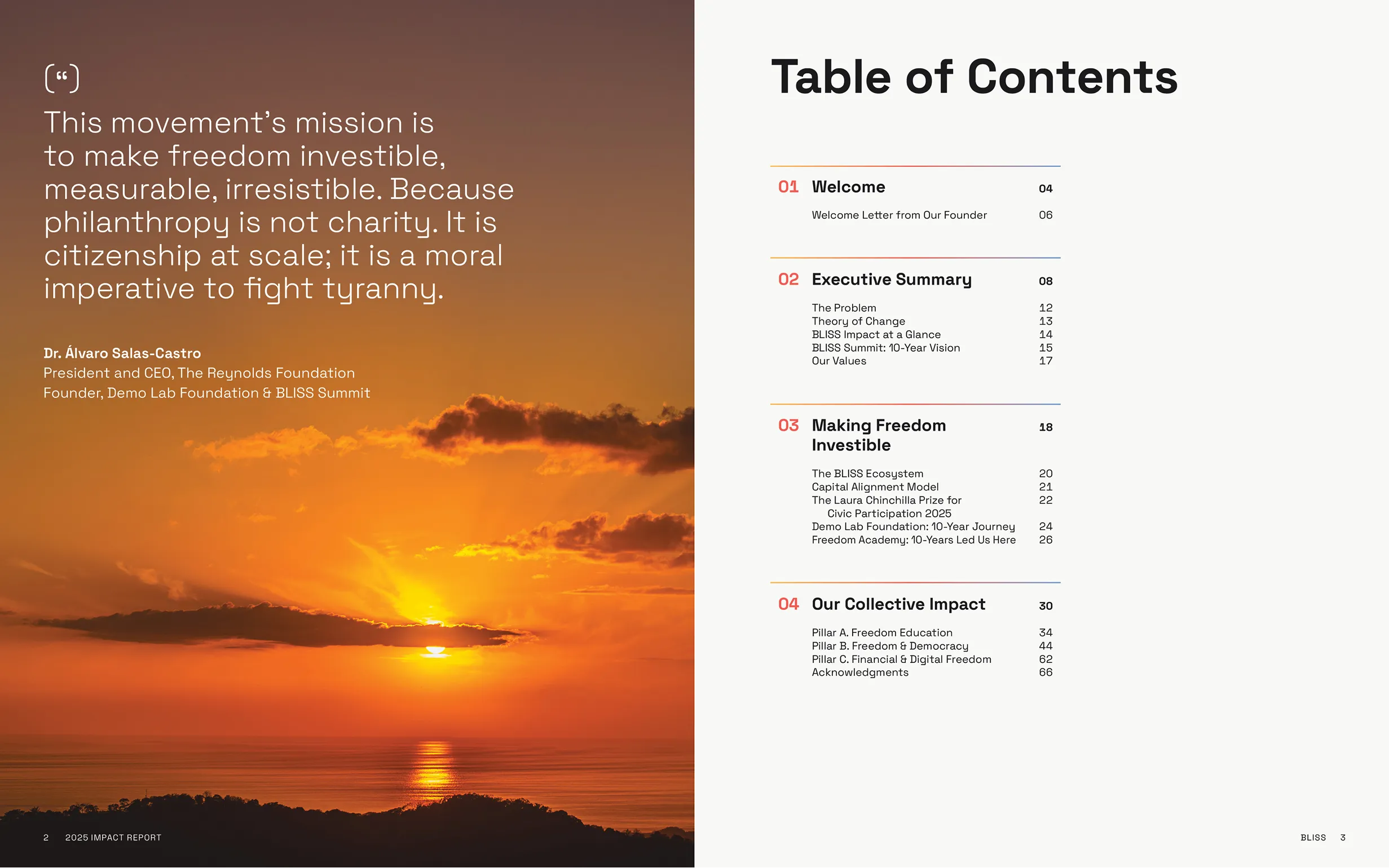
The result of the project’s art direction and design is a 70-page report with a consistent and authoritative visual style. Organized grid layouts pair with curated photography that captures courage, leadership, and the event’s roots in Costa Rica.
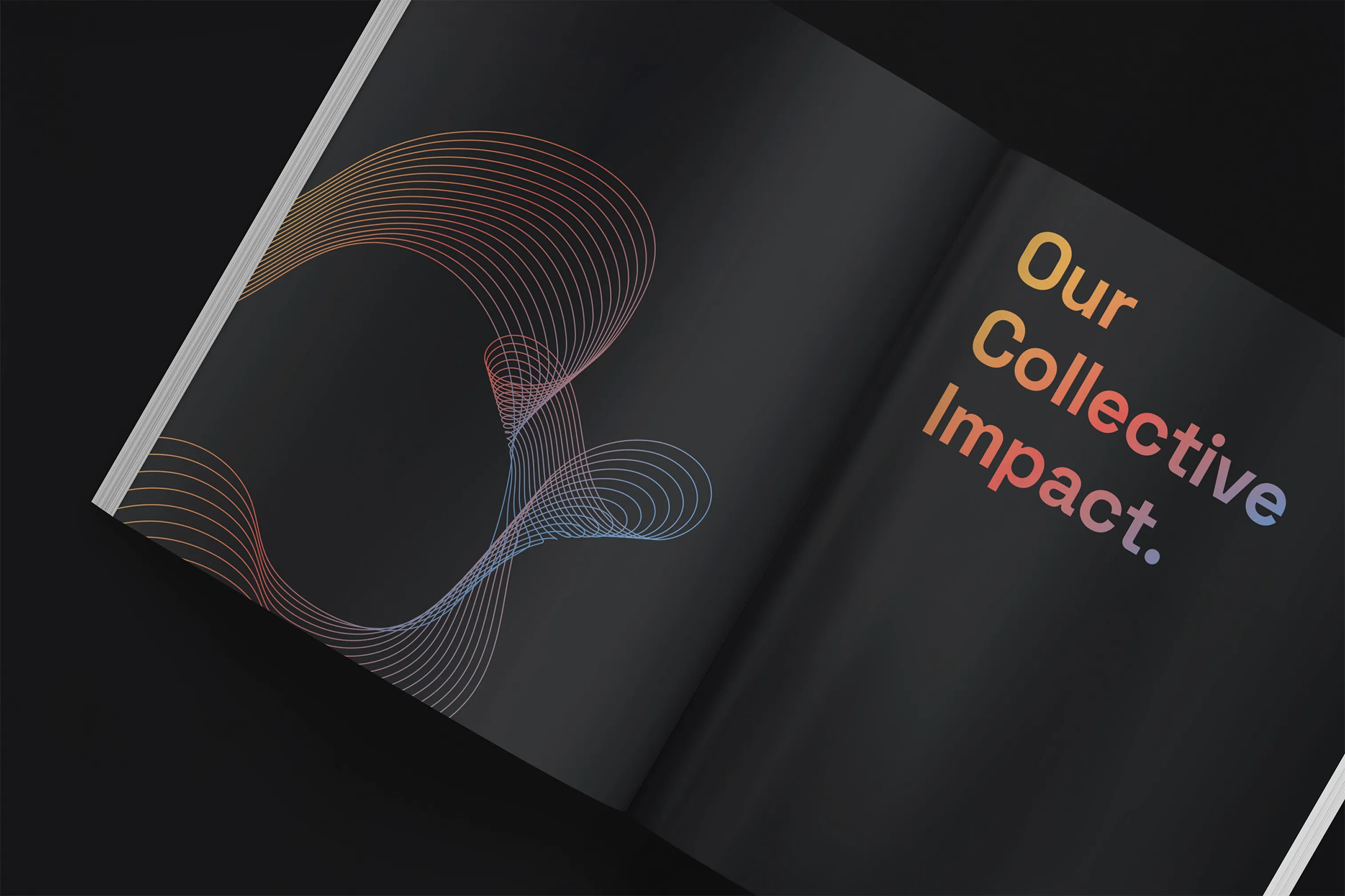
Color use is primarily reserved for gradients and photography, allowing the content to stand alone in confidence. Black divider pages contrast the bulk of the report, making it easy to distinguish sections by providing bold visualizations in between.
Color use is primarily reserved for gradients and photography, allowing the content to stand alone in confidence. Black divider pages contrast the bulk of the report, making it easy to distinguish sections by providing bold visualizations in between.
.webp)
.webp)
.webp)
.webp)
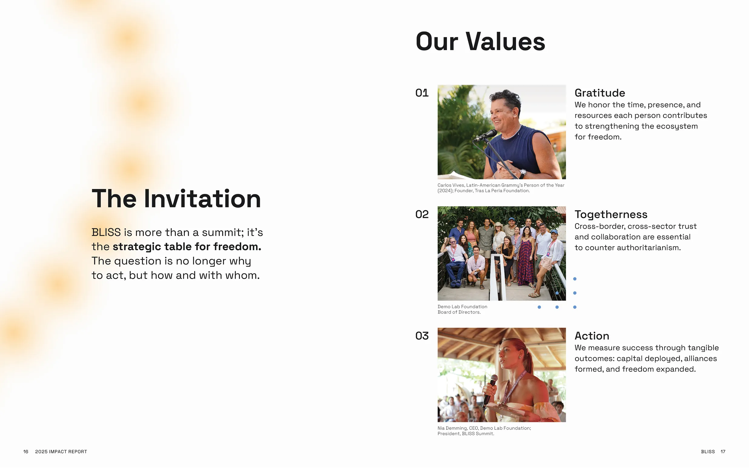
Gradient elements are used to strategically draw attention to certain elements, or to add a visual flourish and tie into the greater event branding. Softer radial gradients embrace white space for feelings of optimism and growth, and add dimensionality to the design. Linear gradients create organic, unique visualizations or help structure and organize content.
.webp)
.webp)
.webp)
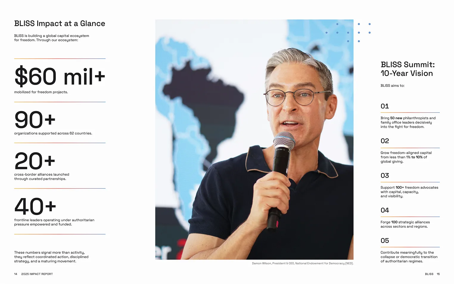
This disciplined visual asset reflects the depth of the BLISS ecosystem by highlighting the institutions, individuals, and platforms that contribute to the cause. Editorial design combines function and aesthetic to detail 25 active projects and dozens of resulting KPIs.
My work transforms high-impact data and outcomes into digestible “at a glance” metrics that provide the clarity needed to scale a global freedom movement.
%20(1).webp)
%20(1).webp)
%20(1).webp)
.webp)
To address shifting priorities and diverse feedback from stakeholders, I shared high-fidelity mockups of the work with strategic recommendations throughout the process. I also provided content consultation to ensure the flow of the report would best serve the audience. These initiatives kept the project on track with a final design that satisfied all
key stakeholders.
%20(1).webp)
.webp)
.webp)
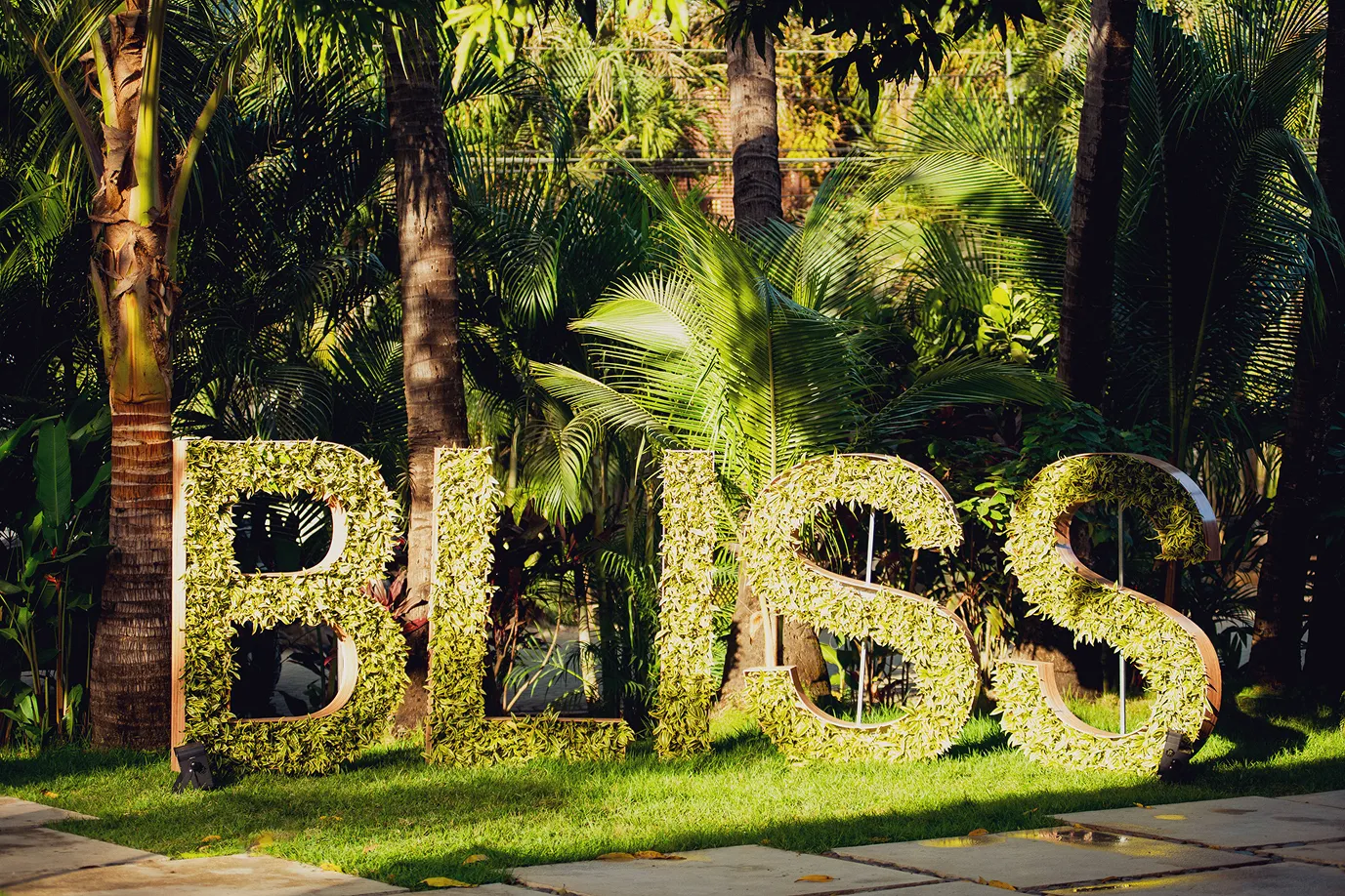
To finish the report, I collaborated directly with the printer to select paper stock, review proofs, adjust colors and layout for print optimization, and ensure quality was up to par. I also developed a rich black ink mix that was unique to BLISS, allowing for a more saturated and impactful coverage in black areas. Finally, I recommended perfect binding for a professional, durable, and high-end look to create a lasting resource.
.webp)
Impact
1/2
Elevating the freedom narrative
I developed a sophisticated design framework to elevate brand visuals and position BLISS as a world-class movement.
Making impact concrete
My design articulated BLISS’s tangible outcomes and KPIs, proving their social impact and making successes accessible to stakeholders.
Codifying the BLISS legacy and history
I synthesized a decade of civic innovation into a visual manifesto—creating a permanent record of the ecosystem’s evolution and impact.
A tool for strategic growth
By creating an asset to attract and retain capital, I improved investor relations and increased the report’s persuasive power.
Credits
Executive Producer
Álvaro Salas-Castro
Álvaro Salas-Castro
Editorial Director
Noemi Salas-Boyer
Noemi Salas-Boyer
Lead Writer
Nia Demming
Nia Demming
Copy Editor
Vale Gallegos
Vale Gallegos
Archivist
Jimmyr Centeno
Jimmyr Centeno
Producer
Matt Twohig
Matt Twohig
Event Photography
Cultivator Content Labs
Cultivator Content Labs
Wait, there’s more...
.webp)
Valley of the Sun YMCA
Community & Wellness Nonprofit
A $683K program service revenue boost derived from mission-driven design t
.webp)
Northern Arizona University
Higher Education
Fostering a 3.67% one-year retention lift by supporting student successt
.webp)
Paradox
AI & Enterprise SaaS
How a visual brand evolution helped 6x ARR and lead to
a successful exit t
Let’s make something remarkable